
vuepress实现自定义首页的样式风格
更新时间:2022年08月11日 16:20:11 作者:zwf193071
这篇文章主要介绍了vuepress实现自定义首页的样式风格,具有很好的参考价值,希望对大家有所帮助。如有错误或未考虑完全的地方,望不吝赐教
vuepress自定义首页的样式风格
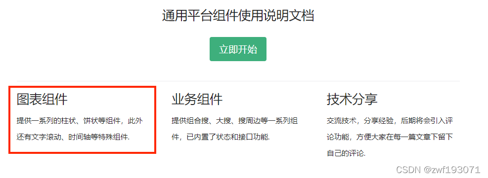
如何自定义vuepress的首页设计风格呢?比如,我希望首页下面的红框内容是可点击的:
请看正文步骤
正文
在docs -> .vuepress下新建theme文件夹,再在theme文件夹下新建components -> Home.vue, 将vuepress -> packages -> @vuepress -> theme-default -> Home.vue的源码拷贝至我们的Home.vue即可,
在源码里稍做修改便能满足我们的业务需求
改过后的Home.vue代码如下所示:
<template>
  <main
    class="home"
    :aria-labelledby="data.heroText !== null ? 'main-title' : null"
  >
    <header class="hero">
      <img
        v-if="data.heroImage"
        :src="$withBase(data.heroImage)"
        :alt="data.heroAlt || 'hero'"
      >

      <h1
        v-if="data.heroText !== null"
        id="main-title"
      >
        {{ data.heroText || $title || 'Hello' }}
      </h1>

      <p
        v-if="data.tagline !== null"
        class="description"
      >
        {{ data.tagline || $description || 'Welcome to your VuePress site' }}
      </p>

      <p
        v-if="data.actionText && data.actionLink"
        class="action"
      >
        <NavLink
          class="action-button"
          :item="actionLink"
        />
      </p>
    </header>

    <div
      v-if="data.features && data.features.length"
      class="features"
    >
      <div
        v-for="(feature, index) in data.features"
        :key="index"
        class="feature"
        @click="handleClickFeature(feature.url)"
      >
        <div class="feature-cover">
          <img :alt="feature.title" :src="feature.img"/>
        </div>
        <div class="feature-body">
          <h2>{{ feature.title }}</h2>
          <p>{{ feature.details }}</p>
        </div>
      </div>
    </div>

    <Content class="theme-default-content custom" />

    <div
      v-if="data.footer"
      class="footer"
    >
      {{ data.footer }}
    </div>
  </main>
</template>
<script>
import NavLink from '@theme/components/NavLink.vue'

export default {
  name: 'Home',

  components: { NavLink },

  computed: {
    data () {
      return this.$page.frontmatter
    },

    actionLink () {
      return {
        link: this.data.actionLink,
        text: this.data.actionText
      }
    }
  },
  methods: {
    handleClickFeature(url) {
        window.location.href = url
    }
  }
}
</script>
<style lang="stylus">
.home
  padding $navbarHeight 2rem 0
  max-width $homePageWidth
  margin 0px auto
  display block
  .hero
    text-align center
    img
      max-width: 100%
      max-height 280px
      display block
      margin 3rem auto 1.5rem
    h1
      font-size 3rem
    h1, .description, .action
      margin 1.8rem auto
    .description
      max-width 35rem
      font-size 1.6rem
      line-height 1.3
      color lighten(#000, 40%)
    .action-button
      display inline-block
      font-size 1.2rem
      color #fff
      background-color $accentColor
      padding 0.8rem 1.6rem
      border-radius 4px
      transition background-color .1s ease
      box-sizing border-box
      border-bottom 1px solid darken($accentColor, 10%)
      .icon.outbound {
        color #fff
      }
      &:hover
        background-color lighten($accentColor, 10%)
  .features
    border-top 1px solid $borderColor
    padding 1.2rem 0
    margin-top 2.5rem
    display flex
    flex-wrap wrap
    align-items flex-start
    align-content stretch
    justify-content space-between
  .feature
    margin-bottom 2rem
    flex-grow 1
    flex-basis 30%
    max-width 30%
    cursor pointer
    border 1px solid $borderColor
    transition box-shadow .3s,border-color .3s
    &:hover {
      border-color transparent;
      box-shadow 0 1px 2px -2px #00000029,0 3px 6px #0000001f,0 5px 12px 4px #00000017
    }
    .feature-cover
      height 12rem
      img
        height: 100%;
        width: 100%;
        object-fit cover
    .feature-body
      padding 0 1.2rem
    h2
      font-size 1.4rem
      font-weight 500
      border-bottom none
      padding-bottom 0
      color lighten($textColor, 10%)
    p
      color lighten($textColor, 25%)
  .footer
    padding 2.5rem
    border-top 1px solid $borderColor
    text-align center
    color lighten($textColor, 25%)

@media (max-width: $MQMobile)
  .home
    .features
      flex-direction column
    .feature
      max-width 100%
      padding 0 2.5rem

@media (max-width: $MQMobileNarrow)
  .home
    padding-left 1.5rem
    padding-right 1.5rem
    .hero
      img
        max-height 210px
        margin 2rem auto 1.2rem
      h1
        font-size 2rem
      h1, .description, .action
        margin 1.2rem auto
      .description
        font-size 1.2rem
      .action-button
        font-size 1rem
        padding 0.6rem 1.2rem
    .feature
      h2
        font-size 1.25rem
</style>
对应首页的README.md内容如下所示:
---
home: true
heroText: SF
heroImage: /logo.png
tagline: 公司业务产品设计体系库
actionText: 立即开始
actionLink: http://xxx.com/service/guide/install.html
features:
  - title: SF Map Graph
    details: 提供一系列的柱状、饼状等组件,此外还有文字滚动、时间轴等特殊组件.
    url: http://xxx.com/service/guide/install.html
    img: /home/graph.png
  - title: SF Map Service
    details: 提供大搜、按钮等一系列组件,已内置了状态和接口功能.
    url: http://xxx.com/service/guide/install.html
    img: /home/service.png
  - title: SF Ui
    details: 基于Vue / Ant Design Vue的UI组件库.
    url: http://xxx.com/service/guide/install.html
    img: /home/ui.png
  - title: SF Icons
    details: 一整套公司自有的图标集.
    url: http://xxx.com/service/guide/icon.html
    img: /home/icon.png
footer: MIT Licensed | Copyright © 2020-present
---
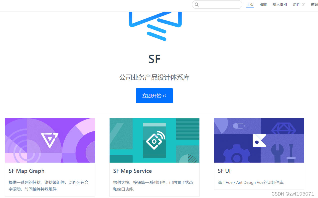
改后的首页效果图如下所示:
vuepress2.x修改默认样式的小技巧
Vuepress2.x 对样式的设置有较大变化,点此查看
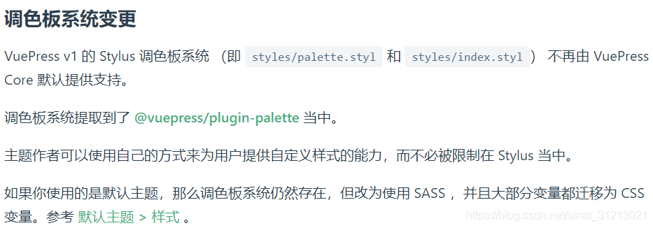
官方推荐使用插件@vuepress/plugin-palette 和 SCSS。对此插件未做详细研究,使用了一种土方式。
详解
步骤1:新建css文件,docs/.vuepress/public/css/index.css
步骤2:配置 docs/.vuepress/config.ts

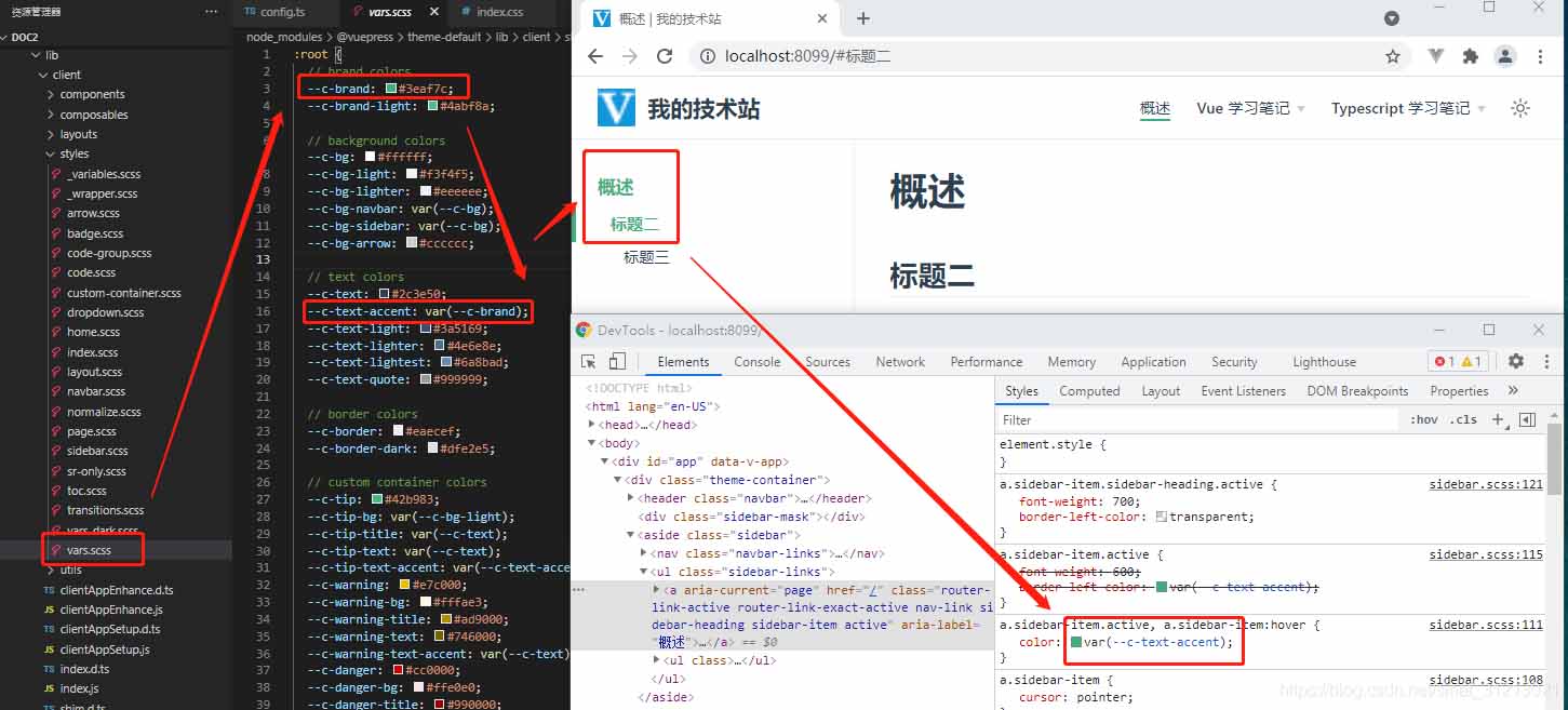
步骤3:先看看官网详解,也可在目录下找到官方变量
// 日间模式
node_modules\@vuepress\theme-default\lib\client\styles\vars.scss
// 夜间模式
node_modules\@vuepress\theme-default\lib\client\styles\vars-dark.scss
步骤4:有两种方式:
方式一:直接修改默认变量,
默认样式如下:
docs/.vuepress/public/css/index.css 中修改
/* 日间模式 */
:root {
    --c-brand: #409eff;
}
新样式
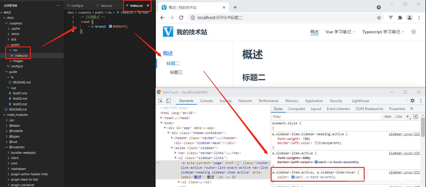
方式二:直接在开发者工具中找到要修改的元素的css名称,然后在 docs/.vuepress/public/css/index.css 中修改即可。如:修改右上角站点名的字体颜色。
/* 左上角标题 */
.navbar .site-name {
    color: #409eff;
}
修改前

修改后

以上为个人经验,希望能给大家一个参考,也希望大家多多支持脚本之家。
相关文章
 这篇文章主要介绍了详解elementUI中input框无法输入的问题,文中通过示例代码介绍的非常详细,对大家的学习或者工作具有一定的参考学习价值,需要的朋友们下面随着小编来一起学习学习吧2020-04-04
 这篇文章主要给大家介绍了关于Vite内网ip访问的2种配置方式,文中通过实例代码介绍的非常详细,对大家学习或者使用Vite具有一定的参考学习价值,需要的朋友可以参考下2023-07-07
 这篇文章主要介绍了vue基础ESLint Prettier配置教程详解,本文使用VsCode + Vue + ESLint + Prettier 实现代码格式规范 + 保存自动修复代码js+vue2022-07-07
 这篇文章主要为大家介绍了vue和react项目中key的作用示例详解,有需要的朋友可以借鉴参考下,希望能够有所帮助,祝大家多多进步,早日升职加薪2023-08-08
 本篇文章主要介绍了vue.js单页面应用实例的简单实现,使用单页应用,没有页面切换,就没有白屏阻塞,可以大大提高 H5 的性能,达到接近原生的流畅体验。2017-04-04
 这篇文章主要介绍了Vue 中 onclick和@click区别,简单点说就是onclick 只能触发 js的原生方法,不能触发vue的封装方法,@click 只能触发vue的封装方法,不能触发js的原生方法,需要的朋友可以参考下2024-02-02
Vue状态模式实现窗口停靠功能(灵动、自由, 管理后台Admin界面)
这篇文章主要介绍了Vue状态模式实现窗口停靠功能(灵动、自由, 管理后台Admin界面),本文通过实例代码文字说明给大家介绍的非常详细,具有一定的参考借鉴价值,需要的朋友可以参考下2020-03-03 这篇文章主要介绍了 详解在vue使用weixin-js-sdk常见使用方法,文中通过示例代码介绍的非常详细,对大家的学习或者工作具有一定的参考学习价值,需要的朋友们下面随着小编来一起学习学习吧2021-05-05
 这篇文章主要为大家介绍了Vue应用qs插件实现参数格式化示例详解,有需要的朋友可以借鉴参考下,希望能够有所帮助,祝大家多多进步,早日升职加薪2023-09-09
 Vue.js通过简洁的API提供高效的数据绑定和灵活的组件系统.这篇文章主要介绍了vue.js 表格分页ajax 异步加载数据的相关资料,需要的朋友可以参考下2016-10-10


最新评论