
Vue.js中el-table表格自定义列控制与拖拽
背景
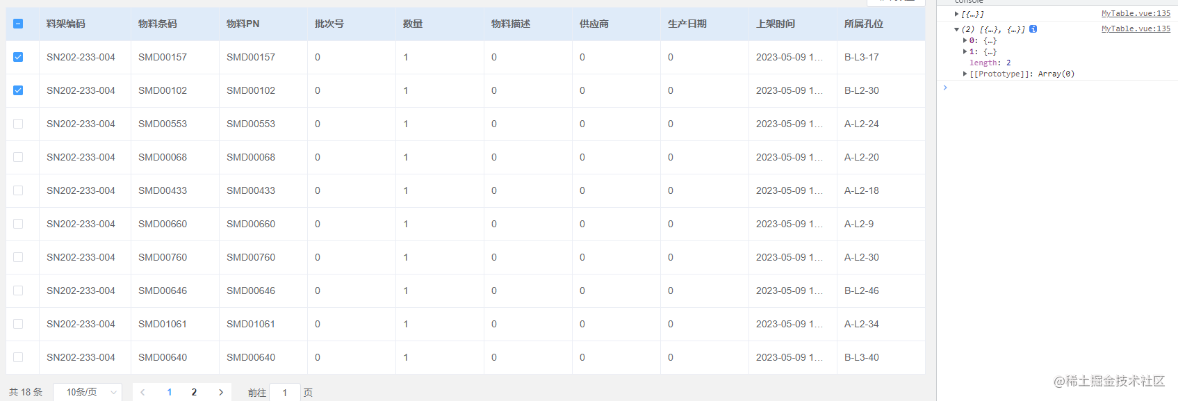
昨天客户:提了一个需求,你们这个表格的数据太乱不是我们重点关注的,然后列出了一些属性值A,B,C,D。。。这些必须展示。

前端仔:简单,30s给你安排上。
今天客户:你们这个表格的列字段不能拖动呀,我们觉得这个几个字段才是我们重点关注的,我要放到前面。。
前端仔:无语,行给你安排。
这些无聊的需求不改又不行,但是自己又不想被他们拖着天天伺候,直接给他们自己可以配置,想咋弄就咋弄。
需求与实现分析(重点)
面对客户的这些需求,总结起来也就是2个功能点,一是表格的列可以自由拖拽,二表格可以展示的列数据可以进行自定义控制。考虑到组件可能会在很多地方使用,所以使用父子传值的模式来进行数据传输。
功能实现
自由拖拽:偷个懒直接应用别人封装好的sortable.js。地址:www.sortablejs.com/
引入
npm install sortablejs
使用
import Sortable from "sortablejs";
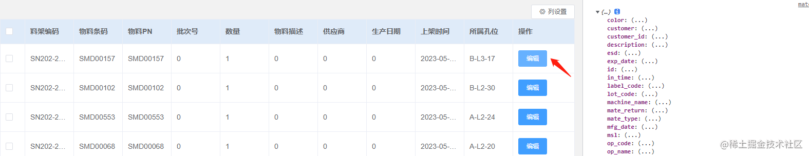
**列控制:**这里考虑使用leement的多选框组el-check-group,我们先自定义一部分默认显示的数据,还有一部分由客户自己勾选设置,这样既可以避免表格内容过多,导致出现横向滚动条的丑陋,也为客户提供了选择性。
上组件代码
<template>
  <div class="myWrap">
    <div class="colum-set">
      <el-popover width="150" placement="bottom-end" trigger="click">
        <div>
          <el-checkbox-group v-model="childCheckedItems" @change="handleCheckedColumChange">
            <el-checkbox v-for="item in tableHeader" :label="item.label" :key="item.label"></el-checkbox>
          </el-checkbox-group>
        </div>
        <el-button slot="reference" size="mini" icon="el-icon-setting">{{ $t('common.column_set') }}</el-button>
      </el-popover>
    </div>
    <el-table :data="tableBody" @selection-change="handleSelectionChange" border row-key="id" :header-cell-style="{
      height: '48px',
      background: '#DFEBF9',
      color: '#606266',
      fontWeight: 'bold',
      fontSize: '14px',
    }">
      <!-- 勾选框列 -->
      <el-table-column type="selection" width="48" fixed v-if="needCheckBox"></el-table-column>
      <!-- 表头列 -->
      <el-table-column v-for="(item, index) in checkedHeader" :key="index" :prop="item.prop" :label="item.label"
        width="auto" show-overflow-tooltip>
      </el-table-column>
      <!-- 表格操作 -->
      <el-table-column :width="tableOperate.width" :label="tableOperate.label" fixed="right" v-if="tableOperate.show">
        <template slot-scope="scope">
          <slot name="tablerow" :row="scope.row"></slot>
        </template>
      </el-table-column>
    </el-table>
  </div>
</template>
<script>
// 引入sortablejs插件,拖拽主要靠的是这个插件
import Sortable from "sortablejs";
export default {
  props: {
    tableBody: {
      required: true,
      type: Array
    },
    tableHeader: {
      type: Array,
      required: true
    },
    needCheckBox: {
      required: true,
      type: Boolean
    },
    tableOperate:{
      required:true,
      type:Object
    }
  },
  data() {
    return {
      checkedHeader: [],
      childCheckedItems: []
    };
  },
  watch: {
    '$store.state.common.lang': function (val) {
      window.location.reload()
    },
    tableHeader: {
      handler(newVal, oldVal) {
        console.log(newVal)
        this.checkedHeader = newVal.filter(item => item.show == true)
        this.childCheckedItems = this.checkedHeader.map(item => {
          return item.label
        })
      },
      immediate: true,
      deep: true
    }
  },
  mounted() {
    // 列的拖拽初始化
    this.columnDropInit();
  },
  methods: {
    //列拖拽
    columnDropInit() {
      // 第一步,获取列容器
      const wrapperColumn = document.querySelector(
        ".el-table__header-wrapper tr"
      );
      // 第二步,给列容器指定对应拖拽规则
      this.sortable = Sortable.create(wrapperColumn, {
        animation: 200,
        delay: 0,
        onEnd: (event) => {
          console.log(
            "根据旧索引和新索引去更新,其实就是交换位置",
            event.oldIndex,
            event.newIndex
          );
          // 接下来做索引的交换
          let tempHableHeader = [...this.checkedHeader]; // 先存一份临时变量表头数据
          let temp; // 临时变量用于交换
          // 这里预留一个变量,因为表头前加了表格多选,且固定。那么得-1,如果还有2列,则-2,以此类推
          temp = tempHableHeader[event.oldIndex - this.control_index];
          tempHableHeader[event.oldIndex - this.control_index] =
            tempHableHeader[event.newIndex - this.control_index];
          tempHableHeader[event.newIndex - this.control_index] = temp;
          // 这里一定要先把表头数据清空,然后再下一轮中去赋值,bug处理
          this.checkedHeader = []
          this.$nextTick(() => {
            this.checkedHeader = tempHableHeader
            this.childCheckedItems = this.checkedHeader.map(item => {
              return item.label
            })
          })
        },
      });
    },
    handleCheckedColumChange(value) {
      this.$emit('changeCheckedColum', value)
    },
    handleSelectionChange(value){
      console.log(value)
    }
  },
};
</script>
<style lang='stylus' scoped>
.myWrap {
  width: 100%;
  height: 100%;
  box-sizing: border-box;
  .colum-set{
    float: right;
  }
  /deep/ .el-table {
    .el-table__header-wrapper {
      tr {
        th {
          cursor: move;
        }
      }
    }
  }
}
.check-colum-div{
  width: 150px;
  display: flex;
  flex-direction: column;
}
</style>
父组件核心代码
<template>
    <MyTable :tableBody="matlist" :tableHeader="tableHeader" :needCheckBox="true" :tableOperate="tableOperate"
    @changeCheckedColum="changeCheckedColum" >
    <template v-slot:tablerow="scope">
    <el-button type="primary" size="small" @click="editRow(scope.row)">
    编辑
    </el-button>
    </template>
    </MyTable>
</template>
<script>
tableHeader: [
        { label: this.$t('storage.shelf_id'), prop: 'shelf_id', show: true },
        { label: this.$t('storage.save_id'), prop: 'save_id', show: false },
        { label: this.$t('storage.label_code'), prop: 'label_code', show: true },
        { label: this.$t('storage.part_num'), prop: 'part_num', show: true },
        { label: this.$t('storage.lot_code'), prop: 'lot_code', show: true },
        { label: this.$t('storage.quantity'), prop: 'quantity', show: true },
        { label: this.$t('storage.description'), prop: 'description', show: true },
        { label: this.$t('storage.supplier_name'), prop: 'supplier_name', show: true },
        { label: this.$t('storage.mfg_date'), prop: 'mfg_date', show: true },
        { label: this.$t('storage.in_time'), prop: 'in_time', show: true },
        { label: this.$t('storage.position'), prop: 'position_info', show: true },
        { label: this.$t('storage.category_name'), prop: 'category_name', show: false },
        { label: this.$t('storage.warehouse_name'), prop: 'warehouse_name',show:false },
      ],
      tableOperate:{
        show:true,
        width:120,
        label:this.$t('common.operation')
      },
</script>
核心代码分析(重点)
columnDropInit(),该方法由sortable提供,实现了表格的拖拽功能,我这里只写了列拖拽,行拖拽可以自己在官网查看。
watch中的tableHeader,为什么要这么做?因为表头所展示的数据,和多选框中被选中项是响应关系,勾选与取消的同时需要相应到表格列的变化。其次表头绑定的是对象数组,额checkbox绑定值只能是字符串或者数字,原本想直接绑定个对象数组的计划泡汤,这是elementui设计决定的。(从elementui源码上解决参考:https://www.jb51.net/javascript/2852009x5.htm)
tableHeader: {
      handler(newVal, oldVal) {
        console.log(newVal)
        this.checkedHeader = newVal.filter(item => item.show == true)
        this.childCheckedItems = this.checkedHeader.map(item => {
          return item.label
        })
      },
      immediate: true,
      deep: true
    }
handleCheckedColumChange,子组件通过$emit触发父组件的数据变更
handleCheckedColumChange(value) {
      this.$emit('changeCheckedColum', value)
},
父组件数据变更,子组件的watch,再次对数据进行监听改变
 changeCheckedColum(value) {
      this.tableHeader.forEach(item => {
        if (value.includes(item.label)) {
          item.show = true
        } else {
          item.show = false
        }
      })
  },
额外预留功能点
表格多选
<!-- 勾选框列 -->
<el-table-column type="selection" width="48" fixed v-if="needCheckBox"></el-table-column>
上面的勾选框主要用来对表格的的数据进行多选操作,方便以后预留使用,通过needCheckBox来控制是否展示,同时子组件监听该属性,来计算表格拖拽时的偏移量,在columnDropInit方法中有详细注释,计算属性方法如下:
computed: {
    control_index: function () {
      return this.needCheckBox ? 1 : 0
    },
},
表格操作,增删查改
<!-- 表格操作 子组件-->
<el-table-column :width="tableOperate.width" :label="tableOperate.label" fixed="right" v-if="tableOperate.show">
    <template slot-scope="scope">
    <slot name="tablerow" :row="scope.row"></slot>
    </template>
</el-table-column>
<!--父组件,插槽取值-->
 <template v-slot:tablerow="scope">
       <el-button type="primary" size="small" @click="editRow(scope.row)">
        {{ $t('common.edit') }}
       </el-button>
 </template>
这个插槽预留,为了方便表格对数据的增删查改,通过插槽传值,获取当前行的row。
最后
本文主要的是通过,对需求的拆分与理解,从表格的拖拽,以及列控制,衍生出开发者个人的开发习惯,对组建的预留以及扩展,方便以后使用。再技术上也有多方面的考量,对大都数开发者也有一定的学习和参考价值。好了,本文到此结束,希望对你有帮助。
到此这篇关于Vue.js中el-table表格自定义列控制与拖拽的文章就介绍到这了,更多相关Vue.js el-table自定义列控制与拖拽内容请搜索脚本之家以前的文章或继续浏览下面的相关文章希望大家以后多多支持脚本之家!
相关文章

vue封装自定义指令之动态显示title操作(溢出显示,不溢出不显示)
这篇文章主要介绍了vue封装自定义指令之动态显示title操作(溢出显示,不溢出不显示),具有很好的参考价值,希望对大家有所帮助。一起跟随小编过来看看吧2020-11-11 在Vue.js中,您可以使用watch选项来创建侦听器,以侦听特定属性的变化,侦听器可以在属性发生变化时执行相关的逻辑,本文给大家详细讲讲Vue中watch侦听器的用法,需要的朋友可以参考下2023-11-11
 在Vue中,el-table是element-ui提供的强大表格组件,可以用于展示静态和动态表格数据,本文主要介绍了element-plus+Vue3实现表格数据动态渲染,感兴趣的可以了解一下2024-03-03
vue+springboot+element+vue-resource实现文件上传教程
这篇文章主要介绍了vue+springboot+element+vue-resource实现文件上传教程,具有很好的参考价值,希望对大家有所帮助。一起跟随小编过来看看吧2020-10-10 这篇文章主要为大家详细介绍了如何基于Vue2实现动态折扣表格,文中的示例代码讲解详细,具有一定的借鉴价值,感兴趣的小伙伴可以跟随小编一起学习一下2024-01-01
 这篇文章主要介绍了vue + ele 实现下拉选择框和下拉多选选择框处理方案,本文通过实例代码给大家介绍的非常详细,对大家的学习或工作具有一定的参考借鉴价值,需要的朋友可以参考下2023-08-08
 今天小编就为大家分享一篇vue-cli脚手架搭建的项目去除eslint验证的方法,具有很好的参考价值,希望对大家有所帮助。一起跟随小编过来看看吧2018-09-09
公共Hooks封装文件下载useDownloadFile实例详解
这篇文章主要为大家介绍了公共Hooks封装文件下载useDownloadFile实例详解,有需要的朋友可以借鉴参考下,希望能够有所帮助,祝大家多多进步,早日升职加薪2022-11-11
vue+element-ui集成随机验证码+用户名+密码的form表单验证功能
在登入页面,我们往往需要通过输入验证码才能进行登入,那我们下面就详讲一下在vue项目中如何配合element-ui实现这个功能,需要的朋友可以参考下2018-08-08 Vue 最独特的特性之一,是其非侵入性的响应式系统,下面这篇文章主要给大家介绍了关于Vue响应式原理源码剖析的相关资料,文中通过示例代码介绍的非常详细,需要的朋友可以参考下2021-10-10


最新评论