
Python绘制散点密度图的三种方式详解
更新时间:2022年06月10日 08:42:20 作者:气象水文科研猫
散点密度图是在散点图的基础上,计算了每个散点周围分布了多少其他的点,并通过颜色表现出来。本文主要介绍了Python绘制散点密度图的三种方式,需要的可以参考下
方式一
import matplotlib.pyplot as plt
import numpy as np
from scipy.stats import gaussian_kde
from mpl_toolkits.axes_grid1 import make_axes_locatable
from matplotlib import rcParams
config = {"font.family":'Times New Roman',"font.size": 16,"mathtext.fontset":'stix'}
rcParams.update(config)
# 读取数据
import pandas as pd
filename=r'F:/Rpython/lp37/testdata.xlsx'
df2=pd.read_excel(filename)#读取文件
x=df2['data1'].values
y=df2['data2'].values
xy = np.vstack([x,y])
z = gaussian_kde(xy)(xy)
idx = z.argsort()
x, y, z = x[idx], y[idx], z[idx]
fig,ax=plt.subplots(figsize=(12,9),dpi=100)
scatter=ax.scatter(x,y,marker='o',c=z,edgecolors='',s=15,label='LST',cmap='Spectral_r')
cbar=plt.colorbar(scatter,shrink=1,orientation='vertical',extend='both',pad=0.015,aspect=30,label='frequency') #orientation='horizontal'
font3={'family':'SimHei','size':16,'color':'k'}
plt.ylabel("估计值",fontdict=font3)
plt.xlabel("预测值",fontdict=font3)
plt.savefig('F:/Rpython/lp37/plot70.png',dpi=800,bbox_inches='tight',pad_inches=0)
plt.show()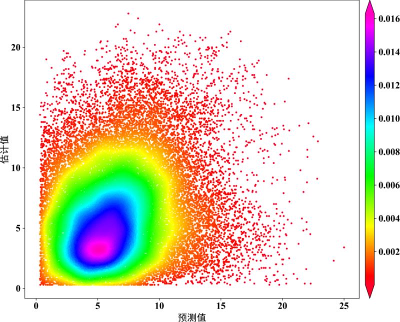
方式二
from statistics import mean
import matplotlib.pyplot as plt
from sklearn.metrics import explained_variance_score,r2_score,median_absolute_error,mean_squared_error,mean_absolute_error
from scipy import stats
import numpy as np
from matplotlib import rcParams
config = {"font.family":'Times New Roman',"font.size": 16,"mathtext.fontset":'stix'}
rcParams.update(config)
def scatter_out_1(x,y): ## x,y为两个需要做对比分析的两个量。
# ==========计算评价指标==========
BIAS = mean(x - y)
MSE = mean_squared_error(x, y)
RMSE = np.power(MSE, 0.5)
R2 = r2_score(x, y)
MAE = mean_absolute_error(x, y)
EV = explained_variance_score(x, y)
print('==========算法评价指标==========')
print('BIAS:', '%.3f' % (BIAS))
print('Explained Variance(EV):', '%.3f' % (EV))
print('Mean Absolute Error(MAE):', '%.3f' % (MAE))
print('Mean squared error(MSE):', '%.3f' % (MSE))
print('Root Mean Squard Error(RMSE):', '%.3f' % (RMSE))
print('R_squared:', '%.3f' % (R2))
# ===========Calculate the point density==========
xy = np.vstack([x, y])
z = stats.gaussian_kde(xy)(xy)
# ===========Sort the points by density, so that the densest points are plotted last===========
idx = z.argsort()
x, y, z = x[idx], y[idx], z[idx]
def best_fit_slope_and_intercept(xs, ys):
m = (((mean(xs) * mean(ys)) - mean(xs * ys)) / ((mean(xs) * mean(xs)) - mean(xs * xs)))
b = mean(ys) - m * mean(xs)
return m, b
m, b = best_fit_slope_and_intercept(x, y)
regression_line = []
for a in x:
regression_line.append((m * a) + b)
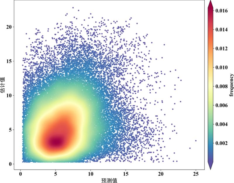
fig,ax=plt.subplots(figsize=(12,9),dpi=600)
scatter=ax.scatter(x,y,marker='o',c=z*100,edgecolors='',s=15,label='LST',cmap='Spectral_r')
cbar=plt.colorbar(scatter,shrink=1,orientation='vertical',extend='both',pad=0.015,aspect=30,label='frequency')
plt.plot([0,25],[0,25],'black',lw=1.5) # 画的1:1线,线的颜色为black,线宽为0.8
plt.plot(x,regression_line,'red',lw=1.5) # 预测与实测数据之间的回归线
plt.axis([0,25,0,25]) # 设置线的范围
plt.xlabel('OBS',family = 'Times New Roman')
plt.ylabel('PRE',family = 'Times New Roman')
plt.xticks(fontproperties='Times New Roman')
plt.yticks(fontproperties='Times New Roman')
plt.text(1,24, '$N=%.f$' % len(y), family = 'Times New Roman') # text的位置需要根据x,y的大小范围进行调整。
plt.text(1,23, '$R^2=%.3f$' % R2, family = 'Times New Roman')
plt.text(1,22, '$BIAS=%.4f$' % BIAS, family = 'Times New Roman')
plt.text(1,21, '$RMSE=%.3f$' % RMSE, family = 'Times New Roman')
plt.xlim(0,25) # 设置x坐标轴的显示范围
plt.ylim(0,25) # 设置y坐标轴的显示范围
plt.savefig('F:/Rpython/lp37/plot71.png',dpi=800,bbox_inches='tight',pad_inches=0)
plt.show()
方式三
import pandas as pd
import numpy as np
from scipy import optimize
import matplotlib.pyplot as plt
from matplotlib import cm
from matplotlib.colors import Normalize
from scipy.stats import gaussian_kde
from matplotlib import rcParams
config={"font.family":'Times New Roman',"font.size":16,"mathtext.fontset":'stix'}
rcParams.update(config)
# 读取数据
filename=r'F:/Rpython/lp37/testdata.xlsx'
df2=pd.read_excel(filename)#读取文件
x=df2['data1'].values.ravel()
y=df2['data2'].values.ravel()
N = len(df2['data1'])
#绘制拟合线
x2 = np.linspace(-10,30)
y2 = x2
def f_1(x,A,B):
    return A*x + B
A1,B1 = optimize.curve_fit(f_1,x,y)[0]
y3 = A1*x + B1
# Calculate the point density
xy = np.vstack([x,y])
z = gaussian_kde(xy)(xy)
norm = Normalize(vmin = np.min(z), vmax = np.max(z))
#开始绘图
fig,ax=plt.subplots(figsize=(12,9),dpi=600)
scatter=ax.scatter(x,y,marker='o',c=z*100,edgecolors='',s=15,label='LST',cmap='Spectral_r')
cbar=plt.colorbar(scatter,shrink=1,orientation='vertical',extend='both',pad=0.015,aspect=30,label='frequency')
cbar.ax.locator_params(nbins=8)
cbar.ax.set_yticklabels([0.005,0.010,0.015,0.020,0.025,0.030,0.035])#0,0.005,0.010,0.015,0.020,0.025,0.030,0.035
ax.plot(x2,y2,color='k',linewidth=1.5,linestyle='--')
ax.plot(x,y3,color='r',linewidth=2,linestyle='-')
fontdict1 = {"size":16,"color":"k",'family':'Times New Roman'}
ax.set_xlabel("PRE",fontdict=fontdict1)
ax.set_ylabel("OBS",fontdict=fontdict1)
# ax.grid(True)
ax.set_xlim((0,25))
ax.set_ylim((0,25))
ax.set_xticks(np.arange(0,25.1,step=5))
ax.set_yticks(np.arange(0,25.1,step=5))
plt.savefig('F:/Rpython/lp37/plot72.png',dpi=800,bbox_inches='tight',pad_inches=0)
plt.show()


到此这篇关于Python绘制散点密度图的三种方式详解的文章就介绍到这了,更多相关Python散点密度图内容请搜索脚本之家以前的文章或继续浏览下面的相关文章希望大家以后多多支持脚本之家!
相关文章
 这篇文章主要为大家详细介绍了python pygame实现2048游戏,具有一定的参考价值,感兴趣的小伙伴们可以参考一下2018-11-11
 本文主要介绍了Python开启Http Server的实现步骤,文中通过示例代码介绍的非常详细,对大家的学习或者工作具有一定的参考学习价值,需要的朋友们下面随着小编来一起学习学习吧2023-07-07
 这篇文章主要介绍了tf.keras.layers模块中的函数,具有很好的参考价值,希望对大家有所帮助。如有错误或未考虑完全的地方,望不吝赐教2023-02-02
 这篇文章主要介绍了Python面向对象特殊属性及方法解析,文中通过示例代码介绍的非常详细,对大家的学习或者工作具有一定的参考学习价值,需要的朋友可以参考下2020-09-09
 本篇文章主要介绍了python实现redis三种cas事务操作,小编觉得挺不错的,现在分享给大家,也给大家做个参考。一起跟随小编过来看看吧2017-12-12
 这篇文章主要介绍了 分享一个Python 遇到数据库超好用的模块,SQLALchemy这个模块,该模块是Python当中最有名的ORM框架,该框架是建立在数据库API之上,使用关系对象映射进行数据库的操作,,需要的朋友可以参考下2022-04-04
 下面小编就为大家带来一篇用python写个自动SSH登录远程服务器的小工具(实例)。小编觉得挺不错的,现在就分享给大家,也给大家做个参考。一起跟随小编过来看看吧2017-06-06
 这篇文章主要介绍了Django执行源生mysql语句实现过程解析,文中通过示例代码介绍的非常详细,对大家的学习或者工作具有一定的参考学习价值,需要的朋友可以参考下2020-11-11
详解python tkinter包获取本地绝对路径(以获取图片并展示)
这篇文章主要给大家介绍了关于python tkinter包获取本地绝对路径(以获取图片并展示)的相关资料,文中通过示例代码介绍的非常详细,对大家的学习或者工作具有一定的参考学习价值,需要的朋友们下面随着小编来一起学习学习吧2020-09-09
解决python和pycharm安装gmpy2 出现ERROR的问题
这篇文章主要介绍了python和pycharm安装gmpy2 出现ERROR的解决方法,本文给大家介绍的非常详细,对大家的学习或工作具有一定的参考借鉴价值,需要的朋友可以参考下2020-08-08


最新评论