
教你用html+css实现炫光倒影按钮
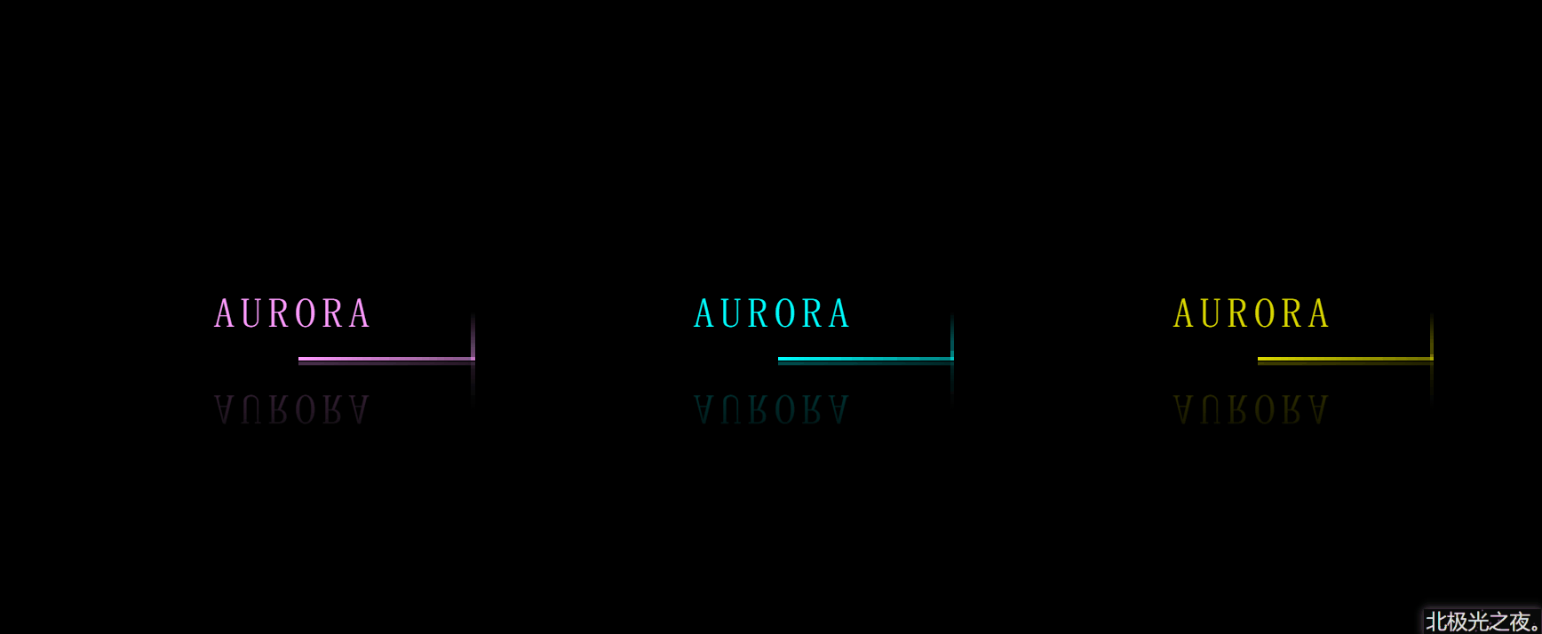
话不多,先看效果:
实现过程(完整源码在最后):
1 老样子,定义基本样式:
   *{
             margin: 0;
            padding: 0;
            box-sizing: border-box;
            font-family: 'fangsong';
        }
        body{
            height: 100vh;
            display: flex;
            align-items: center;
            justify-content: center;
            background-color: rgb(0, 0, 0);
        }
font-family: ‘fangsong’; 仿宋字体。
display: flex;
align-items: center;
justify-content: center; flex布局,让按钮在屏幕居中。
2.定义基本标签:
        <a href="#" class="item item1">
            aurora
            <span></span>
            <span></span>
            <span></span>
            <span></span>
        </a>
        <a href="#" class="item item2">
            aurora
            <span></span>
            <span></span>
            <span></span>
            <span></span>
        </a>
        <a href="#" class="item item3">
            aurora
            <span></span>
            <span></span>
            <span></span>
            <span></span>
        </a>
3个a标签就对应3个按钮,每个按钮里4个span就是环绕按钮的4条边。
且都有个公共的选择器 .item 和 只属于自己的选择器。
3.定义每个按钮的基本样式:
 .item{
            position: relative;
            margin: 50px;
            width: 300px;
            height: 80px;
            text-align: center;
            line-height: 80px;
            text-transform: uppercase;
            text-decoration: none;
            font-size: 35px;
            letter-spacing: 5px;
            color: aqua;
            overflow: hidden;
            -webkit-box-reflect: below 1px linear-gradient( transparent,rgba(6, 133, 133,0.3));
        }
text-align: center;文字对齐方式。
line-height: 80px; 字行高。
text-transform: uppercase; 字母为大写。
text-decoration: none; 去掉a标签默认下划线。
letter-spacing: 5px; 每个字符间的距离。
overflow: hidden;溢出隐藏。
-webkit-box-reflect: below 1px linear-gradient( transparent,rgba(6, 133, 133,0.3)); 这个属性能实现倒影效果。
4. 鼠标经过按钮样式改变:
 .item:hover{
            background-color: aqua;
            box-shadow:0 0 5px aqua,
            0 0 75px aqua,
            0 0 155px aqua;
            color: black;
        }
box-shadow:0 0 5px aqua,
0 0 75px aqua,
0 0 155px aqua; 阴影,写多行可以叠加更亮。
5.设置环绕按钮的4根线上面那条的样式:
.item span:nth-of-type(1){
            position: absolute;
            left: -100%;
            width: 100%;
            height: 3px;
            background-image: linear-gradient(to left,aqua ,transparent);
            animation: shang 1s linear infinite;
        }
        @keyframes shang{
            0%{
                left:-100%;
            }
            50%,100%{
                left:100%;
            }
        }
position: absolute;
left: -100%; 定位在对应位置。
background-image: linear-gradient(to left,aqua ,transparent); 线性渐变颜色。
animation: shang 1s linear infinite; 动画属性,让它动起来。
5.以此类推,设置环绕按钮的其它3根样式:
  .item span:nth-of-type(2){
            position: absolute;
            top: -100%;
            right: 0;
            width: 3px;
            height: 100%;
            background-image: linear-gradient(to top,aqua ,transparent);
            animation: you 1s linear infinite;
            animation-delay: 0.25s;
        }
        @keyframes you{
            0%{
                top:-100%;
            }
            50%,100%{
                top:100%;
            }
        }
        .item span:nth-of-type(3){
            position: absolute;
            right: -100%;
            bottom: 0;
            width: 100%;
            height: 3px;
            background-image: linear-gradient(to right,aqua ,transparent);
            animation: xia 1s linear infinite;
            animation-delay: 0.5s;
        }
        @keyframes xia{
            0%{
                right:-100%;
            }
            50%,100%{
                right:100%;
            }
        }
        .item span:nth-of-type(4){
            position: absolute;
            bottom: -100%;
            left: 0;
            width: 3px;
            height: 100%;
            background-image: linear-gradient(to bottom,aqua ,transparent);
            animation: zuo 1s linear infinite;
            animation-delay: 0.75s;
        }
        @keyframes zuo{
            0%{
                bottom:-100%;
            }
            50%,100%{
                bottom:100%;
            }
        }
animation-delay: 0.75s; 动画延迟执行。每条线对应延迟一段时间,形成时间差,形成环绕效果。
6.给第一,第三个按钮设置其它颜色:
 .item1{
            filter: hue-rotate(100deg);
        }
        .item3{
            filter: hue-rotate(250deg);
        }
filter: hue-rotate(100deg); 用色相旋转,这样不管背景还是阴影颜色都变了。
完整代码:
<!DOCTYPE html>
<html lang="zh-CN">
<head>
    <meta charset="UTF-8">
    <meta http-equiv="X-UA-Compatible" content="IE=edge">
    <meta name="viewport" content="width=device-width, initial-scale=1.0">
    <title>Document</title>
    <style>
        *{
            margin: 0;
            padding: 0;
            box-sizing: border-box;
            font-family: 'fangsong';
        }
        body{
            height: 100vh;
            display: flex;
            align-items: center;
            justify-content: center;
            background-color: rgb(0, 0, 0);
        }
        .item{
            position: relative;
            margin: 50px;
            width: 300px;
            height: 80px;
            text-align: center;
            line-height: 80px;
            text-transform: uppercase;
            text-decoration: none;
            font-size: 35px;
            letter-spacing: 5px;
            color: aqua;
            overflow: hidden;
            -webkit-box-reflect: below 1px linear-gradient( transparent,rgba(6, 133, 133,0.3));
        }
        .item:hover{
            background-color: aqua;
            box-shadow:0 0 5px aqua,
            0 0 75px aqua,
            0 0 155px aqua;
            color: black;
        }
        .item span:nth-of-type(1){
            position: absolute;
            left: -100%;
            width: 100%;
            height: 3px;
            background-image: linear-gradient(to left,aqua ,transparent);
            animation: shang 1s linear infinite;
        }
        @keyframes shang{
            0%{
                left:-100%;
            }
            50%,100%{
                left:100%;
            }
        }
        .item span:nth-of-type(2){
            position: absolute;
            top: -100%;
            right: 0;
            width: 3px;
            height: 100%;
            background-image: linear-gradient(to top,aqua ,transparent);
            animation: you 1s linear infinite;
            animation-delay: 0.25s;
        }
        @keyframes you{
            0%{
                top:-100%;
            }
            50%,100%{
                top:100%;
            }
        }
        .item span:nth-of-type(3){
            position: absolute;
            right: -100%;
            bottom: 0;
            width: 100%;
            height: 3px;
            background-image: linear-gradient(to right,aqua ,transparent);
            animation: xia 1s linear infinite;
            animation-delay: 0.5s;
        }
        @keyframes xia{
            0%{
                right:-100%;
            }
            50%,100%{
                right:100%;
            }
        }
        .item span:nth-of-type(4){
            position: absolute;
            bottom: -100%;
            left: 0;
            width: 3px;
            height: 100%;
            background-image: linear-gradient(to bottom,aqua ,transparent);
            animation: zuo 1s linear infinite;
            animation-delay: 0.75s;
        }
        @keyframes zuo{
            0%{
                bottom:-100%;
            }
            50%,100%{
                bottom:100%;
            }
        }
        .item1{
            filter: hue-rotate(100deg);
        }
        .item3{
            filter: hue-rotate(250deg);
        }
    </style>
</head>
<body>

        <a href="#" class="item item1">
            aurora
            <span></span>
            <span></span>
            <span></span>
            <span></span>
        </a>
        <a href="#" class="item item2">
            aurora
            <span></span>
            <span></span>
            <span></span>
            <span></span>
        </a>
        <a href="#" class="item item3">
            aurora
            <span></span>
            <span></span>
            <span></span>
            <span></span>
        </a>

</body>
</html>
到此这篇关于教你用html+css实现炫光倒影按钮的文章就介绍到这了,更多相关html+css炫光倒影按钮内容请搜索脚本之家以前的文章或继续浏览下面的相关文章希望大家以后多多支持脚本之家!
相关文章
 Javascript的荧光字效果...2007-02-02
 这篇文章主要介绍了教你用html+css实现炫光倒影按钮,用简单的代码分享有趣的CSS创意特效,放松放松心情,一起来学习一下如何制作吧2023-03-03


最新评论