

python Seaborn绘制统计图全面指南(直方图散点图小提琴图热力图相关系数图多张合并)
seaborn基础使用
先看一一个简单案例,
# 导入库
import seaborn as sns
# 设置基本的配置
sns.set_theme()
# 导入数据
tips = sns.load_dataset("tips")
# 可视化
sns.relplot(
    data=tips,
    x="total_bill", y="tip", col="time",
    hue="smoker", style="smoker", size="size",
)

以上是用的seaborn自带的样例数据,该数据需要开魔法,全局代理才能导入。如果无法导入数据,也可以自己参照数据编写样本数据。数据样式如下:

直方图
可视化分布的最常见方法是直方图。直方图是一个条形图,其中表示数据变量的轴被划分为一组离散条柱,并且使用相应条形的高度显示落在每个条柱内的观测值计数:
penguins = sns.load_dataset("penguins")
sns.displot(penguins, x="flipper_length_mm")

也可以设置直方图的宽度。
sns.displot(penguins, x="flipper_length_mm", binwidth=3)

散点图
散点图是指在回归分析中,数据点在直角坐标系平面上的分布图,散点图表示因变量随自变量而变化的大致趋势,据此可以选择合适的函数对数据点进行拟合。
import seaborn as sns
sns.set_theme(style="white")

# Load the example mpg dataset
mpg = sns.load_dataset("mpg")

# Plot miles per gallon against horsepower with other semantics
sns.relplot(x="horsepower", y="mpg", hue="origin", size="weight",
            sizes=(40, 400), alpha=.5, palette="muted",
            height=6, data=mpg)

小提琴图
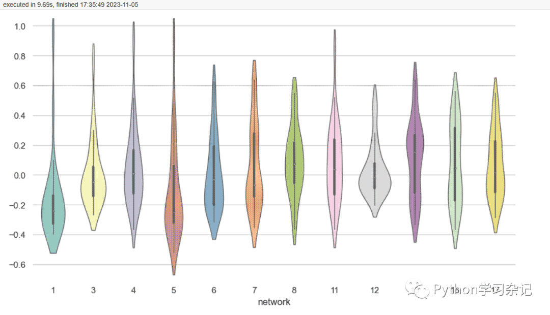
小提琴图(violin plot)是一种用于可视化数值数据分布情况的图表类型,它结合了箱线图和核密度图的优点。小提琴图通常用于比较多个组之间的分布差异,或者显示一个变量在不同类别下的分布情况。
小提琴图的外形类似于小提琴,中间部分是数据的密度估计曲线,两侧是箱线图或者散点图。小提琴图的横轴通常表示变量或者组别,纵轴表示数值变量的取值范围。每个小提琴图的宽度相同,高度表示数据的密度分布情况。
小提琴图中的箱线图表示数据的五数概括(最小值、下四分位数、中位数、上四分位数、最大值),箱线图两侧的线条表示数据的范围。如果需要比较多个组之间的分布差异,可以将它们放在同一个小提琴图上进行比较。如果需要显示一个变量在不同类别下的分布情况,可以将它们分别画在不同的小提琴图中进行比较。
import seaborn as sns
import matplotlib.pyplot as plt
sns.set_theme(style="whitegrid")

# Load the example dataset of brain network correlations
df = sns.load_dataset("brain_networks", header=[0, 1, 2], index_col=0)

# Pull out a specific subset of networks
used_networks = [1, 3, 4, 5, 6, 7, 8, 11, 12, 13, 16, 17]
used_columns = (df.columns.get_level_values("network")
                          .astype(int)
                          .isin(used_networks))
df = df.loc[:, used_columns]

# Compute the correlation matrix and average over networks
corr_df = df.corr().groupby(level="network").mean()
corr_df.index = corr_df.index.astype(int)
corr_df = corr_df.sort_index().T

# Set up the matplotlib figure
f, ax = plt.subplots(figsize=(11, 6))

# Draw a violinplot with a narrower bandwidth than the default
sns.violinplot(data=corr_df, bw_adjust=.5, cut=1, linewidth=1, palette="Set3")

# Finalize the figure
ax.set(ylim=(-.7, 1.05))
sns.despine(left=True, bottom=True)
热力图
import matplotlib.pyplot as plt
import seaborn as sns
sns.set_theme()

# Load the example flights dataset and convert to long-form
flights_long = sns.load_dataset("flights")
flights = (
    flights_long
    .pivot(index="month", columns="year", values="passengers")
)

# Draw a heatmap with the numeric values in each cell
f, ax = plt.subplots(figsize=(9, 6))
sns.heatmap(flights, annot=True, fmt="d", linewidths=.5, ax=ax)

相关系数图
相关系数是最早由统计学家卡尔·皮尔逊设计的统计指标,是研究变量之间线性相关程度的量,一般用字母r表示。取值范围为-1到1,小于0位负相关,大于0为正相关。
import pandas as pd
import seaborn as sns
sns.set_theme()

# Load the brain networks example dataset
df = sns.load_dataset("brain_networks", header=[0, 1, 2], index_col=0)

# Select a subset of the networks
used_networks = [1, 5, 6, 7, 8, 12, 13, 17]
used_columns = (df.columns.get_level_values("network")
                          .astype(int)
                          .isin(used_networks))
df = df.loc[:, used_columns]

# Create a categorical palette to identify the networks
network_pal = sns.husl_palette(8, s=.45)
network_lut = dict(zip(map(str, used_networks), network_pal))

# Convert the palette to vectors that will be drawn on the side of the matrix
networks = df.columns.get_level_values("network")
network_colors = pd.Series(networks, index=df.columns).map(network_lut)

# Draw the full plot
g = sns.clustermap(df.corr(), center=0, cmap="vlag",
                   row_colors=network_colors, col_colors=network_colors,
                   dendrogram_ratio=(.1, .2),
                   cbar_pos=(.02, .32, .03, .2),
                   linewidths=.75, figsize=(12, 13))

g.ax_row_dendrogram.remove()

多张图合并
有时候需要一次画多个图,需要用到FacetGrid模块。
import numpy as np
import pandas as pd
import seaborn as sns

sns.set_theme()

# Generate an example radial datast
r = np.linspace(0, 10, num=100)
df = pd.DataFrame({'r': r, 'slow': r, 'medium': 2 * r, 'fast': 4 * r})

# Convert the dataframe to long-form or "tidy" format
df = pd.melt(df, id_vars=['r'], var_name='speed', value_name='theta')

# Set up a grid of axes with a polar projection
g = sns.FacetGrid(df, col="speed", hue="speed",
                  subplot_kws=dict(projection='polar'), height=4.5,
                  sharex=False, sharey=False, despine=False)

# Draw a scatterplot onto each axes in the grid
g.map(sns.scatterplot, "theta", "r")

以上就是python Seaborn绘制统计图全面指南的详细内容,更多关于python Seaborn绘制统计图的资料请关注脚本之家其它相关文章!
相关文章
 今天小编就为大家分享一篇对Python 实现Mac 屏幕截图详解,具有很好的参考价值,希望对大家有所帮助。一起跟随小编过来看看吧2021-10-10
 这篇文章主要介绍了python实现每次处理一个字符的三种方法,是非常实用的字符串操作技巧,需要的朋友可以参考下2014-10-10
PyQt5实现QLineEdit添加clicked信号的方法
今天小编就为大家分享一篇PyQt5实现QLineEdit添加clicked信号的方法,具有很好的参考价值,希望对大家有所帮助。一起跟随小编过来看看吧2019-06-06 这篇文章主要介绍了python xmlrpc踩坑记录及解决方案,本文给大家介绍的非常详细,对大家的学习或工作具有一定的参考借鉴价值,需要的朋友参考下吧2025-11-11
 本文介绍了Python Numpy库中的linspace函数,该函数用于生成均匀分布的数值序列,通过示例和详细参数解释,帮助读者理解如何使用linspace函数,最后,对比了linspace和arange函数之间的主要差异,感兴趣的朋友跟随小编一起看看吧2024-12-12
 这篇文章主要介绍了pyecharts动态轨迹图的实现示例,文中通过示例代码介绍的非常详细,对大家的学习或者工作具有一定的参考学习价值,需要的朋友们下面随着小编来一起学习学习吧2020-04-04
 你是否曾经遇到过这样的情况,需要分析一个Python打包的可执行文件,但却无法获取原始代码,Python EXE解包技术正是解决这个问题的关键,下面我们就来看看Python解包exe的具体步骤吧2026-01-01
 在日常办公中,重复的 Excel 数据整理、报表生成与邮件分发工作占据大量时间,本文将手把手教你用 Python 实现 Excel 数据批量处理 + 自动化邮件发送全流程,需要的朋友可以参考下2025-12-12
 毕达哥拉斯树,也叫“勾股树”,是由毕达哥拉斯根据勾股定理所画出来的一个可以无限重复的树形图形。本文将利用Python中的Turtle库实现勾股树的绘制,感兴趣的可以了解一下2023-01-01
 这篇文章主要介绍了Python中函数的参数类型详解,文章围绕主题展开详细的内容介绍,具有一定的参考价值,需要的小伙伴可以参考一下2022-07-07
最新评论