
vue中简单弹框dialog的实现方法
更新时间:2018年02月26日 10:14:01 投稿:jingxian
下面小编就为大家分享一篇vue中简单弹框dialog的实现方法,具有很好的参考价值,希望对大家有所帮助。一起跟随小编过来看看吧
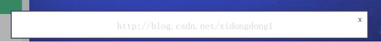
效果如下,dialog中内容自行添加
<template>
 <div>
 <div class="dialog-wrap">
  <div class="dialog-cover" v-if="isShow" @click="closeMyself"></div>
  <transition name="drop">
  <div class="dialog-content" v-if="isShow">
   <p class="dialog-close" @click="closeMyself">x</p>
   <slot>empty</slot>
  </div>
  </transition>
 </div>
 </div>
</template>
接收父组件传参isShow,并返回一个自定义事件on-close
<script>
 export default {
 props: {
  isShow: {
  type: Boolean,
  default: false
  }
 },
 data () {
  return {
  }
 },
 methods: {
  closeMyself () {
  this.$emit('on-close')
  }
 }
 }
</script>
<style scoped>
 .drop-enter-active {
 transition: all .5s ease;
 }
 .drop-leave-active {
 transition: all .3s ease;
 }
 .drop-enter {
 transform: translateY(-500px);
 }
 .drop-leave-active {
 transform: translateY(-500px);
 }
 .dialog-wrap {
 position: fixed;
 width: 100%;
 height: 100%;
 }
 .dialog-cover {
 background: #000;
 opacity: .3;
 position: fixed;
 z-index: 5;
 top: 0;
 left: 0;
 width: 100%;
 height: 100%;
 }
 .dialog-content {
 width: 50%;
 position: fixed;
 max-height: 50%;
 overflow: auto;
 background: #fff;
 top: 20%;
 left: 50%;
 margin-left: -25%;
 z-index: 10;
 border: 2px solid #464068;
 padding: 2%;
 line-height: 1.6;
 }
 .dialog-close {
 position: absolute;
 right: 5px;
 top: 5px;
 width: 20px;
 height: 20px;
 text-align: center;
 cursor: pointer;
 }
 .dialog-close:hover {
 color: #4fc08d;
 }
</style>
以上这篇vue中简单弹框dialog的实现方法就是小编分享给大家的全部内容了,希望能给大家一个参考,也希望大家多多支持脚本之家。
相关文章
 这篇文章主要介绍了vue+element 模态框表格形式的可编辑表单实现,小编觉得挺不错的,现在分享给大家,也给大家做个参考。一起跟随小编过来看看吧2019-06-06
 这篇文章主要介绍了vue如何在data中引入图片的正确路径,具有很好的参考价值,希望对大家有所帮助。如有错误或未考虑完全的地方,望不吝赐教2022-06-06
 这篇文章主要为大家介绍了Vue中异步请求导致页面数据渲染错误问题解决方法示例,有需要的朋友可以借鉴参考下,希望能够有所帮助,祝大家多多进步,早日升职加薪2023-09-09
 这篇文章主要为大家详细介绍了Vue项目中token验证登录,文中示例代码介绍的非常详细,具有一定的参考价值,感兴趣的小伙伴们可以参考一下2021-08-08
 混入(mixin)提供了一种非常灵活的方式,来分发vue组件中的可复用功能。一个混入对象可以包含任意组件选项。当组件使用混入对象时,所有混入对象的选项将被“混合”进入该组件本身的选项2022-09-09
 这篇文章主要介绍了vue百度地图实现自定义弹框样式,具有很好的参考价值,希望对大家有所帮助,如有错误或未考虑完全的地方,望不吝赐教2024-03-03
vue.js默认路由不加载linkActiveClass问题的解决方法
这篇文章主要给大家介绍了关于vue.js默认路由不加载linkActiveClass问题的解决方法,文中通过示例代码介绍的非常详细,对大家的学习或者工作具有一定的参考学习价值,需要的朋友们下面来一起看看吧。2017-12-12 这篇文章主要介绍了Vue之插槽(Slot)的使用方式,具有很好的参考价值,希望对大家有所帮助,如有错误或未考虑完全的地方,望不吝赐教2023-11-11
 keep-alive 是 Vue 内置的一个组件,可以使被包含的组件保留状态,或避免重新渲染。这篇文章主要介绍了vue 指定组件缓存,需要的朋友可以参考下2018-04-04
Vue3+TS项目中eslint、prettier安装配置详细指南
为了更好的统一项目的代码风格,因此在编写时就可以使用eslint+prettier,它们不仅能方便代码编写,还能避免不必要的错误,让代码变得更加严谨,这篇文章主要给大家介绍了关于Vue3+TS项目中eslint、prettier安装配置的相关资料,需要的朋友可以参考下2024-07-07


最新评论