
css 媒体查询 aspect-ratio less 使用方法
发布时间:2019-08-07 08:55:11 作者:佚名  我要评论
我要评论
我要评论这篇文章主要介绍了css 媒体查询 aspect-ratio less 使用方法,本文通过实例代码给大家介绍的非常详细,具有一定的参考借鉴价值,需要的朋友可以参考下
css媒体查询有一个 宽高比很方便,aspect-ratio ,可以直接使用宽/高 来进行页面适配 使用样例如下:
// 宽高比在((320/50)+(728/90))/2 两个尺寸中间值以内 适配 320*50 设计图样式
@media screen and (min-aspect-ratio: ~"249/50") and (max-aspect-ratio: ~"29/4"){
  @base: 320;
  @convert: 375/@base;
  .container{
    width: 100vw;
    height:100%;
    position:relative;
    display:flex;
    flex-flow:row nowrap;
    align-items: center;
    .info-icon-box{
      .width(46*@convert);
      .height(46*@convert);
      .border-radius(10*@convert);
      .border(1@convert,#e3e3e3);
      overflow: hidden;
      .margin-left(10*@convert);
      .min-width(46*@convert);
      .max-width(46*@convert);
      flex-grow: 0;
      img {
        width: 100%;
        height: 100%;
        .border-radius(10);
        vertical-align: top;
      }
    }
    .info-other{
      flex-grow: 1;
      display:flex;
      flex-flow:column nowrap;
      overflow: hidden;
      height:100%;
      .margin-left(10*@convert);
      .info-wrap.roll-box{
        height:200%;
      }
      .info-box{
        width:100%;
        height:50%;
        flex-grow: 1;
        display:flex;
        flex-flow:row nowrap;
        align-items: center;
        .info{
          width:48vw;
          height: 100%;
          flex-grow: 1;
          display: flex;
          //align-items: center;
          flex-direction:column;
          justify-content: center;
          .info-title{
            font-weight:bold;
            .font-size(16*@convert);
            .line-height(26*@convert);
            color: #484848 ;
            .margin-bottom(4*@convert);
          }
          .info-other-rate {
            display: flex;
            align-items: center;
            justify-content: flex-start;
            position:relative;
            z-index:2;
            .star-number{
              .font-size(15*@convert);
              color:#4a4a4a;
              .padding-right(5*@convert);
            }
            .star-evaluate {
              position: relative;
              .width(100*@convert);
              .height(16*@convert);
              background: url("../../assets/images/star_gray.png") no-repeat 0 0;
              background-size: cover;
              overflow: hidden;
              .star {
                position: absolute;
                top: 0;
                left: 0;
                display: inline-block;
                .height(16*@convert);
                background: url("../../assets/images/star.png") no-repeat 0 0;
                background-size: cover;
                overflow: hidden;
              }
              .star-1 {
                .width(8*@convert);
              }
              .star-2 {
                .width(21*@convert);
              }
              .star-3 {
                .width(29*@convert);
              }
              .star-4 {
                .width(42*@convert);
              }
              .star-5 {
                .width(50*@convert);
              }
              .star-6 {
                .width(63*@convert);
              }
              .star-7 {
                .width(71*@convert);
              }
              .star-8 {
                .width(84*@convert);
              }
              .star-9 {
                .width(92*@convert);
              }
              .star-10 {
                .width(100*@convert);
              }
            }
          }
          .info-desc-box{
            display: none;
          }
        }
        .info-install{
          .min-width(66*@convert);
          width:fit-content;
          .height(40*@convert);
          .line-height(40*@convert);
          box-sizing: border-box;
          .padding-all(0,4*@convert,0,4*@convert);
          .font-size(14*@convert);
          color:#fff;
          text-align: center;
          .margin-right(20*@convert);
          background:url("../../assets/images/btn_download_short_shadow.png") no-repeat 0 0;
          background-size:100% 100%;
        }
      }
      .info-desc-box {
        width:100%;
        height:50%;
        .padding-all(4*@convert, 26*@convert, 4*@convert, 0);
        box-sizing: border-box;
        overflow: hidden;
        .info-desc{
          .font-size(14*@convert);
          .line-height(20*@convert);
          color: #484848 ;
          .info-other-rate{
            display: none;
          }
        }
      }
    }
  }
}
// 宽高比大于((320/50)+(728/90))/2 两个尺寸中间值 适配 728*90 设计图样式
@media screen and (min-aspect-ratio: ~"29/4"){
  @base: 728;
  @convert: 375/@base;
  .container{
    width: 100vw;
    height:100%;
    position:relative;
    display:flex;
    flex-flow:row nowrap;
    align-items: center;
    .info-icon-box{
      .width(88*@convert);
      .height(88*@convert);
      .border-radius(10*@convert);
      .border(1@convert,#e3e3e3);
      overflow: hidden;
      .margin-left(10*@convert);
      .min-width(88*@convert);
      .max-width(88*@convert);
      flex-grow: 0;
      img {
        width: 100%;
        height: 100%;
        .border-radius(10);
        vertical-align: top;
      }
    }
    .info-other{
      flex-grow: 1;
      display:flex;
      flex-flow:column nowrap;
      overflow: hidden;
      height:100%;
      .margin-left(10*@convert);
      .info-wrap{
        height:100%;
        .info-box{
          width:100%;
          height:100%;
          flex-grow: 1;
          display:flex;
          flex-flow:row nowrap;
          align-items: center;
          .info{
            width:48vw;
            height: 100%;
            flex-grow: 1;
            display: flex;
            flex-direction:column;
            justify-content: center;
            .margin-right(20*@convert);
            .info-title-rate{
              display: flex;
              flex-flow: row nowrap;
            }
            .info-title{
              font-weight:bold;
              .font-size(24*@convert);
              .line-height(37*@convert);
              color: #484848 ;
              .margin-bottom(4*@convert);
            }
            .info-other-rate {
              display: flex;
              align-items: center;
              justify-content: flex-start;
              position:relative;
              z-index:2;
              .star-number{
                .font-size(15*@convert);
                color:#4a4a4a;
                .padding-right(5*@convert);
              }
              .star-evaluate {
                position: relative;
                .width(100*@convert);
                .height(16*@convert);
                background: url("../../assets/images/star_gray.png") no-repeat 0 0;
                background-size: cover;
                overflow: hidden;
                .star {
                  position: absolute;
                  top: 0;
                  left: 0;
                  display: inline-block;
                  .height(16*@convert);
                  background: url("../../assets/images/star.png") no-repeat 0 0;
                  background-size: cover;
                  overflow: hidden;
                }
                .star-1 {
                  .width(8*@convert);
                }
                .star-2 {
                  .width(21*@convert);
                }
                .star-3 {
                  .width(29*@convert);
                }
                .star-4 {
                  .width(42*@convert);
                }
                .star-5 {
                  .width(50*@convert);
                }
                .star-6 {
                  .width(63*@convert);
                }
                .star-7 {
                  .width(71*@convert);
                }
                .star-8 {
                  .width(84*@convert);
                }
                .star-9 {
                  .width(92*@convert);
                }
                .star-10 {
                  .width(100*@convert);
                }
              }
            }
            .info-desc-box {
              width:100%;
              .height(20*@convert);
              .padding-all(4*@convert, 26*@convert, 4*@convert, 0);
              box-sizing: border-box;
              overflow: hidden;
              .info-desc{
                .font-size(14*@convert);
                .line-height(20*@convert);
                color: #484848 ;
                .info-other-rate{
                  display: none;
                }
              }
              .roll-box{
                height:auto;
              }
            }
          }
          .info-install{
            .min-width(66*@convert);
            width:fit-content;
            .height(40*@convert);
            .line-height(40*@convert);
            box-sizing: border-box;
            .padding-all(0,4*@convert,0,4*@convert);
            .font-size(14*@convert);
            color:#fff;
            text-align: center;
            .margin-right(20*@convert);
            background:url("../../assets/images/btn_download_short_shadow.png") no-repeat 0 0;
            background-size:100% 100%;
          }
        }
      }
      &.info-desc-box {
        display: none;
      }
    }
  }
}
注意三点:
1、宽高比一定是比值的形式,不能直接写小数,宽/高
2、在less中直接写宽高比也不会生效,因为less会编译成小数,可以在比值前面加一个 ~ 完美解决
3、避免样式覆盖,最好把大比例的媒体查询写在后面
总结
以上所述是小编给大家介绍的css 媒体查询 aspect-ratio less 使用方法,希望对大家有所帮助,如果大家有任何疑问请给我留言,小编会及时回复大家的。在此也非常感谢大家对脚本之家网站的支持!
如果你觉得本文对你有帮助,欢迎转载,烦请注明出处,谢谢!
相关文章
- CSS Grid 是一种二维布局系统,可以同时控制行和列,相比 Flex(一维布局),更适合用在整体页面布局或复杂模块结构中,这篇文章主要介绍了前端CSS Grid 布局详解,需要的朋2025-04-16
- CSS 中的 padding 和 margin 是两个非常基础且重要的属性,它们用于控制元素周围的空白区域,本文将详细介绍 padding 和 margin 的概念、区别以及如何在实际项目中使用它们2025-04-07
- will-change 是一个 CSS 属性,用于告诉浏览器某个元素在未来可能会发生哪些变化,本文给大家介绍CSS will-change 属性详解,感兴趣的朋友一起看看吧2025-04-07
- 本文给大家分享在 CSS 中,去除a标签(超链接)的下划线的几种方法,本文给大家介绍的非常详细,感兴趣的朋友一起看看吧2025-04-07
 在前端开发中,CSS(层叠样式表)不仅是用来控制网页的外观和布局,更是实现复杂交互和动态效果的关键技术之一,随着前端技术的不断发展,CSS的用法也日益丰富和高级,本文将2025-04-07
css中的 vertical-align与line-height作用详解
文章详细介绍了CSS中的`vertical-align`和`line-height`属性,包括它们的作用、适用元素、属性值、常见使用场景、常见问题及解决方案,感兴趣的朋友跟随小编一起看看吧2025-03-26浅析CSS 中z - index属性的作用及在什么情况下会失效
z-index属性用于控制元素的堆叠顺序,值越大,元素越显示在上层,它需要元素具有定位属性(如relative、absolute、fixed或sticky),本文给大家介绍CSS 中z - index属性的作用2025-03-21- 文章详细介绍了CSS中的打印媒体查询@mediaprint包括基本语法、常见使用场景和代码示例,如隐藏非必要元素、调整字体和颜色、处理链接的URL显示、分页控制、调整边距和背景等2025-03-18
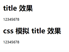
CSS模拟 html 的 title 属性(鼠标悬浮显示提示文字效果)
本文介绍了如何使用CSS模拟HTML的title属性,通过鼠标悬浮显示提示文字效果,通过设置`.tipBox`和`.tipBox.tipContent`的样式,实现了提示内容的隐藏和显示,感兴趣的朋友一起2025-03-10
前端 CSS 动态设置样式::class、:style 等技巧(推荐)
本文介绍了Vue.js中动态绑定类名和内联样式的两种方法:对象语法和数组语法,通过对象语法,可以根据条件动态切换类名或样式;通过数组语法,可以同时绑定多个类名或样式,此外2025-02-26


最新评论