
CSS网页响应式布局实现自动适配Pc/Pad/Phone设备
发布时间:2020-02-17 16:19:03 作者:TANKING  我要评论
我要评论
我要评论这篇文章主要介绍了CSS网页响应式布局实现自动适配Pc/Pad/Phone设备,文中通过示例代码介绍的非常详细,对大家的学习或者工作具有一定的参考学习价值,需要的朋友们下面随着小编来一起学习学习吧
前言
现在的设备很多,有PC、iPad、手机、智能手表、智能电视。如果没有响应式布局,那么电脑网页在手机或者ipad上显示,是体验非常差,操作不方便,视觉疲劳的,所以我们开发网页要做好响应式布局。
index
<!DOCTYPE html>
<html>
<head>
<title>响应式布局</title>
<meta charset="utf-8">
<link rel="stylesheet" type="text/css" href="style.css">
</head>
<body>
<div id="content">
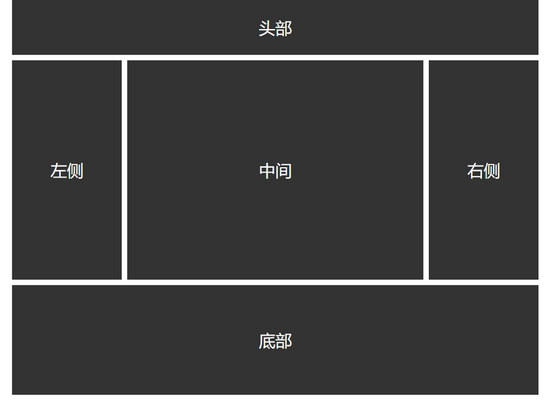
<div id="header">头部</div>
<div id="left">左侧</div>
<div id="center">中间</div>
<div id="right">右侧</div>
<div id="footer">底部</div>
</div>
</body>
</html>
CSS
*{
    margin: 0;
    padding: 0;
}

/*适应PC端 宽度大于1000px*/
@media screen and (min-width: 1000px) {
    #content{
        width: 960px;
        margin:0 auto;
    }

    #header{
        width: 100%;
        line-height: 100px;
        float: left;
        background: #333;
        color: #fff;
        text-align: center;
        font-size: 30px;
        margin-bottom: 10px;
    }

    #left{
        width: 200px;
        line-height: 400px;
        text-align: center;
        background: #333;
        float: left;
        font-size: 30px;
        color: #fff;
        margin-right: 10px;
    }

    #center{
        width: 540px;
        line-height: 400px;
        text-align: center;
        background: #333;
        float: left;
        font-size: 30px;
        color: #fff;
    }

    #right{
        width: 200px;
        line-height: 400px;
        text-align: center;
        background: #333;
        float: right;
        font-size: 30px;
        color: #fff;
    }

    #footer{
        width: 960px;
        height: 200px;
        background: #333;
        color: #fff;
        line-height: 200px;
        font-size: 30px;
        text-align: center;
        float: left;
        margin-top: 10px;
    }
}


/*适应pad端 宽度在640-1000之间*/
@media screen and (min-width: 640px) and (max-width: 1000px) {
    #content{
        width: 600px;
        margin:0 auto;
    }

    #header{
        width: 100%;
        line-height: 100px;
        float: left;
        background: #333;
        color: #fff;
        text-align: center;
        font-size: 30px;
        margin-bottom: 10px;
    }

    #left{
        width: 200px;
        line-height: 400px;
        text-align: center;
        background: #333;
        float: left;
        font-size: 30px;
        color: #fff;
        margin-right: 10px;
    }

    #center{
        width: 390px;
        line-height: 400px;
        text-align: center;
        background: #333;
        float: left;
        font-size: 30px;
        color: #fff;
    }

    #right{
        width: 600px;
        line-height: 300px;
        text-align: center;
        background: #333;
        float: left;
        font-size: 30px;
        color: #fff;
        margin-top: 10px;
    }

    #footer{
        width: 600px;
        height: 200px;
        background: #333;
        color: #fff;
        line-height: 200px;
        font-size: 30px;
        text-align: center;
        float: left;
        margin-top: 10px;
    }
}


/*适应移动端 宽度小于640*/
@media screen and (max-width: 639px){
    #content{
        width: 400px;
        margin:0 auto;
    }

    #header{
        width: 100%;
        line-height: 100px;
        float: left;
        background: #333;
        color: #fff;
        text-align: center;
        font-size: 30px;
        margin-bottom: 10px;
    }

    #left{
        width: 100%;
        line-height: 150px;
        text-align: center;
        background: #333;
        float: left;
        font-size: 30px;
        color: #fff;
        margin-bottom: 10px;
    }

    #center{
        width: 100%;
        line-height: 300px;
        text-align: center;
        background: #333;
        float: left;
        font-size: 30px;
        color: #fff;
    }

    #right{
        width: 100%;
        line-height: 150px;
        text-align: center;
        background: #333;
        float: left;
        font-size: 30px;
        color: #fff;
        margin-top: 10px;
    }

    #footer{
        width: 100%;
        height: 200px;
        background: #333;
        color: #fff;
        line-height: 200px;
        font-size: 30px;
        text-align: center;
        float: left;
        margin-top: 10px;
    }
}
通过@media screen and (限制范围) 来控制网页的布局,例如
min-width代表最小的限制,max-width代表最大的限制。
PC端
Pad端

Phone端

以上就是本文的全部内容,希望对大家的学习有所帮助,也希望大家多多支持脚本之家。
相关文章
 这篇文章主要介绍了CSS像素以及移动端不同屏幕适配问题解决,文中通过示例代码介绍的非常详细,对大家的学习或者工作具有一定的参考学习价值,需要的朋友们下面随着小编来2020-01-13
 这篇文章主要介绍了postcss-pxtorem移动端适配的实现,文中通过示例代码介绍的非常详细,对大家的学习或者工作具有一定的参考学习价值,需要的朋友们下面随着小编来一起学2019-12-03
- 这篇文章主要介绍了css列表滑动防止被底部遮住和适配屏幕长一点的机型处理 ,需要的朋友可以参考下2019-07-09
- 这篇文章主要介绍了css3中媒体查询结合rem布局适配手机屏幕,需要的朋友可以参考下2019-06-10
- 这篇文章主要介绍了手机端用rem+scss做适配的详解,小编觉得挺不错的,现在分享给大家,也给大家做个参考。一起跟随小编过来看看吧2017-11-15
通过CSS3的object-fit来调整图片适配尺寸的技巧简介
这篇文章主要介绍了通过CSS3的object-fit来调整图片适配尺寸的技巧,包括用object-fit来居中并裁剪图片的方法,需要的朋友可以参考下2016-02-27- 在需要调整设备浏览器的viewport时,我们通常在HTML中使用来解决。但是令人意想不到的是,viewport meta标签并不具有“规范性”,即它不是W3C的正式标准,也非Web标准2013-11-10


最新评论