
CSS 中使用径向渐变实现卡券效果
发布时间:2020-07-06 15:48:32 作者:佚名  我要评论
我要评论
我要评论这篇文章主要介绍了CSS 中使用径向渐变实现卡券效果,需要的朋友可以参考下
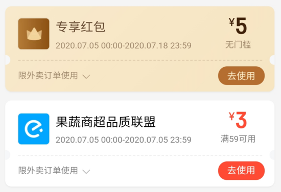
前几天,同事接到一个积分商城项目,其中有一个卡券兑换礼品功能。我想了一会没什么好的思路,就忙自己的项目去了。但想到以后自己可能也会遇到类似的需求,所以周末学习整理了下几种卡券效果的实现。
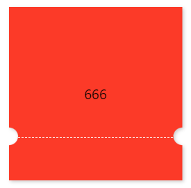
常见的卡券样式如下:
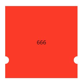
使用伪元素实现(Less 版本)
ticket.less
.ordinary-mixins-ticket-horizontal(@width,@height,@r,@top, @color) {
  position: relative;
  box-sizing: border-box;
  padding: 0 @r;
  width: @width;
  height: @height;
  background-clip: content-box;
  background-color: @color;

  &::before {
    position: absolute;
    top: 0;
    left: 0;
    content: "";
    display: block;
    width: @r + 1px;
    height: 100%;
    background: radial-gradient(@r circle at left @top, transparent @r, @color @r + 1px);
  }

  &::after {
    position: absolute;
    top: 0;
    right: 0;
    content: "";
    display: block;
    //这里的 @r + 1px 是为了避免某些百分百比缩放页面时,出现空隙
    width: @r + 1px;
    height: 100%;
    //这里的 @r + 1px 是为了防止出现锯齿
    background: radial-gradient(@r circle at right @top, transparent @r, @color @r + 1px);
  }
}

.parent {
  .ordinary-mixins-ticket-horizontal(200px, 200px, 10px, 150px, #fc3a28);
}
.child {
  line-height: 200px;
}
App.js
import React from 'react';
import './App.css';
import './ticket.less';

function App() {
    return (
        <div className="App" style={
            {
                display: "flex",
                justifyContent: "center",
                alignItems: "center",
                height: 600
            }
        }>
            <div className={'parent'}>
                <div className="child">666</div>
            </div>
        </div>
    );
}

export default App;
升级版样式一(Less 版本)
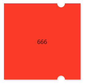
.mixins-ticket-vertical(@width, @height, @r, @left, @l-color, @r-color) {
  width: @width;
  height: @height;
  // @left - 1px 是为了避免某些百分百比缩放页面时,出现空隙
  // @r + 1px 是为了防止出现锯齿
  // 51% 是为了防止出现元素中间会有一小段空白区域的情况
  background: radial-gradient(circle at left top, transparent @r, @l-color  @r + 1px) @left - 1px top ~'/' 100% 51% no-repeat,
  radial-gradient(circle at left bottom, transparent @r, @l-color  @r + 1px) @left - 1px bottom ~'/' 100% 51% no-repeat,
    radial-gradient(circle at  right top, transparent @r, @r-color  @r + 1px ) -(@width - @left) top ~'/' 100% 51% no-repeat,
    radial-gradient(circle at right bottom , transparent @r, @r-color  @r + 1px )  -(@width - @left) bottom ~'/' 100% 51% no-repeat;

  filter: drop-shadow(2px 2px 2px rgba(0, 0, 0, .2));
}

.mixins-ticket-vertical-two(@width, @height, @r, @left, @l-color, @r-color) {
  width: @width;
  height: @height;
  // @left + 1px 是为了避免某些百分百比缩放页面时,出现空隙
  // @r + 1px 是为了防止出现锯齿
  // 51% 是为了防止出现元素中间会有一小段空白区域的情况
  background: radial-gradient(circle at left top, transparent @r, @r-color @r + 1px) right top ~'/' (@width - @left) 51% no-repeat,
  radial-gradient(circle at left bottom, transparent @r, @l-color @r + 1px) right bottom ~'/' (@width - @left)   51% no-repeat,
  radial-gradient(circle at right top, transparent @r, @r-color @r + 1px) left top ~'/' @left + 1px 51% no-repeat,
  radial-gradient(circle at right bottom, transparent @r, @l-color @r + 1px) left bottom ~'/' @left + 1px   51% no-repeat;

  filter: drop-shadow(2px 2px 2px rgba(0, 0, 0, .2));
}

.parent {
  .mixins-ticket-vertical(200px, 200px, 10px, 150px, #fc3a28,#fc3a28);
  //.mixins-ticket-vertical-two(200px, 200px, 10px, 150px, #fc3a28,#fc3a28);
}
.child {
  line-height: 200px;
}
升级版样式一(Scss 版本)
@mixin mixins-ticket-vertical($width, $height, $r, $left, $l-color, $r-color) {
  width: $width;
  height: $height;
  // $left - 1px 是为了避免某些百分百比缩放页面时,出现空隙
  // $r + 1px 是为了防止出现锯齿
  // 51% 是为了防止出现元素中间会有一小段空白区域的情况
  background: radial-gradient(circle at left top, transparent $r, $l-color  $r + 1px) $left - 1px top / 100% 51% no-repeat,
  radial-gradient(circle at left bottom, transparent $r, $l-color  $r + 1px) $left - 1px bottom / 100% 51% no-repeat,
  radial-gradient(circle at  right top, transparent $r, $r-color  $r + 1px ) -($width - $left) top / 100% 51% no-repeat,
  radial-gradient(circle at right bottom , transparent $r, $r-color  $r + 1px )  -($width - $left) bottom / 100% 51% no-repeat;

  filter: drop-shadow(2px 2px 2px rgba(0, 0, 0, .2));
}

.parent {
  @include mixins-ticket-vertical(200px, 200px, 10px, 150px, #fc3a28, #fc3a28);
}

.child {
  line-height: 200px;
}
升级版样式二(Less 版本)
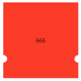
.mixins-ticket-horizontal(@width, @height, @r, @top, @l-color, @r-color) {
  width: @width;
  height: @height;
  background: radial-gradient(circle at left top, transparent @r, @l-color @r + 1px) left  @top - 1px ~'/' 51% 100% no-repeat,
  radial-gradient(circle at left bottom, transparent @r, @l-color @r + 1px) left -(@height - @top) ~'/' 51% 100% no-repeat,
  radial-gradient(circle at right top, transparent @r, @r-color @r + 1px) right  @top - 1px ~'/' 51% 100% no-repeat,
  radial-gradient(circle at right bottom, transparent @r, @r-color @r + 1px) right -(@height - @top) ~'/' 51% 100% no-repeat;

  filter: drop-shadow(2px 2px 2px rgba(0, 0, 0, .2));
}

.mixins-ticket-horizontal-two(@width, @height, @r, @top, @l-color, @r-color) {
  width: @width;
  height: @height;
  background: radial-gradient(circle at left top, transparent @r, @r-color @r + 1px) left bottom ~'/' 51%  (@height - @top) no-repeat,
  radial-gradient(circle at left bottom, transparent @r, @l-color @r + 1px) left top ~'/' 51%  @top + 1px  no-repeat,
  radial-gradient(circle at right top, transparent @r, @r-color @r + 1px) right bottom ~'/' 51%  (@height - @top) no-repeat,
  radial-gradient(circle at right bottom, transparent @r, @l-color @r + 1px) right top ~'/' 51% @top + 1px no-repeat;

  filter: drop-shadow(2px 2px 2px rgba(0, 0, 0, .2));
}

.parent {
  .mixins-ticket-horizontal(200px, 200px, 10px, 150px, #fc3a28,#fc3a28);
  //.mixins-ticket-horizontal-two(200px, 200px, 10px, 150px, #fc3a28,#fc3a28);
}
.child {
  line-height: 200px;
}
升级版样式三(Less 版本)
.mixins-ticket-horizontal-line(@width, @height, @r, @top, @l-color, @r-color,@border-offset,@border-color) {
  width: @width;
  height: @height;
  background: radial-gradient(circle at left top, transparent @r, @l-color @r + 1px) left @top - 1px ~'/' 51% 100% no-repeat,
  radial-gradient(circle at left bottom, transparent @r, @l-color @r + 1px) left -(@height - @top) ~'/' 51% 100% no-repeat,
  radial-gradient(circle at right top, transparent @r, @r-color @r + 1px) right @top - 1px ~'/' 51% 100% no-repeat,
  radial-gradient(circle at right bottom, transparent @r, @r-color @r + 1px) right -(@height - @top) ~'/' 51% 100% no-repeat;
  filter: drop-shadow(2px 2px 2px rgba(0, 0, 0, .2));

  &::after {
    position: absolute;
    left: 0;
    right: 0;
    top: @top;
    margin: auto;
    content: '';
    width: calc(~"100%" - 2*@r - @border-offset);
    border-top: 1px dashed @border-color;
  }
}

.parent {
  .mixins-ticket-horizontal(200px, 200px, 10px, 150px, #fc3a28,#fc3a28);
  //.mixins-ticket-horizontal-two(200px, 200px, 10px, 150px, #fc3a28,#fc3a28);
}
.child {
  line-height: 200px;
}
升级版样式四(Less 版本)
.mixins-ticket-vertical-three(@width, @height, @r, @left, @l-color, @r-color,@sm-r,@sm-offset,@sm-color) {
  width: @width;
  height: @height;
  // @left - 1px 是为了避免某些百分百比缩放页面时,出现空隙
  // @r + 1px 是为了防止出现锯齿
  // 51% 是为了防止出现元素中间会有一小段空白区域的情况
  background: radial-gradient(circle at left top, transparent @r, @l-color  @r + 1px) @left - 1px top ~'/' 100% 51% no-repeat,
  radial-gradient(circle at left bottom, transparent @r, @l-color  @r + 1px) @left - 1px bottom ~'/' 100% 51% no-repeat,
    radial-gradient(circle at  right top, transparent @r, @r-color  @r + 1px ) -(@width - @left) top ~'/' 100% 51% no-repeat,
    radial-gradient(circle at right bottom , transparent @r, @r-color  @r + 1px )  -(@width - @left) bottom ~'/' 100% 51% no-repeat;

  filter: drop-shadow(2px 2px 2px rgba(0, 0, 0, .2));

  &::after {
    content: '';
    position: absolute;
    top: 0;
    right: -@sm-r;
    width: @sm-r;
    height: 100%;
    background-image: radial-gradient(circle at @sm-r, transparent @sm-r, @r-color @sm-r + 1px);
    //background-size: @sm-r;
    background-size: @sm-r @sm-offset;
  }
}

.parent {
  .mixins-ticket-vertical-three(200px, 200px, 10px, 150px, #fc3a28, #fc3a28,5px,20px,#fc3a28);
}

.child {
  line-height: 200px;
}
注意事项
// ticket.less

//background: radial-gradient(circle at top right, transparent @r, @lcolor 0) -(@width - @left) top ~'/' 100% 55% no-repeat;
// 将上面的这行代码拆解如下:
//background-image: radial-gradient(circle at top right, transparent @r, @lcolor 0);
//background-position:-(@width - @left) top ;
//background-size:100% 55% ;
//background-repeat: no-repeat;

/*注意:这里先是有 50px 的透明区域,紧接着第二个区域设置了 0 ,可以理解为从这里开始重新设置样式区间*/
/*background: radial-gradient(circle at top right, transparent 50px, red 0, #66a8ff 50%);*/

/*在Chrome下,如果两个区域之间颜色直接以 0 偏差过渡,会有比较严重的锯齿*/
/*background: radial-gradient(10px at left,transparent 50%,#F6327C 50%);*/
/*background: radial-gradient(10px at left,transparent 50%,#F6327C 55%);*/

/*加阴影效果*/
/*filter: drop-shadow(2px 2px 2px rgba(0,0,0,.2));*/

/*多个径向渐变累加*/
/*background:
radial-gradient(50px 100px ellipse, transparent 40px, yellow 41px, red 49px, transparent 50px),
radial-gradient(30px circle, red, red 29px, transparent 30px);*/
总结
到此这篇关于CSS 中使用径向渐变实现卡券效果的文章就介绍到这了,更多相关css 径向渐变实现卡券效果内容请搜索脚本之家以前的文章或继续浏览下面的相关文章,希望大家以后多多支持脚本之家!
相关文章
- CSS Grid 是一种二维布局系统,可以同时控制行和列,相比 Flex(一维布局),更适合用在整体页面布局或复杂模块结构中,这篇文章主要介绍了前端CSS Grid 布局详解,需要的朋2025-04-16
- CSS 中的 padding 和 margin 是两个非常基础且重要的属性,它们用于控制元素周围的空白区域,本文将详细介绍 padding 和 margin 的概念、区别以及如何在实际项目中使用它们2025-04-07
- will-change 是一个 CSS 属性,用于告诉浏览器某个元素在未来可能会发生哪些变化,本文给大家介绍CSS will-change 属性详解,感兴趣的朋友一起看看吧2025-04-07
- 本文给大家分享在 CSS 中,去除a标签(超链接)的下划线的几种方法,本文给大家介绍的非常详细,感兴趣的朋友一起看看吧2025-04-07
 在前端开发中,CSS(层叠样式表)不仅是用来控制网页的外观和布局,更是实现复杂交互和动态效果的关键技术之一,随着前端技术的不断发展,CSS的用法也日益丰富和高级,本文将2025-04-07
css中的 vertical-align与line-height作用详解
文章详细介绍了CSS中的`vertical-align`和`line-height`属性,包括它们的作用、适用元素、属性值、常见使用场景、常见问题及解决方案,感兴趣的朋友跟随小编一起看看吧2025-03-26浅析CSS 中z - index属性的作用及在什么情况下会失效
z-index属性用于控制元素的堆叠顺序,值越大,元素越显示在上层,它需要元素具有定位属性(如relative、absolute、fixed或sticky),本文给大家介绍CSS 中z - index属性的作用2025-03-21- 文章详细介绍了CSS中的打印媒体查询@mediaprint包括基本语法、常见使用场景和代码示例,如隐藏非必要元素、调整字体和颜色、处理链接的URL显示、分页控制、调整边距和背景等2025-03-18
CSS模拟 html 的 title 属性(鼠标悬浮显示提示文字效果)
本文介绍了如何使用CSS模拟HTML的title属性,通过鼠标悬浮显示提示文字效果,通过设置`.tipBox`和`.tipBox.tipContent`的样式,实现了提示内容的隐藏和显示,感兴趣的朋友一起2025-03-10
前端 CSS 动态设置样式::class、:style 等技巧(推荐)
本文介绍了Vue.js中动态绑定类名和内联样式的两种方法:对象语法和数组语法,通过对象语法,可以根据条件动态切换类名或样式;通过数组语法,可以同时绑定多个类名或样式,此外2025-02-26


最新评论