
仿网易nec首页动画效果(实现原理+代码)
发布时间:2013-06-19 17:26:06 作者:佚名  我要评论
我要评论
我要评论首先介绍关于animation属性;nec动画实现原理:采用三层背景层、气泡层、文字镂空层。气泡层通过animation属性实现了运动效果,具体实现如下,感兴趣的朋友可以参考下哈
仿网页nec首页动画效果
nec链接:http://nec.netease.com/
首先,介绍animation
animation检索或设置对象所应用的动画特效。
animation由“keyframes”这个属性来实现这样的效果。
keyframes具有其自己的语法规则,他的命名是由"@keyframes"开头,后面紧接着是这个“动画的名称”加上一对花括号“{}”,括号中就是一些不同时间段样式规则,有点像我们css的样式写法一样。
关于animation属性介绍:
animation-name:检索或设置对象所应用的动画名称
animation-duration:检索或设置对象动画的持续时间
animation-timing-function:检索或设置对象动画的过渡类型
animation-delay:检索或设置对象动画延迟的时间
animation-iteration-count:检索或设置对象动画的循环次数
animation-direction:检索或设置对象动画在循环中是否反向运动
animation-play-state:检索或设置对象动画的状态。w3c正考虑是否将该属性移除,因为动画的状态可以通过其它的方式实现,比如重设样式
nec动画实现原理:
采用三层背景层、气泡层、文字镂空层。气泡层通过animation属性实现了运动效果。
html结构:
<div class="kbanner">
<div class="knecbg knecone"></div>
<div class="knecbg knectwo">
<i></i>
<i></i>
<i></i>
<i></i>
<i></i>
</div>
<div class="knecbg knecthree"></div>
</div>
css样式:
.kbanner{
position: relative;
width: 856px;
height: 366px;
background: url(http://images.cnblogs.com/cnblogs_com/kuikui/354173/o_banner1.jpg) center top no-repeat;
}
.knecbg{
position: absolute;
left: 150px;
top: 77px;
width: 487px;
height: 186px;
overflow: hidden;
}
.knecone{
background: url(//img.jbzj.com/file_images/article/201306/o_pao.png) left top no-repeat;
z-index: 1;
}
.knectwo{
z-index: 2;
}
.knecthree{
background: url(//img.jbzj.com/file_images/article/201306/o_pao.png) left bottom no-repeat;
z-index: 3;
}
.knectwo i{
position: absolute;
display: block;
top: -50px;
width: 53px;
height: 56px;
overflow: hidden;
background: url(//img.jbzj.com/file_images/article/201306/o_pao.png) no-repeat -9999px -9999px;
-webkit-animation: paoi 7s 2s infinite;
-moz-animation: paoi 7s 2s infinite;
-ms-animation: paoi 7s 2s infinite;
animation: paoi 7s 2s infinite;
}
.knectwo i:nth-child(1){
left: 25px;
-webkit-animation-delay: 3s;
-moz-animation-delay: 3s;
-ms-animation-delay: 3s;
animation-delay: 3s;
background-position: -507px 0;
}
.knectwo i:nth-child(2){
left: 85px;
-webkit-animation-delay: 6s;
-moz-animation-delay: 6s;
-ms-animation-delay: 6s;
animation-delay: 6s;
background-position: -507px -64px;
}
.knectwo i:nth-child(3){
left: 190px;
-webkit-animation-delay: 4s;
-moz-animation-delay: 4s;
-ms-animation-delay: 4s;
animation-delay: 4s;
background-position: -507px -140px;
}
.knectwo i:nth-child(4){
left: 285px;
-webkit-animation-delay: 8s;
-moz-animation-delay: 8s;
-ms-animation-delay: 8s;
animation-delay: 8s;
background-position: -507px 0;
}
.knectwo i:nth-child(5){
left: 400px;
-webkit-animation-delay: 5s;
-moz-animation-delay: 5s;
-ms-animation-delay: 5s;
animation-delay: 5s;
background-position: -507px 0;
}
@-webkit-keyframes paoi {
% {
top:186px;
}
% {
top:-56px;
}
}@-moz-keyframes paoi {
% {
top:186px;
}
% {
top:-56px;
}
}@-ms-keyframes paoi {
% {
top:186px;
}
% {
top:-56px;
}
}@keyframes paoi {
% {
top:186px;
}
% {
top:-56px;
}
nec动画效果:
提示:您可以先修改部分代码再运行
nec链接:http://nec.netease.com/
首先,介绍animation
animation检索或设置对象所应用的动画特效。
animation由“keyframes”这个属性来实现这样的效果。
keyframes具有其自己的语法规则,他的命名是由"@keyframes"开头,后面紧接着是这个“动画的名称”加上一对花括号“{}”,括号中就是一些不同时间段样式规则,有点像我们css的样式写法一样。
关于animation属性介绍:
animation-name:检索或设置对象所应用的动画名称
animation-duration:检索或设置对象动画的持续时间
animation-timing-function:检索或设置对象动画的过渡类型
animation-delay:检索或设置对象动画延迟的时间
animation-iteration-count:检索或设置对象动画的循环次数
animation-direction:检索或设置对象动画在循环中是否反向运动
animation-play-state:检索或设置对象动画的状态。w3c正考虑是否将该属性移除,因为动画的状态可以通过其它的方式实现,比如重设样式
nec动画实现原理:
采用三层背景层、气泡层、文字镂空层。气泡层通过animation属性实现了运动效果。
html结构:
复制代码
代码如下:<div class="kbanner">
<div class="knecbg knecone"></div>
<div class="knecbg knectwo">
<i></i>
<i></i>
<i></i>
<i></i>
<i></i>
</div>
<div class="knecbg knecthree"></div>
</div>
css样式:
复制代码
代码如下:.kbanner{
position: relative;
width: 856px;
height: 366px;
background: url(http://images.cnblogs.com/cnblogs_com/kuikui/354173/o_banner1.jpg) center top no-repeat;
}
.knecbg{
position: absolute;
left: 150px;
top: 77px;
width: 487px;
height: 186px;
overflow: hidden;
}
.knecone{
background: url(//img.jbzj.com/file_images/article/201306/o_pao.png) left top no-repeat;
z-index: 1;
}
.knectwo{
z-index: 2;
}
.knecthree{
background: url(//img.jbzj.com/file_images/article/201306/o_pao.png) left bottom no-repeat;
z-index: 3;
}
.knectwo i{
position: absolute;
display: block;
top: -50px;
width: 53px;
height: 56px;
overflow: hidden;
background: url(//img.jbzj.com/file_images/article/201306/o_pao.png) no-repeat -9999px -9999px;
-webkit-animation: paoi 7s 2s infinite;
-moz-animation: paoi 7s 2s infinite;
-ms-animation: paoi 7s 2s infinite;
animation: paoi 7s 2s infinite;
}
.knectwo i:nth-child(1){
left: 25px;
-webkit-animation-delay: 3s;
-moz-animation-delay: 3s;
-ms-animation-delay: 3s;
animation-delay: 3s;
background-position: -507px 0;
}
.knectwo i:nth-child(2){
left: 85px;
-webkit-animation-delay: 6s;
-moz-animation-delay: 6s;
-ms-animation-delay: 6s;
animation-delay: 6s;
background-position: -507px -64px;
}
.knectwo i:nth-child(3){
left: 190px;
-webkit-animation-delay: 4s;
-moz-animation-delay: 4s;
-ms-animation-delay: 4s;
animation-delay: 4s;
background-position: -507px -140px;
}
.knectwo i:nth-child(4){
left: 285px;
-webkit-animation-delay: 8s;
-moz-animation-delay: 8s;
-ms-animation-delay: 8s;
animation-delay: 8s;
background-position: -507px 0;
}
.knectwo i:nth-child(5){
left: 400px;
-webkit-animation-delay: 5s;
-moz-animation-delay: 5s;
-ms-animation-delay: 5s;
animation-delay: 5s;
background-position: -507px 0;
}
@-webkit-keyframes paoi {
% {
top:186px;
}
% {
top:-56px;
}
}@-moz-keyframes paoi {
% {
top:186px;
}
% {
top:-56px;
}
}@-ms-keyframes paoi {
% {
top:186px;
}
% {
top:-56px;
}
}@keyframes paoi {
% {
top:186px;
}
% {
top:-56px;
}
nec动画效果:
提示:您可以先修改部分代码再运行
相关文章
 本文介绍了div 图片如何在DIV内水平居中,无论文字居中、图片居中等内容居中我们都可以使用以上两种方法实现,一般推荐使用CSS进行,但网页多时候,我们只需要修改CSS文件2021-11-30
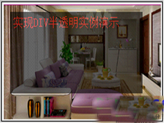 DIV半透明实现,使用CSS实现DIV成半透明效果,CSS实现层与背景半透明效果。本文通过实例代码给大家介绍的非常详细,需要的朋友参考下吧2021-11-30
 新手在使用web标准(div css)开发网页的时候,遇到第一个问题是div与span有什么区别,什么时候用div,什么时候用span标签。下面小编就通过本文给大家讲解下,感兴趣的朋友2021-11-30
 这篇文章主要介绍了设置div背景透明的方法示例,文中通过示例代码介绍的非常详细,对大家的学习或者工作具有一定的参考学习价值,需要的朋友们下面随着小编来一起学习学习2021-02-20
 这篇文章主要介绍了CSS实现div不设高度完全居中,文中通过示例代码介绍的非常详细,对大家的学习或者工作具有一定的参考学习价值,需要的朋友们下面随着小编来一起学习学习2021-02-04
 这篇文章主要介绍了div自适应高度自动填充剩余高度,文中通过示例代码介绍的非常详细,对大家的学习或者工作具有一定的参考学习价值,需要的朋友们下面随着小编来一起学习学2020-07-08
- 这篇文章主要介绍了DIV+CSS的命名规矩才能有利于SEO优化的实现方法,需要的朋友可以参考下2018-11-15
- 这篇文章主要介绍了DIV或者DIV里面的图片水平与垂直居中的方法,需要的朋友可以参考下2018-11-15
 这篇文章主要介绍了详解如何用div实现自制滚动条,滚动条是浏览器中最常见的组件了。想要学习如何自制滚动条的方法,需要了解的朋友可以参考下2018-03-21
- Div布局是学习的重点,这篇文章主要为大家详细介绍了div对齐与网页布局的相关学习资料,具有一定的参考价值,感兴趣的小伙伴们可以参考一下2017-08-31


最新评论