
使用css3制作登录表单的步骤
发布时间:2014-04-07 16:42:52 作者:佚名  我要评论
我要评论
我要评论这篇文章主要介绍了使用css3制作登录表单的步骤,需要的朋友可以参考下

制作步骤:
一, 引入prefixfree.js脚本
下面代码中使用了CSS3无前缀脚本prefixfree.js,可以省去CSS3中前缀“-moz”、“-webkit”、“-o”、“-ms”。
复制代码
代码如下:<script type="text/javascript" charset="UTF-8" src="prefixfree.min.js"></script>
二, <body>标签结构
复制代码
代码如下:<body>
<div class="content">
<form action="" method="post" class="login-form">
<div class="username">
<input type="text" name="username" placeholder="" autocomplete="on" />
<span class="user-icon icon">u</span>
</div>
<div class="password">
<input type="password" name="password" placeholder="" />
<span class="password-icon icon">p</span>
</div>
<div class="account-control">
<input type="checkbox" name="Remember me" id="Remember me" value="Remember me" checked="checked" />
<label for="Remember me" data-on="c" class="check"></label>
<label for="Remember me" class="info">Remember me</label>
<button type="submit">Login</button>
</div>
</form>
</div>
</body>
三,CSS代码
复制代码
代码如下:body {
background: url(bg.png);
background-size: 100% 100%;
margin:0;
padding:0;}
.content {
width:600px;
height:420px;
margin:50px auto;
}
.login-form {
width:400px;
height:177px;
margin:70px auto 0;
padding-top:73px;
position:relative;
background-image:-*-linear-gradient(top,rgb(255,255,255),rgb(242,242,242));
box-shadow:0 3px 3px rgba(21,62,78,0.8);
}
.login-form:before {
content:"";
position:absolute;
top:-50px;
left:150px;
width:102px;
height:102px;
padding:2px;
border:1px solid rgb(216,216,219);
background:#fff url("profilepicture.jpg") no-repeat 2px 2px;
}
.not-registered {
position:absolute;
color:rgb(153,153,153);
font-weight:bold;
font-size:13px;
top:calc(100% + 20px);
background-color:rgb(255,255,255);
width:400px;
height:46px;
margin:0 auto;
line-height:46px;
text-align: center;
box-shadow:0 3px 3px rgba(21,62,78,0.8);
}
.not-registered a {
margin-left:5px;
text-decoration: none;
color:rgb(52,119,182);
cursor: pointer;
}
.login-form div {
width:216px;
height:28px;
margin:20px auto;
position:relative;
line-height:28px;
border:none;
}
.login-form .user-icon,
.login-form .password-icon {
display:inline-block;
font-family: 'loginform-icon';
font-size:15px;
text-align:center;
line-height:28px;
color:rgb(153,153,153);
position:absolute;
left:1px;
top:1px;
background-color:rgb(255,255,255);
border:none;
border-right:1px solid rgb(229,229,232);
width:30px;
height:28px;
transition: all 300ms linear;
}
.login-form .username input, .login-form .password input {
height:100%;
width:calc(100% - 40px);
padding-left:40px;
border-radius:2px;
border:1px solid;
border-color:rgb(229,229,232) rgb(220,220,221) rgb(213,213,213) rgb(220,220,221);
display:block;
transition: all 300ms linear;
}</p> <p>.login-form .icon:before, .login-form .icon:after {
content:"";
position:absolute;
top:10px;
left:30px;
width:0;
height:0;
border:4px solid transparent;
border-left-color:rgb(255,255,255);
}
.login-form .icon:before {
top:9px;
border:5px solid transparent;
border-left-color:rgb(229,229,232);
}
.login-form .username input:focus, .login-form .password input:focus {
border-color:rgb(69,153,228);
box-shadow:0 0 2px 1px rgb(200,223,244);
}
.login-form .username input:focus + span, .login-form .password input:focus + span {
background:-*-linear-gradient(top,rgb(255,255,255),rgb(245,245,245));
color:rgb(51,51,51);
}
.login-form .username input:focus + span:after, .login-form .password input:focus + span:after {
border-left-color:rgb(250,250,250);
}</p> <p>.login-form .account-control label {
margin-left:24px;
font-size:12px;
font-family: Arial, Helvetica, sans-serif;
cursor:pointer;
}
.login-form button[type="submit"] {
color:#fff;
font-weight:bold;
float:right;
width:68px;
height:30px;
position:relative;
background:-*-linear-gradient(top,rgb(74,162,241),rgb(52,119,182)) 1px 0 no-repeat,
-*-linear-gradient(top,rgb(52,118,181),rgb(36,90,141)) left top no-repeat;
background-size:66px 28px,68px 29px;
border:none;
border-top:1px solid rgb(52,118,181);
border-radius:2px;
box-shadow:inset 0 1px 0 rgb(86,174,251);
text-shadow:0 1px 1px rgb(51,113,173);
transition: all 200ms linear;
}
.login-form button[type="submit"]:hover {
text-shadow:0 0 2px rgb(255,255,255);
box-shadow:inset 0 1px 0 rgb(86,174,251),0 0 10px 3px rgba(74,162,241,0.5);
}
.login-form button[type="submit"]:active {
background:-*-linear-gradient(top,rgb(52,119,182),rgb(74,162,241)) 1px 0 no-repeat,
-*-linear-gradient(top,rgb(52,118,181),rgb(36,90,141)) left top no-repeat;
}</p> <p>.login-form .account-control input {
width:0px;
height:0px;
}
.login-form label.check {
position:absolute;
left:0;
top:50%;
margin:-8px 0;
display:inline-block;
width:16px;
height:16px;
line-height: 16px;
text-align:center;
border-radius:2px;
background:-*-linear-gradient(top,rgb(255,255,255),rgb(246,246,246)) 1px 1px no-repeat,
-*-linear-gradient(top,rgb(227,227,230),rgb(165,165,165)) left top no-repeat;
background-size:14px 14px,16px 16px;
}
.login-form .account-control input:checked + label.check:before {
content:attr(data-on);
font-family:loginform-icon;
}
@font-face {
font-family: 'loginform-icon';
src: url("font/loginform-icon.eot");
src: url("font/loginform-icon.eot?#iefix") format('embedded-opentype'),
url("font/loginform-icon.woff") format('woff'),
url("font/loginform-icon.ttf") format('truetype'),
url("font/loginform-icon.svg#loginform-icon") format('svg');
font-weight: normal;
font-style: normal;
}
OK,制作完成!自己动手试试吧。
相关文章
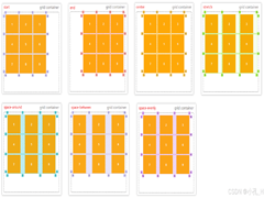 CS3的Grid网格布局是目前最强的二维布局系统,可以同时对列和行进行处理,将网页划分成一个个网格,可以任意组合不同的网格,做出各种各样的布局,本文介绍CSS3 最强二维布局系2025-02-27
- 本文介绍了如何使用CSS3的transform属性和动画技巧实现波浪式图片墙,通过设置图片的垂直偏移量,并使用动画使其周期性地改变位置,可以创建出动态且具有波浪效果的图片墙,同2025-02-27
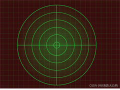 文章介绍了如何使用CSS3实现一个雷达探测扫描的效果,包括夜色背景、蜘蛛网盘、扫描体的转动效果、尾巴阴影以及被扫描到的光点,通过HTML和CSS的配合,实现了丰富的动画效果,2025-02-21
- CSS3的Flexbox是一种强大的布局模式,通过设置display:flex可以轻松实现对齐、排列和分布网页元素,它解决了传统布局方法中的对齐、间距分配和自适应布局等问题,接下来通过本2025-02-19
 本文给大家介绍css3 实现icon刷新转动效果,文章开头给大家介绍了webkit-transform、animation、@keyframes这三个属性,结合实例代码给大家介绍的非常详细,感兴趣的朋友一2025-02-19
- CSS3过渡属性用于实现元素从一种样式平滑过渡到另一种样式,通过设置transition-property过渡属性、transition-duration过渡时长transition-timing-function过渡函数和trans2025-02-19
- 本文介绍了如何使用CSS3创建一个简单的动态旋转加载样式,通过定义一个带有类名“loader”的HTML元素,并使用CSS样式和@keyframes规则来实现旋转动画,你可以根据需要调整样式2025-02-19
- 这篇文章主要介绍了如何使用CSS3的transition属性实现平滑的过渡动画,本文通过实例代码给大家介绍的非常详细,感兴趣的朋友一起看看吧2025-02-13
 本文介绍了使用CSS3中的Flexbox和Grid布局实现等高元素布局的方法,通过简单的两列实现、每行放置3列以及全部代码的展示,展示了这两种布局方式的实现细节和效果,感兴趣的朋2025-02-11
- CSS3和SVG的结合使用为网页设计带来了创新的动态视觉效果,本文通过一个圆形进度条的动画特效示例,展示了如何利用CSS3的动画功能和SVG的矢量图形能力来创建丰富的用户交互体2024-10-24


最新评论