
一款css实现的鼠标经过按钮的特效
发布时间:2014-09-11 15:30:59 作者:佚名  我要评论
我要评论
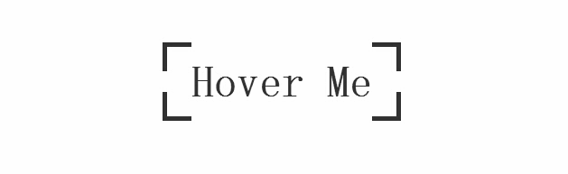
我要评论css3实现的鼠标经过按钮特效,按钮初始时,边框为断开的按钮,当鼠标经过按钮时动画变为封闭的边框,经测试,还不错,喜欢的朋友可以看看
今天要为各网友再带来一款css实现的鼠标经过按钮的特效。按钮初始时,边框为断开的按钮,当鼠标经过按钮时动画变为封闭的边框。效果图如下:
源码下载
我们一起看下实现的代码:
html代码:
<body>
<a target="_blank" class="btn-edge" href=https://www.jb51.net>Hover Me</a>
</body>
css代码:
*, *:before, *:after
{
margin: 0;
padding: 0;
-webkit-box-sizing: border-box;
-moz-box-sizing: border-box;
box-sizing: border-box;
}
body
{
padding-top: 10%;
text-align: center;
overflow-x: hidden;
}
.btn-edge
{
position: relative;
display: inline-block;
padding: 1rem 2rem;
font-family: 'Titillium Web' , sans-serif;
font-weight: 700;
text-decoration: none;
font-size: 3rem;
color: #333;
background-image: -webkit-gradient(linear, left top, left bottom, from(#333), to(#333)), -webkit-gradient(linear, left top, left bottom, from(#333), to(#333)), -webkit-gradient(linear, left top, left bottom, from(#333), to(#333)), -webkit-gradient(linear, left top, left bottom, from(#333), to(#333)), -webkit-gradient(linear, left top, left bottom, from(#333), to(#333)), -webkit-gradient(linear, left top, left bottom, from(#333), to(#333)), -webkit-gradient(linear, left top, left bottom, from(#333), to(#333)), -webkit-gradient(linear, left top, left bottom, from(#333), to(#333));
background-image: -webkit-linear-gradient(#333, #333), -webkit-linear-gradient(#333, #333), -webkit-linear-gradient(#333, #333), -webkit-linear-gradient(#333, #333), -webkit-linear-gradient(#333, #333), -webkit-linear-gradient(#333, #333), -webkit-linear-gradient(#333, #333), -webkit-linear-gradient(#333, #333);
background-image: linear-gradient(#333, #333), linear-gradient(#333, #333), linear-gradient(#333, #333), linear-gradient(#333, #333), linear-gradient(#333, #333), linear-gradient(#333, #333), linear-gradient(#333, #333), linear-gradient(#333, #333);
background-repeat: no-repeat;
-webkit-background-size: 2rem 5px, 2rem 5px, 2rem 5px, 2rem 5px, 5px 2rem, 5px 2rem, 5px 2rem, 5px 2rem;
background-size: 2rem 5px, 2rem 5px, 2rem 5px, 2rem 5px, 5px 2rem, 5px 2rem, 5px 2rem, 5px 2rem;
background-position: 0 0, 100% 0, 0 100%, 100% 100%;
-webkit-box-shadow: inset 0 0 0 5px rgba(255, 99, 71, 0);
box-shadow: inset 0 0 0 5px rgba(255, 99, 71, 0);
-webkit-transition: background-size 1s .4s, -webkit-box-shadow .4s, color .4s;
transition: background-size 1s .4s, box-shadow .4s, color .4s;
-webkit-transform: translateZ(0);
transform: translateZ(0);
}
.btn-edge:hover
{
color: tomato;
-webkit-background-size: 100% 5px, 100% 5px, 100% 5px, 100% 5px, 5px 100%, 5px 100%, 5px 100%, 5px 100%;
background-size: 100% 5px, 100% 5px, 100% 5px, 100% 5px, 5px 100%, 5px 100%, 5px 100%, 5px 100%;
-webkit-box-shadow: inset 0 0 0 5px tomato;
box-shadow: inset 0 0 0 5px tomato;
-webkit-transition: background-size 1s, -webkit-box-shadow .4s .6s, color .4s .6s;
transition: background-size 1s, box-shadow .4s .6s, color .4s .6s;
}

源码下载
我们一起看下实现的代码:
html代码:
复制代码
代码如下:<body>
<a target="_blank" class="btn-edge" href=https://www.jb51.net>Hover Me</a>
</body>
css代码:
复制代码
代码如下:*, *:before, *:after
{
margin: 0;
padding: 0;
-webkit-box-sizing: border-box;
-moz-box-sizing: border-box;
box-sizing: border-box;
}
body
{
padding-top: 10%;
text-align: center;
overflow-x: hidden;
}
.btn-edge
{
position: relative;
display: inline-block;
padding: 1rem 2rem;
font-family: 'Titillium Web' , sans-serif;
font-weight: 700;
text-decoration: none;
font-size: 3rem;
color: #333;
background-image: -webkit-gradient(linear, left top, left bottom, from(#333), to(#333)), -webkit-gradient(linear, left top, left bottom, from(#333), to(#333)), -webkit-gradient(linear, left top, left bottom, from(#333), to(#333)), -webkit-gradient(linear, left top, left bottom, from(#333), to(#333)), -webkit-gradient(linear, left top, left bottom, from(#333), to(#333)), -webkit-gradient(linear, left top, left bottom, from(#333), to(#333)), -webkit-gradient(linear, left top, left bottom, from(#333), to(#333)), -webkit-gradient(linear, left top, left bottom, from(#333), to(#333));
background-image: -webkit-linear-gradient(#333, #333), -webkit-linear-gradient(#333, #333), -webkit-linear-gradient(#333, #333), -webkit-linear-gradient(#333, #333), -webkit-linear-gradient(#333, #333), -webkit-linear-gradient(#333, #333), -webkit-linear-gradient(#333, #333), -webkit-linear-gradient(#333, #333);
background-image: linear-gradient(#333, #333), linear-gradient(#333, #333), linear-gradient(#333, #333), linear-gradient(#333, #333), linear-gradient(#333, #333), linear-gradient(#333, #333), linear-gradient(#333, #333), linear-gradient(#333, #333);
background-repeat: no-repeat;
-webkit-background-size: 2rem 5px, 2rem 5px, 2rem 5px, 2rem 5px, 5px 2rem, 5px 2rem, 5px 2rem, 5px 2rem;
background-size: 2rem 5px, 2rem 5px, 2rem 5px, 2rem 5px, 5px 2rem, 5px 2rem, 5px 2rem, 5px 2rem;
background-position: 0 0, 100% 0, 0 100%, 100% 100%;
-webkit-box-shadow: inset 0 0 0 5px rgba(255, 99, 71, 0);
box-shadow: inset 0 0 0 5px rgba(255, 99, 71, 0);
-webkit-transition: background-size 1s .4s, -webkit-box-shadow .4s, color .4s;
transition: background-size 1s .4s, box-shadow .4s, color .4s;
-webkit-transform: translateZ(0);
transform: translateZ(0);
}
.btn-edge:hover
{
color: tomato;
-webkit-background-size: 100% 5px, 100% 5px, 100% 5px, 100% 5px, 5px 100%, 5px 100%, 5px 100%, 5px 100%;
background-size: 100% 5px, 100% 5px, 100% 5px, 100% 5px, 5px 100%, 5px 100%, 5px 100%, 5px 100%;
-webkit-box-shadow: inset 0 0 0 5px tomato;
box-shadow: inset 0 0 0 5px tomato;
-webkit-transition: background-size 1s, -webkit-box-shadow .4s .6s, color .4s .6s;
transition: background-size 1s, box-shadow .4s .6s, color .4s .6s;
}
相关文章
 CS3的Grid网格布局是目前最强的二维布局系统,可以同时对列和行进行处理,将网页划分成一个个网格,可以任意组合不同的网格,做出各种各样的布局,本文介绍CSS3 最强二维布局系2025-02-27
- 本文介绍了如何使用CSS3的transform属性和动画技巧实现波浪式图片墙,通过设置图片的垂直偏移量,并使用动画使其周期性地改变位置,可以创建出动态且具有波浪效果的图片墙,同2025-02-27
 文章介绍了如何使用CSS3实现一个雷达探测扫描的效果,包括夜色背景、蜘蛛网盘、扫描体的转动效果、尾巴阴影以及被扫描到的光点,通过HTML和CSS的配合,实现了丰富的动画效果,2025-02-21
- CSS3的Flexbox是一种强大的布局模式,通过设置display:flex可以轻松实现对齐、排列和分布网页元素,它解决了传统布局方法中的对齐、间距分配和自适应布局等问题,接下来通过本2025-02-19
 本文给大家介绍css3 实现icon刷新转动效果,文章开头给大家介绍了webkit-transform、animation、@keyframes这三个属性,结合实例代码给大家介绍的非常详细,感兴趣的朋友一2025-02-19
- CSS3过渡属性用于实现元素从一种样式平滑过渡到另一种样式,通过设置transition-property过渡属性、transition-duration过渡时长transition-timing-function过渡函数和trans2025-02-19
- 本文介绍了如何使用CSS3创建一个简单的动态旋转加载样式,通过定义一个带有类名“loader”的HTML元素,并使用CSS样式和@keyframes规则来实现旋转动画,你可以根据需要调整样式2025-02-19
- 这篇文章主要介绍了如何使用CSS3的transition属性实现平滑的过渡动画,本文通过实例代码给大家介绍的非常详细,感兴趣的朋友一起看看吧2025-02-13
 本文介绍了使用CSS3中的Flexbox和Grid布局实现等高元素布局的方法,通过简单的两列实现、每行放置3列以及全部代码的展示,展示了这两种布局方式的实现细节和效果,感兴趣的朋2025-02-11
- CSS3和SVG的结合使用为网页设计带来了创新的动态视觉效果,本文通过一个圆形进度条的动画特效示例,展示了如何利用CSS3的动画功能和SVG的矢量图形能力来创建丰富的用户交互体2024-10-24


最新评论