
一款纯css3实现的动画加载导航
发布时间:2014-10-08 14:10:23 作者:佚名  我要评论
我要评论
我要评论这篇文章主要为大家介绍了用css3实现的动画加载导航,该导航出现的时候以动画的形式出现,下面请和脚本之家的小编一起来学习一下
今天为给大家再带来一款纯css3实现的动画加载导航。该导航出现的时候以动画的形式出现。效果图如下:
html代码:
复制代码
代码如下: <ul class="main-menu">
<li class="main-menu-item active"><a href="#">Home</a></li><li class="main-menu-item">
<a href="#">About Us</a></li><li class="main-menu-item"><a href="#">Another Link</a></li><li
class="main-menu-item"><a href="#">And another</a></li><li class="main-menu-item"><a
href="#">Stuff</a></li><li class="main-menu-item"><a href="#">Help</a></li><li class="main-menu-item">
<a href="#">Contact</a></li></ul>
css代码:
复制代码
代码如下: *, *:after, *:before {
-moz-box-sizing: border-box;
box-sizing: border-box;
margin: 0;
padding: 0;
}
html, body {
background: #f0f0f0;
font-family: Helvetica, sans-serif;
height: 100%;
}
.main-menu {
margin: auto;
width: 960px;
text-align: center;
position: relative;
list-style-type: none;
margin-top: 2em;
}
.main-menu::after,
.main-menu-item.active::after {
content: '';
display: inline-block;
position: absolute;
}
.main-menu::after {
width: 70%;
height: 2px;
background: #9B1C27;
-webkit-animation: menuLine 1s ease forwards;
animation: menuLine 1s ease forwards;
-webkit-transform: scaleX(0);
-ms-transform: scaleX(0);
transform: scaleX(0);
bottom: 0;
left: 0;
right: 0;
margin: auto;
opacity: 0;
}
@-webkit-keyframes menuLine {
to {
-webkit-transform: scaleX(1);
transform: scaleX(1);
opacity: 1;
}
}
@keyframes menuLine {
to {
-webkit-transform: scaleX(1);
transform: scaleX(1);
opacity: 1;
}
}
@-webkit-keyframes menuItem {
to {
-webkit-transform: translateY(0);
transform: translateY(0);
opacity: 1;
}
}
@keyframes menuItem {
to {
-webkit-transform: translateY(0);
transform: translateY(0);
opacity: 1;
}
}
.main-menu-item a {
display: block;
padding: 1em;
text-decoration: none;
color: #555;
opacity: 0;
-webkit-transform: translateY(40%);
-ms-transform: translateY(40%);
transform: translateY(40%);
-webkit-animation: menuItem .8s ease forwards;
animation: menuItem .8s ease forwards;
-webkit-transition: all .2s ease;
transition: all .2s ease;
}
.main-menu-item:nth-child(4) a {
-webkit-animation-delay: .4s;
animation-delay: .4s;
}
.main-menu-item:nth-child(3) a, .main-menu-item:nth-child(5) a {
-webkit-animation-delay: .5s;
animation-delay: .5s;
}
.main-menu-item:nth-child(2) a, .main-menu-item:nth-child(6) a {
-webkit-animation-delay: .6s;
animation-delay: .6s;
}
.main-menu-item:nth-child(1) a, .main-menu-item:nth-child(7) a {
-webkit-animation-delay: .7s;
animation-delay: .7s;
}
.main-menu-item {
display: inline-block;
position: relative;
}
.main-menu-item:hover a, .main-menu-item.active {
color: #9B1C27;
}
.main-menu-item:hover a::after, .main-menu-item.active::after {
width: 0;
height: 0;
border-bottom: .5em solid #9B1C27;
border-left: .5em solid transparent;
border-right: .5em solid transparent;
bottom: 0;
left: 0;
right: 0;
margin: auto;
opacity: 0;
-webkit-transform: translateY(0.05em);
-ms-transform: translateY(0.05em);
transform: translateY(0.05em);
-webkit-animation: menuItem .8s 1.2s ease forwards;
animation: menuItem .8s 1.2s ease forwards;
}
相关文章
- 这篇文章主要介绍了CSS3中的字体及相关属性,本文通过实例代码给大家介绍的非常详细,对大家的学习或工作具有一定的参考借鉴价值,需要的朋友可以参考下2025-06-12
- 本文详细解析了CSS3中实现账号密码输入框提示特效的原理和方法,包括HTML5的placeholder属性与CSS3新特性如伪类选择器、动态效果和过渡动画的结合使用,感兴趣的朋友跟随小2025-05-14
- CSS3的布局特性为前端开发者提供了无限可能,无论是Flexbox的一维布局还是Grid的二维布局,它们都能够帮助开发者以更清晰、简洁的方式实现复杂的网页布局,本文给大家介绍C2025-05-14
CSS3 Facebook-style Buttons 项目常见问题及最新解决方案
CSS3 Facebook-style Buttons 是一个开源项目,旨在通过简单的 CSS 代码来重现 Facebook 按钮和工具栏的外观,本文给大家介绍CSS3 Facebook-style Buttons 项目常见问题及2025-05-14使用animation.css库快速实现CSS3旋转动画效果
随着Web技术的不断发展,动画效果已经成为了网页设计中不可或缺的一部分,本文将深入探讨animation.css的工作原理,如何使用以及其在实际项目中的应用,感兴趣的朋友一起看2025-05-14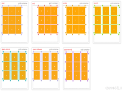 CS3的Grid网格布局是目前最强的二维布局系统,可以同时对列和行进行处理,将网页划分成一个个网格,可以任意组合不同的网格,做出各种各样的布局,本文介绍CSS3 最强二维布局系2025-02-27
- 本文介绍了如何使用CSS3的transform属性和动画技巧实现波浪式图片墙,通过设置图片的垂直偏移量,并使用动画使其周期性地改变位置,可以创建出动态且具有波浪效果的图片墙,同2025-02-27
 文章介绍了如何使用CSS3实现一个雷达探测扫描的效果,包括夜色背景、蜘蛛网盘、扫描体的转动效果、尾巴阴影以及被扫描到的光点,通过HTML和CSS的配合,实现了丰富的动画效果,2025-02-21
- CSS3的Flexbox是一种强大的布局模式,通过设置display:flex可以轻松实现对齐、排列和分布网页元素,它解决了传统布局方法中的对齐、间距分配和自适应布局等问题,接下来通过本2025-02-19
 本文给大家介绍css3 实现icon刷新转动效果,文章开头给大家介绍了webkit-transform、animation、@keyframes这三个属性,结合实例代码给大家介绍的非常详细,感兴趣的朋友一2025-02-19


最新评论