
实例教程 纯CSS3打造非常炫的加载动画效果
发布时间:2014-11-05 14:26:31 作者:佚名  我要评论
我要评论
我要评论这篇文章主要为大家介绍了一款非常炫的加载图,代码非常简单。没有用任何javascript代码。纯css3实现。用在需要一定时间加载的地方非常合适,感兴趣的可以来复制代码学习哦
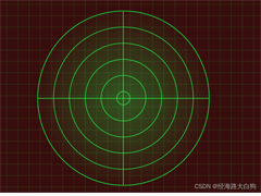
纯css3打造的一款非常炫的加载图。用在需要一定时间加载的地方非常合适。代码非常简单。没有用任何javascript代码。纯css3实现。先上效果图:

实现代码如下:
html代码:
XML/HTML Code复制内容到剪贴板
- <div class="content">
- <div style="width: 970px; margin: auto">
- </div>
- <div class="rotate">
- <span class="triangle base"></span><span class="triangle no1"></span><span class="triangle no2">
- </span><span class="triangle no3"></span>
- </div>
- </div>
CSS代码:
CSS Code复制内容到剪贴板
- body {
- padding:0;
- margin:0;
- background-color: #2a4e66;
- overflow: hidden;
- }
- .content {
- width:100%;
- height:100%;
- top:0;
- rightright:0;
- bottombottom:0;
- left:0;
- position:absolute;
- }
- .rotate {
- position: absolute;
- top: 50%;
- left: 50%;
- margin: -93px 0 0 -93px;
- background: transparent;
- width: 186px;
- height: 186px;
- border-radius: 50%;
- z-index: 20;
- }
- .rotate:after {
- content: '';
- position: absolute;
- box-shadow: 0 0 30px #ffffff, 0 0 10px #ffffff, 0 0 2px #ffffff, inset 0 0 2px #ffffff, inset 0 0 4px #ffffff;
- width: 186px;
- height: 186px;
- border-radius: 50%;
- z-index: 10;
- }
- span.triangle.base {
- position: absolute;
- width: 0;
- height: 0;
- margin: 46px 0 0 13px;
- border-left: 80px solid transparent;
- border-right: 80px solid transparent;
- border-top: 140px solid #eeeeee;
- transform-origin: 50% 50%;
- z-index: 20;
- }
- span.triangle.no1 {
- position: absolute;
- margin: 46px 0 0 13px;
- width: 0;
- height: 0;
- border-left: 80px solid transparent;
- border-right: 80px solid transparent;
- border-bottom: 140px solid #eeeeee;
- transform-origin: 0 100%;
- z-index: 20;
- }
- span.triangle.no2 {
- position: absolute;
- margin: 46px 0 0 13px;
- width: 0;
- height: 0;
- border-left: 80px solid transparent;
- border-right: 80px solid transparent;
- border-bottom: 140px solid #eeeeee;
- transform-origin: 100% 100%;
- z-index: 20;
- }
- span.triangle.no3 {
- position: absolute;
- margin: 46px 0 0 13px;
- width: 0;
- height: 0;
- border-left: 80px solid transparent;
- border-right: 80px solid transparent;
- border-bottom: 140px solid #eeeeee;
- transform-origin: 50% 100%;
- z-index: 20;
- }
- /* Animation */
- .rotate {
- -webkit-animation: rotateTriangle 3s linear infinite;
- animation: rotateTriangle 3s linear infinite;
- }
- @-webkit-keyframes rotateTriangle {
- from { -webkit-transform: rotate(0deg); }
- to { -webkit-transform: rotate(60deg); }
- }
- @keyframes rotateTriangle {
- from { transform: rotate(0deg); }
- to { transform: rotate(60deg); }
- }
- .rotate:after {
- -webkit-animation: glowAnimation 3s ease infinite;
- animation: glowAnimation 3s ease infinite;
- }
- @-webkit-keyframes glowAnimation {
- 0% { box-shadow: 0 0 30px #ffffff, 0 0 10px #ffffff, 0 0 2px #ffffff, inset 0 0 2px #ffffff, inset 0 0 4px #ffffff; }
- 10% { box-shadow: 0 0 80px #ffffff, 0 0 20px #ffffff, 0 0 2px #ffffff, inset 0 0 4px #ffffff, inset 0 0 8px #ffffff; }
- 100% { box-shadow: 0 0 30px #ffffff, 0 0 10px #ffffff, 0 0 2px #ffffff, inset 0 0 2px #ffffff, inset 0 0 4px #ffffff; }
- }
- @keyframes glowAnimation {
- 0% { box-shadow: 0 0 30px #ffffff, 0 0 10px #ffffff, 0 0 2px #ffffff, inset 0 0 2px #ffffff, inset 0 0 4px #ffffff; }
- 10% { box-shadow: 0 0 80px #ffffff, 0 0 20px #ffffff, 0 0 2px #ffffff, inset 0 0 4px #ffffff, inset 0 0 8px #ffffff; }
- 100% { box-shadow: 0 0 30px #ffffff, 0 0 10px #ffffff, 0 0 2px #ffffff, inset 0 0 2px #ffffff, inset 0 0 4px #ffffff; }
- }
- span.triangle.base {
- -webkit-animation: scaleTriangleBase 3s linear infinite;
- animation: scaleTriangleBase 3s linear infinite;
- }
- @-webkit-keyframes scaleTriangleBase {
- from { -webkit-transform: translate(0px,-11px) scale(0.5); }
- to { -webkit-transform: translate(0px,0px) scale(1); }
- }
- @keyframes scaleTriangleBase {
- from { transform: translate(0px,-11px) scale(0.5); }
- to { transform: translate(0px,0px) scale(1); }
- }
- span.triangle.no1 {
- -webkit-animation: scaleTriangleOne 3s linear infinite;
- animation: scaleTriangleOne 3s linear infinite;
- }
- @-webkit-keyframes scaleTriangleOne {
- from { -webkit-transform: translate(0px,-46px) scale(0.5); }
- to { -webkit-transform: translate(-80px,0px) scale(0); }
- }
- @keyframes scaleTriangleOne {
- from { transform: translate(0px,-46px) scale(0.5); }
- to { transform: translate(-80px,0px) scale(0); }
- }
- span.triangle.no2 {
- -webkit-animation: scaleTriangleTwo 3s linear infinite;
- animation: scaleTriangleTwo 3s linear infinite;
- }
- @-webkit-keyframes scaleTriangleTwo {
- from { -webkit-transform: translate(0px,-46px) scale(0.5); }
- to { -webkit-transform: translate(80px,0px) scale(0); }
- }
- @keyframes scaleTriangleTwo {
- from { transform: translate(0px,-46px) scale(0.5); }
- to { transform: translate(80px,0px) scale(0); }
- }
- span.triangle.no3 {
- -webkit-animation: scaleTriangleThree 3s linear infinite;
- animation: scaleTriangleThree 3s linear infinite;
- }
- @-webkit-keyframes scaleTriangleThree {
- from { -webkit-transform: translate(0px,-116px) scale(0.5); }
- to { -webkit-transform: translate(0px,-280px) scale(0); }
- }
- @keyframes scaleTriangleThree {
- from { transform: translate(0px,-116px) scale(0.5); }
- to { transform: translate(0px,-280px) scale(0); }
- }
相关文章
- 这篇文章主要介绍了CSS3中的字体及相关属性,本文通过实例代码给大家介绍的非常详细,对大家的学习或工作具有一定的参考借鉴价值,需要的朋友可以参考下2025-06-12
- 本文详细解析了CSS3中实现账号密码输入框提示特效的原理和方法,包括HTML5的placeholder属性与CSS3新特性如伪类选择器、动态效果和过渡动画的结合使用,感兴趣的朋友跟随小2025-05-14
- CSS3的布局特性为前端开发者提供了无限可能,无论是Flexbox的一维布局还是Grid的二维布局,它们都能够帮助开发者以更清晰、简洁的方式实现复杂的网页布局,本文给大家介绍C2025-05-14
CSS3 Facebook-style Buttons 项目常见问题及最新解决方案
CSS3 Facebook-style Buttons 是一个开源项目,旨在通过简单的 CSS 代码来重现 Facebook 按钮和工具栏的外观,本文给大家介绍CSS3 Facebook-style Buttons 项目常见问题及2025-05-14使用animation.css库快速实现CSS3旋转动画效果
随着Web技术的不断发展,动画效果已经成为了网页设计中不可或缺的一部分,本文将深入探讨animation.css的工作原理,如何使用以及其在实际项目中的应用,感兴趣的朋友一起看2025-05-14 CS3的Grid网格布局是目前最强的二维布局系统,可以同时对列和行进行处理,将网页划分成一个个网格,可以任意组合不同的网格,做出各种各样的布局,本文介绍CSS3 最强二维布局系2025-02-27
- 本文介绍了如何使用CSS3的transform属性和动画技巧实现波浪式图片墙,通过设置图片的垂直偏移量,并使用动画使其周期性地改变位置,可以创建出动态且具有波浪效果的图片墙,同2025-02-27
 文章介绍了如何使用CSS3实现一个雷达探测扫描的效果,包括夜色背景、蜘蛛网盘、扫描体的转动效果、尾巴阴影以及被扫描到的光点,通过HTML和CSS的配合,实现了丰富的动画效果,2025-02-21
- CSS3的Flexbox是一种强大的布局模式,通过设置display:flex可以轻松实现对齐、排列和分布网页元素,它解决了传统布局方法中的对齐、间距分配和自适应布局等问题,接下来通过本2025-02-19
 本文给大家介绍css3 实现icon刷新转动效果,文章开头给大家介绍了webkit-transform、animation、@keyframes这三个属性,结合实例代码给大家介绍的非常详细,感兴趣的朋友一2025-02-19


最新评论