
一款基于css3的列表toggle特效实例教程
发布时间:2015-01-04 09:32:02 作者:佚名  我要评论
我要评论
我要评论之前介绍了css3的很多实例教程,今天给大家带来一款基于css3的列表toggle特效。右上角一个按钮,当列表不显示的时候,单击按钮列表动画出现,当列表显示时,单击按钮,列表动画消失
今天给大家带来一款基于css3的列表toggle特效。右上角一个按钮,当列表不显示的时候,单击按钮列表动画出现,当列表显示时,单击按钮,列表动画消失,效果图如下:

实现的代码。
htm代码:
复制内容到剪贴板
- <div class='menu'>
- toggle visibility</div>
- <ul class='list reverse'>
- <li class='item'>Item 1</li>
- <li class='item'>Item 2</li>
- <li class='item'>Item 3</li>
- <li class='item'>Item 4</li>
- <li class='item'>Item 5</li>
- <li class='item'>Item 6</li>
- <li class='item'>Item 7</li>
- <li class='item'>Item 8</li>
- <li class='item'>Item 9</li>
- <li class='item'>Item 10</li>
- <li class='item'>Item 11</li>
- <li class='item'>Item 12</li>
- </ul>
css3代码:
CSS Code复制内容到剪贴板
- * {
- -moz-box-sizing: border-box;
- box-sizing: border-box;
- }
- body {
- margin: 0;
- padding: 0;
- font-family: 'Avenir Next';
- background: #000;
- color: white;
- }
- .menu {
- background: tomato;
- padding: 20px;
- position: absolute;
- z-index: 1;
- height: 55px;
- top: 0;
- rightright: 50px;
- }
- .list {
- -webkit-perspective: 100vw;
- perspective: 100vw;
- width: 100vw;
- height: 100vh;
- display: -webkit-flex;
- display: -ms-flexbox;
- display: flex;
- -webkit-flex-flow: column wrap;
- -ms-flex-flow: column wrap;
- flex-flow: column wrap;
- }
- .list.hidden {
- pointer-events: none;
- }
- .list.hidden .item {
- -webkit-animation: disappear both;
- animation: disappear both;
- -webkit-animation-direction: alternate;
- animation-direction: alternate;
- }
- .list.reverse {
- -webkit-flex-flow: row-reverse wrap-reverse;
- -ms-flex-flow: row-reverse wrap-reverse;
- flex-flow: row-reverse wrap-reverse;
- }
- .item {
- font-size: 30px;
- padding: 20px;
- height: 100px;
- width: calc(100vw / 3);
- height: calc(100vh / 4);
- -webkit-animation: appear both;
- animation: appear both;
- }
- .item:nth-child(1) {
- background: #008a8a;
- -webkit-animation-delay: 0.03333s !important;
- -webkit-animation-duration: 0.1s !important;
- }
- .item:nth-child(2) {
- background: #009494;
- -webkit-animation-delay: 0.06667s !important;
- -webkit-animation-duration: 0.2s !important;
- }
- .item:nth-child(3) {
- background: #009f9f;
- -webkit-animation-delay: 0.1s !important;
- -webkit-animation-duration: 0.3s !important;
- }
- .item:nth-child(4) {
- background: #00a9a9;
- -webkit-animation-delay: 0.13333s !important;
- -webkit-animation-duration: 0.4s !important;
- }
- .item:nth-child(5) {
- background: #00b3b3;
- -webkit-animation-delay: 0.16667s !important;
- -webkit-animation-duration: 0.5s !important;
- }
- .item:nth-child(6) {
- background: #00bdbd;
- -webkit-animation-delay: 0.2s !important;
- -webkit-animation-duration: 0.6s !important;
- }
- .item:nth-child(7) {
- background: #00c7c7;
- -webkit-animation-delay: 0.23333s !important;
- -webkit-animation-duration: 0.7s !important;
- }
- .item:nth-child(8) {
- background: #00d2d2;
- -webkit-animation-delay: 0.26667s !important;
- -webkit-animation-duration: 0.8s !important;
- }
- .item:nth-child(9) {
- background: #00dcdc;
- -webkit-animation-delay: 0.3s !important;
- -webkit-animation-duration: 0.9s !important;
- }
- .item:nth-child(10) {
- background: #00e6e6;
- -webkit-animation-delay: 0.33333s !important;
- -webkit-animation-duration: 1s !important;
- }
- .item:nth-child(11) {
- background: #00f0f0;
- -webkit-animation-delay: 0.36667s !important;
- -webkit-animation-duration: 1.1s !important;
- }
- .item:nth-child(12) {
- background: #00fafa;
- -webkit-animation-delay: 0.4s !important;
- -webkit-animation-duration: 1.2s !important;
- }
- @-webkit-keyframes appear {
- from {
- opacity: 0;
- -webkit-transform: scale(0.8);
- transform: scale(0.8);
- }
- to {
- opacity: 1;
- -webkit-transform: scale(1);
- transform: scale(1);
- }
- }
- @keyframes appear {
- from {
- opacity: 0;
- -webkit-transform: scale(0.8);
- transform: scale(0.8);
- }
- to {
- opacity: 1;
- -webkit-transform: scale(1);
- transform: scale(1);
- }
- }
- @-webkit-keyframes disappear {
- from {
- opacity: 1;
- -webkit-transform: scale(1);
- transform: scale(1);
- }
- to {
- opacity: 0;
- -webkit-transform: scale(0.9) rotateX(0deg) translateZ(-1500px);
- transform: scale(0.9) rotateX(0deg) translateZ(-1500px);
- }
- }
- @keyframes disappear {
- from {
- opacity: 1;
- -webkit-transform: scale(1);
- transform: scale(1);
- }
- to {
- opacity: 0;
- -webkit-transform: scale(0.9) rotateX(0deg) translateZ(-1500px);
- transform: scale(0.9) rotateX(0deg) translateZ(-1500px);
- }
- }
相关文章
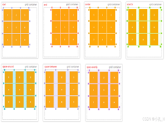 CS3的Grid网格布局是目前最强的二维布局系统,可以同时对列和行进行处理,将网页划分成一个个网格,可以任意组合不同的网格,做出各种各样的布局,本文介绍CSS3 最强二维布局系2025-02-27
- 本文介绍了如何使用CSS3的transform属性和动画技巧实现波浪式图片墙,通过设置图片的垂直偏移量,并使用动画使其周期性地改变位置,可以创建出动态且具有波浪效果的图片墙,同2025-02-27
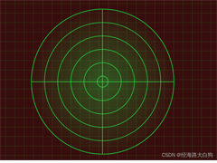 文章介绍了如何使用CSS3实现一个雷达探测扫描的效果,包括夜色背景、蜘蛛网盘、扫描体的转动效果、尾巴阴影以及被扫描到的光点,通过HTML和CSS的配合,实现了丰富的动画效果,2025-02-21
- CSS3的Flexbox是一种强大的布局模式,通过设置display:flex可以轻松实现对齐、排列和分布网页元素,它解决了传统布局方法中的对齐、间距分配和自适应布局等问题,接下来通过本2025-02-19
 本文给大家介绍css3 实现icon刷新转动效果,文章开头给大家介绍了webkit-transform、animation、@keyframes这三个属性,结合实例代码给大家介绍的非常详细,感兴趣的朋友一2025-02-19
- CSS3过渡属性用于实现元素从一种样式平滑过渡到另一种样式,通过设置transition-property过渡属性、transition-duration过渡时长transition-timing-function过渡函数和trans2025-02-19
- 本文介绍了如何使用CSS3创建一个简单的动态旋转加载样式,通过定义一个带有类名“loader”的HTML元素,并使用CSS样式和@keyframes规则来实现旋转动画,你可以根据需要调整样式2025-02-19
- 这篇文章主要介绍了如何使用CSS3的transition属性实现平滑的过渡动画,本文通过实例代码给大家介绍的非常详细,感兴趣的朋友一起看看吧2025-02-13
 本文介绍了使用CSS3中的Flexbox和Grid布局实现等高元素布局的方法,通过简单的两列实现、每行放置3列以及全部代码的展示,展示了这两种布局方式的实现细节和效果,感兴趣的朋2025-02-11
- CSS3和SVG的结合使用为网页设计带来了创新的动态视觉效果,本文通过一个圆形进度条的动画特效示例,展示了如何利用CSS3的动画功能和SVG的矢量图形能力来创建丰富的用户交互体2024-10-24


最新评论