
CSS3+js实现简单的时钟特效
发布时间:2015-03-18 09:54:42 作者:佚名  我要评论
我要评论
我要评论本文给大家分享的是使用CSS3结合js实现简单的时钟特效的代码,主要是使用了css3 的transform属性中的 rotate的旋转效果和translate的位移效果的,这里推荐给大家,希望大家能够喜欢。
学习css3ing,正在学习transfomr,突发奇想用此做个小时钟,开始吧:
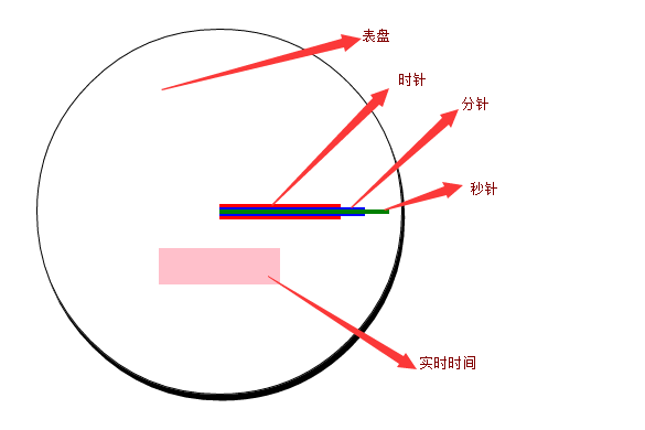
准备前期工作,把时钟的表盘,时分秒针,实时时间标签 的大概样子做好,效果如图:
html代码如下:
复制代码
代码如下:<div class="main">
<div id="timeLabel"></div>
<div id="hour"></div>
<div id="minute"></div>
<div id="second"></div>
</div>
css 代码如下:
复制代码
代码如下:<style>
* {
margin: 0;
padding: 0;
}
.main {
position: relative;
margin: 100px auto;
width: 300px;
height: 300px;
border-radius: 300px;
border: 1px solid #000;
box-shadow:2px 5px;
}
#timeLabel {
position: absolute;
background-color:pink;
width:100px;
height:30px;
left:100px;
top:180px;
}
#hour {
width: 100px;
height: 10px;
background-color: red;
position:absolute;
left:150px;
top:145px;
}
#minute {
width:120px;
height:8px;
background-color:blue;
position:absolute;
left:150px;
top:146px;
}
#second {
width: 140px;
height: 4px;
background-color: green;
position: absolute;
left: 150px;
top: 148px;
}
</style>
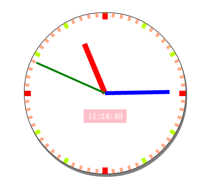
2. 初始化默认时间,和表盘刻度 ,效果如下:
更改后的css代码:
复制代码
代码如下:<style>
* {
margin: 0;
padding: 0;
}
.main {
position: relative;
margin: 100px auto;
width: 300px;
height: 300px;
border-radius: 300px;
border: 1px solid #000;
box-shadow: 2px 5px #808080;
}
#timeLabel {
position: absolute;
background-color: pink;
width: 80px;
height: 25px;
left: 110px;
top: 180px;
color: #fff;
line-height: 25px;
text-align: center;
}
#hour {
width: 100px;
height: 10px;
background-color: red;
position: absolute;
left: 150px;
top: 145px;
transform-origin: 0 50%;
}
#minute {
width: 120px;
height: 8px;
background-color: blue;
position: absolute;
left: 150px;
top: 146px;
transform-origin: 0 50%;
}
#second {
width: 140px;
height: 4px;
background-color: green;
position: absolute;
left: 150px;
top: 148px;
transform-origin: 0 50%;
}
.hourPointer, .minuterPointer, .secondPointer {
position: absolute;
transform-origin: 0 50%;
}
.hourPointer {
height: 10px;
width: 12px;
left: 150px;
top: 145px;
background-color: #f00;
z-index:3;
}
.minuterPointer {
height: 8px;
width: 10px;
left: 150px;
top: 146px;
background-color: #b6ff00;
z-index: 2;
}
.secondPointer {
height: 6px;
width: 8px;
left: 150px;
top: 147px;
background-color: #fa8;
z-index: 1;
}
</style>
初始化 js代码:
复制代码
代码如下:window.onload = function () {
initClock();
}
var timer = null;
function $(id) {
return document.getElementById(id)
}
function CreateKeDu(pElement, className, deg, translateWidth) {
var Pointer = document.createElement("div");
Pointer.className = className
Pointer.style.transform = "rotate(" + deg + "deg) translate(" + translateWidth + "px)";
pElement.appendChild(Pointer);
}
function initClock() {
var main = $("biaopan");
var timeLabel = $("timeLabel");
var hour = $("hour");
var minute = $("minute");
var second = $("second");
var now = new Date();
var nowHour = now.getHours();
var nowMinute = now.getMinutes();
var nowSecond = now.getSeconds();
//初始化timeLabel
timeLabel.innerHTML = nowHour + ":" + nowMinute + ":" + nowSecond;
//初始化表盘
for (var index = 0; index < 4; index++) {
CreateKeDu(main, "hourPointer", index * 90, 138);
}
for (var index = 0; index < 12; index++) {
CreateKeDu(main, "minuterPointer",index*30, 140);
}
for (var index = 0; index < 60; index++) {
CreateKeDu(main, "secondPointer", index * 6, 142);
}
//初始化时分秒针
second.style.transform = "rotate(" + (nowSecond * 6 - 90) + "deg)";
minute.style.transform = "rotate(" + (nowMinute * 6 + 1 / 10 * nowSecond - 90) + "deg)";
hour.style.transform = "rotate(" + (nowHour * 30 + 1 / 2 * nowMinute + 1 / 120 * nowSecond - 90) + "deg)";
}
3.添加定时器:
js代码如下:
复制代码
代码如下://定时器
function startMove() {
clearInterval(timer);
timer = setInterval(function () {
var now = new Date();
var nowSecond = now.getSeconds();
var nowMinute = now.getMinutes();
var nowHour = now.getHours();
second.style.transform = "rotate(" + (nowSecond * 6 - 90) + "deg)";
minute.style.transform = "rotate(" + (nowMinute * 6 + 1 / 10 * nowSecond - 90) + "deg)";
hour.style.transform = "rotate(" + (nowHour * 30 + 1 / 2 * nowMinute + 1 / 120 * nowSecond - 90) + "deg)";
timeLabel.innerHTML = nowHour + ":" + nowMinute + ":" + nowSecond;
}, 1000);
}
4.使用OOP方式更改:
修改后的js代码如下:
复制代码
代码如下:function Clock() {
//定义属性
this.main = this.$("biaopan");
this.timeLabel = this.$("timeLabel");
this.hour = this.$("hour");
this.minute = this.$("minute");
this.second = this.$("second");
this.nowHour = null;
this.nowMinute = null;
this.nowSecond = null;
this.timer = null;
var _this = this;
//初始化函数
var init = function () {
_this.getNowTime();
_this.initClock();
_this.InterVal();
}
init();
}
Clock.prototype.$ = function (id) {
return document.getElementById(id)
}
Clock.prototype.CreateKeDu = function (className, deg, translateWidth) {
var Pointer = document.createElement("div");
Pointer.className = className
Pointer.style.transform = "rotate(" + deg + "deg) translate(" + translateWidth + "px)";
this.main.appendChild(Pointer);
}
Clock.prototype.getNowTime = function () {
var now = new Date();
this.nowHour = now.getHours();
this.nowMinute = now.getMinutes();
this.nowSecond = now.getSeconds();
}
Clock.prototype.setPosition = function () {
this.second.style.transform = "rotate(" + (this.nowSecond * 6 - 90) + "deg)";
this.minute.style.transform = "rotate(" + (this.nowMinute * 6 + 1 / 10 * this.nowSecond - 90) + "deg)";
this.hour.style.transform = "rotate(" + (this.nowHour * 30 + 1 / 2 * this.nowMinute + 1 / 120 * this.nowSecond - 90) + "deg)";
}
Clock.prototype.initClock = function () {
//初始化timeLabel
this.timeLabel.innerHTML = this.nowHour + ":" + this.nowMinute + ":" + this.nowSecond;
//初始化表盘
for (var index = 0; index < 4; index++) {
this.CreateKeDu("hourPointer", index * 90, 138);
}
for (var index = 0; index < 12; index++) {
this.CreateKeDu("minuterPointer", index * 30, 140);
}
for (var index = 0; index < 60; index++) {
this.CreateKeDu("secondPointer", index * 6, 142);
}
this.setPosition();
}
Clock.prototype.InterVal = function () {
clearInterval(this.timer);
var _this = this;
this.timer = setInterval(function () {
_this.getNowTime();
_this.second.style.transform = "rotate(" + (_this.nowSecond * 6 - 90) + "deg)";
_this.minute.style.transform = "rotate(" + (_this.nowMinute * 6 + 1 / 10 * _this.nowSecond - 90) + "deg)";
_this.hour.style.transform = "rotate(" + (_this.nowHour * 30 + 1 / 2 * _this.nowMinute + 1 / 120 * _this.nowSecond - 90) + "deg)";
_this.timeLabel.innerHTML = _this.nowHour + ":" + _this.nowMinute + ":" + _this.nowSecond;
}, 1000);
}
最后调用如下:
复制代码
代码如下:window.onload = function () {
new Clock();
}
最终页面代码:
复制代码
代码如下:<!DOCTYPE html>
<html xmlns="<a href="http://www.w3.org/1999/xhtml">http://www.w3.org/1999/xhtml</a>">
<head>
<meta http-equiv="Content-Type" content="text/html; charset=utf-8" />
<title></title>
<style>
* {
margin: 0;
padding: 0;
}
.main {
position: relative;
margin: 100px auto;
width: 300px;
height: 300px;
border-radius: 300px;
border: 1px solid #000;
box-shadow: 2px 5px #808080;
}
#timeLabel {
position: absolute;
background-color: pink;
width: 80px;
height: 25px;
left: 110px;
top: 180px;
color: #fff;
line-height: 25px;
text-align: center;
}
#hour {
width: 100px;
height: 10px;
background-color: red;
position: absolute;
left: 150px;
top: 145px;
transform-origin: 0 50%;
}
#minute {
width: 120px;
height: 8px;
background-color: blue;
position: absolute;
left: 150px;
top: 146px;
transform-origin: 0 50%;
}
#second {
width: 140px;
height: 4px;
background-color: green;
position: absolute;
left: 150px;
top: 148px;
transform-origin: 0 50%;
}
.hourPointer, .minuterPointer, .secondPointer {
position: absolute;
transform-origin: 0 50%;
}
.hourPointer {
height: 10px;
width: 12px;
left: 150px;
top: 145px;
background-color: #f00;
z-index: 3;
}
.minuterPointer {
height: 8px;
width: 10px;
left: 150px;
top: 146px;
background-color: #b6ff00;
z-index: 2;
}
.secondPointer {
height: 6px;
width: 8px;
left: 150px;
top: 147px;
background-color: #fa8;
z-index: 1;
}
</style>
<script>
function Clock() {
//定义属性
this.main = this.$("biaopan");
this.timeLabel = this.$("timeLabel");
this.hour = this.$("hour");
this.minute = this.$("minute");
this.second = this.$("second");
this.nowHour = null;
this.nowMinute = null;
this.nowSecond = null;
this.timer = null;
var _this = this;
//初始化函数
var init = function () {
_this.getNowTime();
_this.initClock();
_this.InterVal();
}
init();
}
Clock.prototype.$ = function (id) {
return document.getElementById(id)
}
Clock.prototype.CreateKeDu = function (className, deg, translateWidth) {
var Pointer = document.createElement("div");
Pointer.className = className
Pointer.style.transform = "rotate(" + deg + "deg) translate(" + translateWidth + "px)";
this.main.appendChild(Pointer);
}
Clock.prototype.getNowTime = function () {
var now = new Date();
this.nowHour = now.getHours();
this.nowMinute = now.getMinutes();
this.nowSecond = now.getSeconds();
}
Clock.prototype.setPosition = function () {
this.second.style.transform = "rotate(" + (this.nowSecond * 6 - 90) + "deg)";
this.minute.style.transform = "rotate(" + (this.nowMinute * 6 + 1 / 10 * this.nowSecond - 90) + "deg)";
this.hour.style.transform = "rotate(" + (this.nowHour * 30 + 1 / 2 * this.nowMinute + 1 / 120 * this.nowSecond - 90) + "deg)";
}
Clock.prototype.initClock = function () {
//初始化timeLabel
this.timeLabel.innerHTML = this.nowHour + ":" + this.nowMinute + ":" + this.nowSecond;
//初始化表盘
for (var index = 0; index < 4; index++) {
this.CreateKeDu("hourPointer", index * 90, 138);
}
for (var index = 0; index < 12; index++) {
this.CreateKeDu("minuterPointer", index * 30, 140);
}
for (var index = 0; index < 60; index++) {
this.CreateKeDu("secondPointer", index * 6, 142);
}
this.setPosition();
}
Clock.prototype.InterVal = function () {
clearInterval(this.timer);
var _this = this;
this.timer = setInterval(function () {
_this.getNowTime();
_this.second.style.transform = "rotate(" + (_this.nowSecond * 6 - 90) + "deg)";
_this.minute.style.transform = "rotate(" + (_this.nowMinute * 6 + 1 / 10 * _this.nowSecond - 90) + "deg)";
_this.hour.style.transform = "rotate(" + (_this.nowHour * 30 + 1 / 2 * _this.nowMinute + 1 / 120 * _this.nowSecond - 90) + "deg)";
_this.timeLabel.innerHTML = _this.nowHour + ":" + _this.nowMinute + ":" + _this.nowSecond;
}, 1000);
}
window.onload = function () {
new Clock();
}
</script>
</head>
<body>
<div class="main" id="biaopan">
<div id="timeLabel"></div>
<div id="hour"></div>
<div id="minute"></div>
<div id="second"></div>
</div>
</body>
</html>
总结:本例中使用了css3 的transform属性中的 rotate的旋转效果和translate的位移效果。
以上所述就是本文的全部内容了,希望本文能够对大家学习CSS3有所帮助。
相关文章
 这是一款基于js+css3实现的扁平化APP图标时钟动画效果源码,是一款扁平化风格APP时钟动态图标代码,可事实显示时钟的时针、分针与秒针的运行状态,画面运行效果流畅自然,2015-04-08
 今天我们来分享一款风格独特的时钟特效源码,这款CSS3时钟动画是一款数字时钟,时间每过一秒,相应的位置就会像翻日历一样翻过去。另外,这款CSS3数字时钟有点立体的效果,2014-11-22
 这是一款基于jquery+CSS3实现的数字时钟效果源码,可实现年月日及具体时间的显示,还可以读取并实时显示本地时间。并且在秒数的显示上有闪动的效果2014-10-20
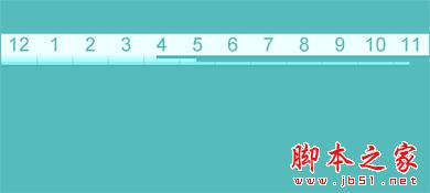 这是一款jQuery时钟插件,它非常有特点,即不是数字时钟,也不是圆盘时钟,而是基于线性的时钟。其制作思想是把圆形的时钟刻度展开成直线,把时针分针和秒针也变成可以滑动2014-07-01
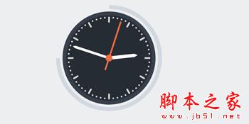 这是一款超酷的纯CSS3实现的圆盘时钟动画效果,这款时钟动画在初始化的时候就有动画特效,包括圆盘的形成,以及时钟指针的形成,都赋予了极为炫酷的动画色彩。2014-06-20
 一款数字时钟,时间每过一秒,相应的位置就会像翻日历一样翻过去2014-05-04
 一款完全利用CSS3实现钟表,不是用任何的图片和第三方的工具2014-04-14
- 利用html5,css实现钟摆效果 ,在项目中经常会遇到,今天小编把基于HTML5+CSS3实现简单的时钟效果的实现代码分享到脚本之家平台,需要的额朋友参考下吧2017-09-11


最新评论