
用CSS3和table标签实现一个圆形轨迹的动画的示例代码
发布时间:2019-01-17 16:07:29 作者:纠纠结结  我要评论
我要评论
我要评论这篇文章主要介绍了用CSS3和table标签实现一个圆形轨迹的动画的示例代码,文中通过示例代码介绍的非常详细,对大家的学习或者工作具有一定的参考学习价值,需要的朋友们下面随着小编来一起学习学习吧
html:其实就是根据table标签把几个实心圆div进行等边六角形的排布,并放入一个div容器中,然后利用CSS3的循环旋转的动画效果对最外层的div容器进行自转实现,当然不要忘了把div容器的外边框设置圆形弧度的。
<div class="animation_div">
        <table class="table_class">
            <tr>
                <td></td>
                <td>
                    <div class="BMI" ng-click="compriseClicked('BMI')" ng-class="{isSelected:clickUrlKey=='BMI'}">
                        <strong>BMI</strong>
                    </div>
                </td>
                <td></td>
                <td>
                    <div class="color_blind" ng-click="compriseClicked('color_blind')" ng-class="{isSelected:clickUrlKey=='color_blind'}">
                        <strong>色盲色弱</strong>
                    </div>
                </td>
                <td></td>
            </tr>
            <tr>
                <td>
                    <div class="space_div"></div>
                </td>
            </tr>
            <tr>
                <td>
                    <div class="HR" ng-click="compriseClicked('HR')" ng-class="{isSelected:clickUrlKey=='HR'}">
                        <strong>心率</strong>
                    </div>
                </td>
                <td></td>
                <td>
                    <a href="#/app/custom_made/counselor/{{clickUrlKey}}" style="text-decoration: none;
                        color: black;">
                        <div class="start_test">
                            <strong>开始测试</strong>
                        </div>
                    </a>
                </td>
                <td></td>
                <td>
                    <div class="fat_content" ng-click="compriseClicked('fat_content')" ng-class="{isSelected:clickUrlKey=='fat_content'}">
                        <strong>脂肪含量</strong>
                    </div>
                </td>
            </tr>
            <tr>
                <td>
                    <div class="space_div"></div>
                </td>
            </tr>
            <tr>
                <td></td>
                <td>
                    <div class="WHR" ng-click="compriseClicked('WHR')" ng-class="{isSelected:clickUrlKey=='WHR'}">
                        <strong>腰臀比</strong>
                    </div>
                </td>
                <td></td>
                <td>
                    <div class="safe_period" ng-click="compriseClicked('safe_period')" ng-class="{isSelected:clickUrlKey=='safe_period'}">
                        <strong>安全期</strong>
                    </div>
                </td>
                <td></td>
            </tr>
        </table>
    </div>

    <h3>clickUrlKey:{{clickUrlKey}}</h3>
css:因为在圆形的轨迹中有6个实心圆,分别设置了不同的类以方便自定义,所以当中实心圆的样式设置有重复的地方,还可以进行优化,在这就先不处理了
<style>
      /*定义动画*/

      @-webkit-keyframes round_animation {
          0%{
              -webkit-transform:rotate(0deg);
              width:260px;
              height:260px;
          }
          100%{
              -webkit-transform:rotate(360deg);
              width:260px;
              height:260px;
              left:0px;
              top:0px;
          }
      }

      /*定义外框的样式*/
      /*调用动画并设置动画的参数*/

      .animation_div {
          -webkit-transform-origin:center center;                       /*定义旋转中心点*/
          -webkit-animation:round_animation 15s infinite alternate;     /*infinite alternate表示循环播放动画*/

          margin: 60px auto;
          width:260px;
          height:260px;
          border: 1px solid black;
          border-radius: 130px;
          left:0px;
          top:0px;
      }

      .animation_div strong {
          font-size: 12px;
      }

      .BMI {
          width: 50px;
          height: 50px;
          background-color: orange;
          border-radius: 100px;
          text-align: center;

          /*文字垂直居中*/
          vertical-align: middle;
          line-height: 50px;
      }

      .color_blind {
          width: 50px;
          height: 50px;
          background-color: green;
          border-radius: 100px;
          text-align: center;

          /*文字垂直居中*/
          vertical-align: middle;
          line-height: 50px;
      }

      .HR{
          margin-left: -15px;
          width: 50px;
          height: 50px;
          background-color: blue;
          border-radius: 100px;
          text-align: center;

          /*文字垂直居中*/
          vertical-align: middle;
          line-height: 50px;
      }

      .start_test {
          width: 60px;
          height: 60px;
          background-color: red;
          border-radius: 100px;
          text-align: center;

          /*文字垂直居中*/
          vertical-align: middle;
          line-height: 50px;
      }

      .fat_content {
          margin-left: 15px;
          width: 50px;
          height: 50px;
          background-color: gray;
          border-radius: 100px;
          text-align: center;

          /*文字垂直居中*/
          vertical-align: middle;
          line-height: 50px;
      }

      .WHR {
          width: 50px;
          height: 50px;
          background-color: purple;
          border-radius: 100px;
          text-align: center;

          /*文字垂直居中*/
          vertical-align: middle;
          line-height: 50px;
      }

      .safe_period {
          width: 50px;
          height: 50px;
          background-color: yellow;
          border-radius: 100px;
          text-align: center;

          /*文字垂直居中*/
          vertical-align: middle;
          line-height: 50px;
      }

      .space_div {
          width: 50px;
          height: 50px;
          background-color: clear;
          border-radius: 100px;
      }

      .rightmenu_btn {
          height: 60px;
          float: none;
      }

      .rightmenu_btn button {
          margin-top: 50px;
          width: 20px;
          height: 60px;
          border: 1px solid rgb(221, 221, 221);
          border-right: 0px;
          float: right;
      }

      .isSelected {
          border: 1px solid red;
      }
  </style>
JS:这里的代码可以不实现,因为这跟动画的效果无关,是一个点击的响应事件
angular.module('starter.controllers', [])
    .controller('healthCtrl', function($scope, $location) {
        $scope.clickUrlKey = "BMI";
        $scope.compriseClicked = function(clickUrlKey) {
            $scope.clickUrlKey = clickUrlKey;
        };
    })
效果图如下:

以上就是本文的全部内容,希望对大家的学习有所帮助,也希望大家多多支持脚本之家。
相关文章
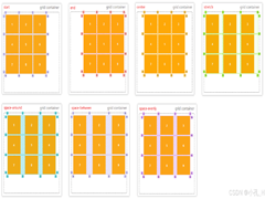 CS3的Grid网格布局是目前最强的二维布局系统,可以同时对列和行进行处理,将网页划分成一个个网格,可以任意组合不同的网格,做出各种各样的布局,本文介绍CSS3 最强二维布局系2025-02-27
- 本文介绍了如何使用CSS3的transform属性和动画技巧实现波浪式图片墙,通过设置图片的垂直偏移量,并使用动画使其周期性地改变位置,可以创建出动态且具有波浪效果的图片墙,同2025-02-27
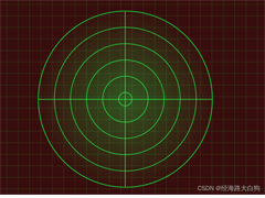 文章介绍了如何使用CSS3实现一个雷达探测扫描的效果,包括夜色背景、蜘蛛网盘、扫描体的转动效果、尾巴阴影以及被扫描到的光点,通过HTML和CSS的配合,实现了丰富的动画效果,2025-02-21
- CSS3的Flexbox是一种强大的布局模式,通过设置display:flex可以轻松实现对齐、排列和分布网页元素,它解决了传统布局方法中的对齐、间距分配和自适应布局等问题,接下来通过本2025-02-19
 本文给大家介绍css3 实现icon刷新转动效果,文章开头给大家介绍了webkit-transform、animation、@keyframes这三个属性,结合实例代码给大家介绍的非常详细,感兴趣的朋友一2025-02-19
- CSS3过渡属性用于实现元素从一种样式平滑过渡到另一种样式,通过设置transition-property过渡属性、transition-duration过渡时长transition-timing-function过渡函数和trans2025-02-19
- 本文介绍了如何使用CSS3创建一个简单的动态旋转加载样式,通过定义一个带有类名“loader”的HTML元素,并使用CSS样式和@keyframes规则来实现旋转动画,你可以根据需要调整样式2025-02-19
- 这篇文章主要介绍了如何使用CSS3的transition属性实现平滑的过渡动画,本文通过实例代码给大家介绍的非常详细,感兴趣的朋友一起看看吧2025-02-13
 本文介绍了使用CSS3中的Flexbox和Grid布局实现等高元素布局的方法,通过简单的两列实现、每行放置3列以及全部代码的展示,展示了这两种布局方式的实现细节和效果,感兴趣的朋2025-02-11
- CSS3和SVG的结合使用为网页设计带来了创新的动态视觉效果,本文通过一个圆形进度条的动画特效示例,展示了如何利用CSS3的动画功能和SVG的矢量图形能力来创建丰富的用户交互体2024-10-24


最新评论