
CSS3 input框的实现代码类似Google登录的动画效果
发布时间:2020-08-04 09:43:59 作者:佚名  我要评论
我要评论
我要评论这篇文章主要介绍了CSS3 input框的实现代码类似Google登录的动画效果,本文通过实例代码给大家介绍的非常详细,对大家的学习或工作具有一定的参考借鉴价值,需要的朋友可以参考下
用css3将input框写出类似Google登录页面的动画效果
效果一
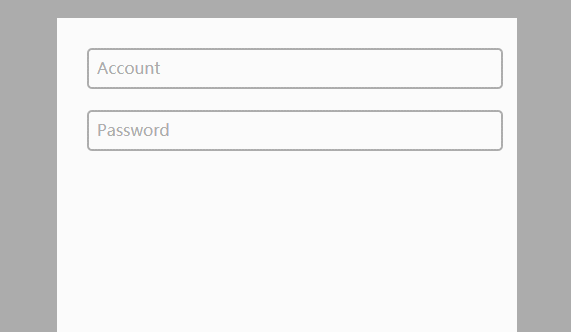
代码如下
CSS
body{
    background-color:#acacac;
  }
  .form-container{
    display: block;
    position: relative;
    width: 400px;
    height: 400px;
    background: #fff;
    margin: 50px auto;
    padding: 30px;
  }

  input{
    display: block;
    position: relative;
    background: none;
    border: 2px solid #acacac;
    border-radius:5px;
    width: 100%;
    font-weight: bold;
    padding-left:10px;
    font-size: 16px;
    height:35px;
    z-index: 1;
  }

  label{
    display: inline-block;
    position: relative;
    top: -32px;
    left: 10px;
    color: #acacac;
    font-size: 16px;
    z-index: 2;
    transition: all 0.2s ease-out;
  }

  input:focus, input:valid{
    outline: none;
    border: 2px solid #00aced;
  }

  input:focus + label, input:valid + label{
    top: -50px;
    font-size: 16px;
    color: #00aced;
    background-color:#fff;
  }
HTML
<div class="main">
    <div class="form-container">
      <input type="text" name="input1" required>
      <label for="input1">Account</label>

      <input type="text" name="input2" required>
      <label for="input2">Password</label>
    </div>
  </div>
效果二
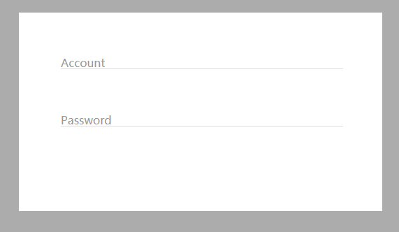
代码如下:
CSS
body{
    background-color:#acacac;
  }
  .form-container{
    display: block;
    position: relative;
    width: 400px;
    background: #fff;
    margin: 50px auto;
    padding: 60px;
  }

  input{
    display: block;
    position: relative;
    background: none;
    border: none;
    border-bottom: 1px solid #ddd;
    width: 100%;
    font-weight: bold;
    font-size: 16px;
    z-index: 2;
  }

  label{
    display: block;
    position: relative;
    top: -20px;
    left: 0px;
    color: #999;
    font-size: 16px;
    z-index: 1;
    transition: all 0.3s ease-out;
    margin-bottom:40px;
  }

  input:focus, input:valid{
    outline: none;
    border-bottom: 1px solid #00aced;
  }

  input:focus + label, input:valid + label{
    top: -50px;
    font-size: 16px;
    color: #00aced;
    background-color:#fff;
  }
HTML
<div class="main">
    <div class="form-container">
      <input type="text" name="input1" required>
      <label for="input1">Account</label>
      <input type="text" name="input2" required>
      <label for="input2">Password</label>
    </div>
  </div>
总结
到此这篇关于CSS3 input框的实现代码类似Google登录的动画效果的文章就介绍到这了,更多相关CSS3 input框内容请搜索脚本之家以前的文章或继续浏览下面的相关文章,希望大家以后多多支持脚本之家!
相关文章
- 这篇文章主要介绍了CSS3中的字体及相关属性,本文通过实例代码给大家介绍的非常详细,对大家的学习或工作具有一定的参考借鉴价值,需要的朋友可以参考下2025-06-12
- 本文详细解析了CSS3中实现账号密码输入框提示特效的原理和方法,包括HTML5的placeholder属性与CSS3新特性如伪类选择器、动态效果和过渡动画的结合使用,感兴趣的朋友跟随小2025-05-14
- CSS3的布局特性为前端开发者提供了无限可能,无论是Flexbox的一维布局还是Grid的二维布局,它们都能够帮助开发者以更清晰、简洁的方式实现复杂的网页布局,本文给大家介绍C2025-05-14
CSS3 Facebook-style Buttons 项目常见问题及最新解决方案
CSS3 Facebook-style Buttons 是一个开源项目,旨在通过简单的 CSS 代码来重现 Facebook 按钮和工具栏的外观,本文给大家介绍CSS3 Facebook-style Buttons 项目常见问题及2025-05-14使用animation.css库快速实现CSS3旋转动画效果
随着Web技术的不断发展,动画效果已经成为了网页设计中不可或缺的一部分,本文将深入探讨animation.css的工作原理,如何使用以及其在实际项目中的应用,感兴趣的朋友一起看2025-05-14 CS3的Grid网格布局是目前最强的二维布局系统,可以同时对列和行进行处理,将网页划分成一个个网格,可以任意组合不同的网格,做出各种各样的布局,本文介绍CSS3 最强二维布局系2025-02-27
- 本文介绍了如何使用CSS3的transform属性和动画技巧实现波浪式图片墙,通过设置图片的垂直偏移量,并使用动画使其周期性地改变位置,可以创建出动态且具有波浪效果的图片墙,同2025-02-27
 文章介绍了如何使用CSS3实现一个雷达探测扫描的效果,包括夜色背景、蜘蛛网盘、扫描体的转动效果、尾巴阴影以及被扫描到的光点,通过HTML和CSS的配合,实现了丰富的动画效果,2025-02-21
- CSS3的Flexbox是一种强大的布局模式,通过设置display:flex可以轻松实现对齐、排列和分布网页元素,它解决了传统布局方法中的对齐、间距分配和自适应布局等问题,接下来通过本2025-02-19
 本文给大家介绍css3 实现icon刷新转动效果,文章开头给大家介绍了webkit-transform、animation、@keyframes这三个属性,结合实例代码给大家介绍的非常详细,感兴趣的朋友一2025-02-19


最新评论