
CSS3 实现倒计时效果
发布时间:2020-11-25 16:53:19 作者:Yogev Ahuvia Love Settings Ch  我要评论
我要评论
我要评论这篇文章主要介绍了CSS3 实现倒计时效果的示例代码,帮助大家更好的理解和使用CSS3,感兴趣的朋友可以了解下
实现效果

实现代码
html
<div class='wrapper'>
  <div class='time-part-wrapper'>
    <div class='time-part minutes tens'>
      <div class='digit-wrapper'>
        <span class='digit'>0</span>
        <span class='digit'>5</span>
        <span class='digit'>4</span>
        <span class='digit'>3</span>
        <span class='digit'>2</span>
        <span class='digit'>1</span>
        <span class='digit'>0</span>
      </div>
    </div>
    <div class='time-part minutes ones'>
      <div class='digit-wrapper'>
        <span class='digit'>0</span>
        <span class='digit'>9</span>
        <span class='digit'>8</span>
        <span class='digit'>7</span>
        <span class='digit'>6</span>
        <span class='digit'>5</span>
        <span class='digit'>4</span>
        <span class='digit'>3</span>
        <span class='digit'>2</span>
        <span class='digit'>1</span>
        <span class='digit'>0</span>
      </div>
    </div>
  </div>
  <div class='time-part-wrapper'>
    <div class='time-part seconds tens'>
      <div class='digit-wrapper'>
        <span class='digit'>0</span>
        <span class='digit'>5</span>
        <span class='digit'>4</span>
        <span class='digit'>3</span>
        <span class='digit'>2</span>
        <span class='digit'>1</span>
        <span class='digit'>0</span>
      </div>
    </div>
    <div class='time-part seconds ones'>
      <div class='digit-wrapper'>
        <span class='digit'>0</span>
        <span class='digit'>9</span>
        <span class='digit'>8</span>
        <span class='digit'>7</span>
        <span class='digit'>6</span>
        <span class='digit'>5</span>
        <span class='digit'>4</span>
        <span class='digit'>3</span>
        <span class='digit'>2</span>
        <span class='digit'>1</span>
        <span class='digit'>0</span>
      </div>
    </div>
  </div>
  <div class='time-part-wrapper'>
    <div class='time-part hundredths tens'>
      <div class='digit-wrapper'>
        <span class='digit'>0</span>
        <span class='digit'>9</span>
        <span class='digit'>8</span>
        <span class='digit'>7</span>
        <span class='digit'>6</span>
        <span class='digit'>5</span>
        <span class='digit'>4</span>
        <span class='digit'>3</span>
        <span class='digit'>2</span>
        <span class='digit'>1</span>
        <span class='digit'>0</span>
      </div>
    </div>
    <div class='time-part hundredths ones'>
      <div class='digit-wrapper'>
        <span class='digit'>0</span>
        <span class='digit'>9</span>
        <span class='digit'>8</span>
        <span class='digit'>7</span>
        <span class='digit'>6</span>
        <span class='digit'>5</span>
        <span class='digit'>4</span>
        <span class='digit'>3</span>
        <span class='digit'>2</span>
        <span class='digit'>1</span>
        <span class='digit'>0</span>
      </div>
    </div>
  </div>
</div>
css
/* Play with speed and easing of the animation */
/* =========================================== */
.digit {
  display: inline-block;
  font-size: 200px;
  color: rgba(0, 0, 0, 0.25);
  height: 180px;
  line-height: 1;
}

.time-part-wrapper {
  display: inline-block;
  margin-right: 50px;
  position: relative;
}
.time-part-wrapper:not(:last-child):after {
  content: ":";
  display: block;
  width: 30px;
  height: 230px;
  position: absolute;
  top: 0px;
  right: -30px;
  color: rgba(0, 0, 0, 0.25);
  font-size: 200px;
  line-height: 0.9;
}

.time-part {
  width: 140px;
  text-align: center;
  height: 180px;
  overflow: hidden;
  display: inline-block;
  margin-left: -5px;
  box-sizing: border-box;
}
.time-part .digit-wrapper {
  animation-timing-function: cubic-bezier(1, 0, 1, 0);
}
.time-part.minutes.tens .digit-wrapper {
  animation-name: minutes-tens;
  animation-duration: 3600s;
  animation-iteration-count: 1;
}
.time-part.minutes.ones .digit-wrapper {
  animation-name: minutes-ones;
  animation-duration: 600s;
  animation-iteration-count: 6;
}
.time-part.seconds.tens .digit-wrapper {
  animation-name: seconds-tens;
  animation-duration: 60s;
  animation-iteration-count: 60;
}
.time-part.seconds.ones .digit-wrapper {
  animation-name: seconds-ones;
  animation-duration: 10s;
  animation-iteration-count: 360;
}
.time-part.hundredths.tens .digit-wrapper {
  animation-name: hundredths-tens;
  animation-duration: 1s;
  animation-iteration-count: 3600;
}
.time-part.hundredths.ones .digit-wrapper {
  animation-name: hundredths-ones;
  animation-duration: 0.1s;
  animation-iteration-count: 36000;
}

@keyframes minutes-tens {
  0% {
    transform: translateY(-180px);
  }
  16.66667% {
    transform: translateY(-360px);
  }
  33.33333% {
    transform: translateY(-540px);
  }
  50% {
    transform: translateY(-720px);
  }
  66.66667% {
    transform: translateY(-900px);
  }
  83.33333% {
    transform: translateY(-1080px);
  }
}
@keyframes minutes-ones {
  0% {
    transform: translateY(-180px);
  }
  10% {
    transform: translateY(-360px);
  }
  20% {
    transform: translateY(-540px);
  }
  30% {
    transform: translateY(-720px);
  }
  40% {
    transform: translateY(-900px);
  }
  50% {
    transform: translateY(-1080px);
  }
  60% {
    transform: translateY(-1260px);
  }
  70% {
    transform: translateY(-1440px);
  }
  80% {
    transform: translateY(-1620px);
  }
  90% {
    transform: translateY(-1800px);
  }
}
@keyframes seconds-tens {
  0% {
    transform: translateY(-180px);
  }
  16.66667% {
    transform: translateY(-360px);
  }
  33.33333% {
    transform: translateY(-540px);
  }
  50% {
    transform: translateY(-720px);
  }
  66.66667% {
    transform: translateY(-900px);
  }
  83.33333% {
    transform: translateY(-1080px);
  }
}
@keyframes seconds-ones {
  0% {
    transform: translateY(-180px);
  }
  10% {
    transform: translateY(-360px);
  }
  20% {
    transform: translateY(-540px);
  }
  30% {
    transform: translateY(-720px);
  }
  40% {
    transform: translateY(-900px);
  }
  50% {
    transform: translateY(-1080px);
  }
  60% {
    transform: translateY(-1260px);
  }
  70% {
    transform: translateY(-1440px);
  }
  80% {
    transform: translateY(-1620px);
  }
  90% {
    transform: translateY(-1800px);
  }
}
@keyframes hundredths-tens {
  0% {
    transform: translateY(-180px);
  }
  10% {
    transform: translateY(-360px);
  }
  20% {
    transform: translateY(-540px);
  }
  30% {
    transform: translateY(-720px);
  }
  40% {
    transform: translateY(-900px);
  }
  50% {
    transform: translateY(-1080px);
  }
  60% {
    transform: translateY(-1260px);
  }
  70% {
    transform: translateY(-1440px);
  }
  80% {
    transform: translateY(-1620px);
  }
  90% {
    transform: translateY(-1800px);
  }
}
@keyframes hundredths-ones {
  0% {
    transform: translateY(-180px);
  }
  10% {
    transform: translateY(-360px);
  }
  20% {
    transform: translateY(-540px);
  }
  30% {
    transform: translateY(-720px);
  }
  40% {
    transform: translateY(-900px);
  }
  50% {
    transform: translateY(-1080px);
  }
  60% {
    transform: translateY(-1260px);
  }
  70% {
    transform: translateY(-1440px);
  }
  80% {
    transform: translateY(-1620px);
  }
  90% {
    transform: translateY(-1800px);
  }
}
body {
  background: #F1614B;
  margin: 0;
  font-family: "Aldrich";
}

.wrapper {
  margin: 100px auto;
  width: 1000px;
  position: relative;
}
.wrapper:before, .wrapper:after {
  content: "";
  display: block;
  position: absolute;
  width: 100%;
  left: 0;
  height: 20px;
  z-index: 10;
}
.wrapper:before {
  top: 0px;
  background-image: url('data:image/svg+xml;base64,PD94bWwgdmVyc2lvbj0iMS4wIiBlbmNvZGluZz0idXRmLTgiPz4gPHN2ZyB2ZXJzaW9uPSIxLjEiIHhtbG5zPSJodHRwOi8vd3d3LnczLm9yZy8yMDAwL3N2ZyI+PGRlZnM+PGxpbmVhckdyYWRpZW50IGlkPSJncmFkIiBncmFkaWVudFVuaXRzPSJvYmplY3RCb3VuZGluZ0JveCIgeDE9IjAuNSIgeTE9IjAuMCIgeDI9IjAuNSIgeTI9IjEuMCI+PHN0b3Agb2Zmc2V0PSIwJSIgc3RvcC1jb2xvcj0iI2YxNjE0YiIvPjxzdG9wIG9mZnNldD0iMTAwJSIgc3RvcC1jb2xvcj0iI2YxNjE0YiIgc3RvcC1vcGFjaXR5PSIwLjAiLz48L2xpbmVhckdyYWRpZW50PjwvZGVmcz48cmVjdCB4PSIwIiB5PSIwIiB3aWR0aD0iMTAwJSIgaGVpZ2h0PSIxMDAlIiBmaWxsPSJ1cmwoI2dyYWQpIiAvPjwvc3ZnPiA=');
  background-size: 100%;
  background-image: -webkit-gradient(linear, 50% 0%, 50% 100%, color-stop(0%, #f1614b), color-stop(100%, rgba(241, 97, 75, 0)));
  background-image: -moz-linear-gradient(top, #f1614b 0%, rgba(241, 97, 75, 0) 100%);
  background-image: -webkit-linear-gradient(top, #f1614b 0%, rgba(241, 97, 75, 0) 100%);
  background-image: linear-gradient(to bottom, #f1614b 0%, rgba(241, 97, 75, 0) 100%);
}
.wrapper:after {
  bottom: 0px;
  background-image: url('data:image/svg+xml;base64,PD94bWwgdmVyc2lvbj0iMS4wIiBlbmNvZGluZz0idXRmLTgiPz4gPHN2ZyB2ZXJzaW9uPSIxLjEiIHhtbG5zPSJodHRwOi8vd3d3LnczLm9yZy8yMDAwL3N2ZyI+PGRlZnM+PGxpbmVhckdyYWRpZW50IGlkPSJncmFkIiBncmFkaWVudFVuaXRzPSJvYmplY3RCb3VuZGluZ0JveCIgeDE9IjAuNSIgeTE9IjAuMCIgeDI9IjAuNSIgeTI9IjEuMCI+PHN0b3Agb2Zmc2V0PSIwJSIgc3RvcC1jb2xvcj0iI2YxNjE0YiIgc3RvcC1vcGFjaXR5PSIwLjAiLz48c3RvcCBvZmZzZXQ9IjEwMCUiIHN0b3AtY29sb3I9IiNmMTYxNGIiLz48L2xpbmVhckdyYWRpZW50PjwvZGVmcz48cmVjdCB4PSIwIiB5PSIwIiB3aWR0aD0iMTAwJSIgaGVpZ2h0PSIxMDAlIiBmaWxsPSJ1cmwoI2dyYWQpIiAvPjwvc3ZnPiA=');
  background-size: 100%;
  background-image: -webkit-gradient(linear, 50% 0%, 50% 100%, color-stop(0%, rgba(241, 97, 75, 0)), color-stop(100%, #f1614b));
  background-image: -moz-linear-gradient(top, rgba(241, 97, 75, 0) 0%, #f1614b 100%);
  background-image: -webkit-linear-gradient(top, rgba(241, 97, 75, 0) 0%, #f1614b 100%);
  background-image: linear-gradient(to bottom, rgba(241, 97, 75, 0) 0%, #f1614b 100%);
}
以上就是CSS3 实现倒计时效果的详细内容,更多关于CSS3 倒计时的资料请关注脚本之家其它相关文章!
相关文章
- 这篇文章主要介绍了CSS3中的字体及相关属性,本文通过实例代码给大家介绍的非常详细,对大家的学习或工作具有一定的参考借鉴价值,需要的朋友可以参考下2025-06-12
- 本文详细解析了CSS3中实现账号密码输入框提示特效的原理和方法,包括HTML5的placeholder属性与CSS3新特性如伪类选择器、动态效果和过渡动画的结合使用,感兴趣的朋友跟随小2025-05-14
- CSS3的布局特性为前端开发者提供了无限可能,无论是Flexbox的一维布局还是Grid的二维布局,它们都能够帮助开发者以更清晰、简洁的方式实现复杂的网页布局,本文给大家介绍C2025-05-14
CSS3 Facebook-style Buttons 项目常见问题及最新解决方案
CSS3 Facebook-style Buttons 是一个开源项目,旨在通过简单的 CSS 代码来重现 Facebook 按钮和工具栏的外观,本文给大家介绍CSS3 Facebook-style Buttons 项目常见问题及2025-05-14使用animation.css库快速实现CSS3旋转动画效果
随着Web技术的不断发展,动画效果已经成为了网页设计中不可或缺的一部分,本文将深入探讨animation.css的工作原理,如何使用以及其在实际项目中的应用,感兴趣的朋友一起看2025-05-14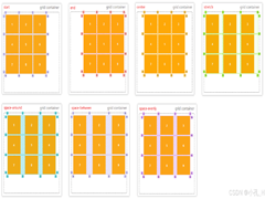 CS3的Grid网格布局是目前最强的二维布局系统,可以同时对列和行进行处理,将网页划分成一个个网格,可以任意组合不同的网格,做出各种各样的布局,本文介绍CSS3 最强二维布局系2025-02-27
- 本文介绍了如何使用CSS3的transform属性和动画技巧实现波浪式图片墙,通过设置图片的垂直偏移量,并使用动画使其周期性地改变位置,可以创建出动态且具有波浪效果的图片墙,同2025-02-27
 文章介绍了如何使用CSS3实现一个雷达探测扫描的效果,包括夜色背景、蜘蛛网盘、扫描体的转动效果、尾巴阴影以及被扫描到的光点,通过HTML和CSS的配合,实现了丰富的动画效果,2025-02-21
- CSS3的Flexbox是一种强大的布局模式,通过设置display:flex可以轻松实现对齐、排列和分布网页元素,它解决了传统布局方法中的对齐、间距分配和自适应布局等问题,接下来通过本2025-02-19
 本文给大家介绍css3 实现icon刷新转动效果,文章开头给大家介绍了webkit-transform、animation、@keyframes这三个属性,结合实例代码给大家介绍的非常详细,感兴趣的朋友一2025-02-19


最新评论