
CSS3实现的渐变幻灯片效果
发布时间:2020-12-07 16:50:39 作者:Mark Lee  我要评论
我要评论
我要评论这篇文章主要介绍了CSS3实现的渐变幻灯片效果的示例代码,帮助大家更好的理解和使用CSS3,感兴趣的朋友可以了解下
实现效果

代码
html
<div class="css-slideshow"> <figure> <img src="http://themarklee.com/wp-content/uploads/2013/10/class-header-css3.jpg" alt="class-header-css3" width="495" height="370" class="alignnone size-full wp-image-172" /><figcaption><strong>CSS3:</strong> CSS3 delivers a wide range of stylization and effects, enhancing the web app without sacrificing your semantic structure or performance. Additionally Web Open Font Format (WOFF) provides typographic flexibility and control far beyond anything the web has offered before.</figcaption> </figure> <figure> <img src="http://themarklee.com/wp-content/uploads/2013/10/class-header-semantics.jpg" alt="class-header-semantics" width="495" height="370" class="alignnone size-full wp-image-179" /><figcaption><strong>Semantics:</strong> Giving meaning to structure, semantics are front and center with HTML5. A richer set of tags, along with RDFa, microdata, and microformats, are enabling a more useful, data driven web for both programs and your users.</figcaption> </figure> <figure> <img src="http://themarklee.com/wp-content/uploads/2013/10/class-header-offline.jpg" alt="class-header-offline" width="495" height="370" class="alignnone size-large wp-image-178" /><figcaption><strong>Offline & Storage:</strong> Web Apps can start faster and work even if there is no internet connection, thanks to the HTML5 App Cache, as well as the Local Storage, Indexed DB, and the File API specifications.</figcaption> </figure> <figure> <img src="http://themarklee.com/wp-content/uploads/2013/10/class-header-device.jpg" alt="class-header-device" width="495" height="370" class="alignnone size-full wp-image-177" /><figcaption><strong>Device Access:</strong> Beginning with the Geolocation API, Web Applications can present rich, device-aware features and experiences. Incredible device access innovations are being developed and implemented, from audio/video input access to microphones and cameras, to local data such as contacts & events, and even tilt orientation.</figcaption> </figure> <figure> <img src="http://themarklee.com/wp-content/uploads/2013/10/class-header-connectivity.jpg" alt="class-header-connectivity" width="495" height="370" class="alignnone size-large wp-image-176" /><figcaption><strong>Connectivity:</strong> More efficient connectivity means more real-time chats, faster games, and better communication. Web Sockets and Server-Sent Events are pushing (pun intended) data between client and server more efficiently than ever before.</figcaption> </figure> <figure> <img src="http://themarklee.com/wp-content/uploads/2013/10/class-header-multimedia.jpg" alt="class-header-multimedia" width="495" height="370" class="alignnone size-large wp-image-175" /><figcaption><strong>Multimedia:</strong> Audio and video are first class citizens in the HTML5 web, living in harmony with your apps and sites. Lights, camera, action!</figcaption> </figure> <figure> <img src="http://themarklee.com/wp-content/uploads/2013/10/class-header-3d.jpg" alt="class-header-3d" width="495" height="370" class="alignnone size-large wp-image-174" /><figcaption><strong>3D, Graphics & Effects:</strong> Between SVG, Canvas, WebGL, and CSS3 3D features, you're sure to amaze your users with stunning visuals natively rendered in the browser.</figcaption> </figure> <figure> <img src="http://themarklee.com/wp-content/uploads/2013/10/class-header-performance.jpg" alt="class-header-performance" width="495" height="370" class="alignnone size-large wp-image-173" /><figcaption><strong>Performance & Integration:</strong> Make your Web Apps and dynamic web content faster with a variety of techniques and technologies such as Web Workers and XMLHttpRequest 2. No user should ever wait on your watch.</figcaption> </figure> </div> <p class="css-slideshow-attr"><a href="http://www.w3.org/html/logo/" target="_top">Images and captions are from the W3C</a></p>
css
body{
font-family: "HelveticaNeue-Light", "Helvetica Neue Light", "Helvetica Neue", Helvetica, Arial, "Lucida Grande", sans-serif;
  font-weight: 300;
}
.css-slideshow{
  position: relative;
  max-width: 495px;
  height: 370px;
  margin: 5em auto .5em auto;
}
.css-slideshow figure{
  margin: 0;
  max-width: 495px;
  height: 370px;
  background: #000;
  position: absolute;
}
.css-slideshow img{
  box-shadow: 0 0 2px #666;
}
.css-slideshow figcaption{
  position: absolute;
  top: 0;
  color: #fff;
  background: rgba(0,0,0, .3);
  font-size: .8em;
  padding: 8px 12px;
  opacity: 0;
  transition: opacity .5s;
}
.css-slideshow:hover figure figcaption{
  transition: opacity .5s;
  opacity: 1;
}
.css-slideshow-attr{
  max-width: 495px;
  text-align: right;
  font-size: .7em;
  font-style: italic;
  margin:0 auto;
}
.css-slideshow-attr a{
  color: #666;
}
.css-slideshow figure{
  opacity:0;
}
figure:nth-child(1) {
  animation: xfade 48s 42s infinite;
}
figure:nth-child(2) {
  animation: xfade 48s 36s infinite;
}
figure:nth-child(3) {
  animation: xfade 48s 30s infinite;
}
figure:nth-child(4) {
  animation: xfade 48s 24s infinite;
}
figure:nth-child(5) {
  animation: xfade 48s 18s infinite;
}
figure:nth-child(6) {
  animation: xfade 48s 12s infinite;
}
figure:nth-child(7) {
  animation: xfade 48s 6s infinite;
}
figure:nth-child(8) {
  animation: xfade 48s 0s infinite;
}

@keyframes xfade{
  0%{
    opacity: 1;
  }
  10.5% {
    opacity: 1;
  }
  12.5%{
    opacity: 0;
  }
  98% {
    opacity: 0;
  }
  100% {
    opacity: 1;
  }
}
以上就是CSS3实现的渐变幻灯片效果的详细内容,更多关于CSS3渐变幻灯片的资料请关注脚本之家其它相关文章!
相关文章
- 这篇文章主要介绍了CSS3中的字体及相关属性,本文通过实例代码给大家介绍的非常详细,对大家的学习或工作具有一定的参考借鉴价值,需要的朋友可以参考下2025-06-12
- 本文详细解析了CSS3中实现账号密码输入框提示特效的原理和方法,包括HTML5的placeholder属性与CSS3新特性如伪类选择器、动态效果和过渡动画的结合使用,感兴趣的朋友跟随小2025-05-14
- CSS3的布局特性为前端开发者提供了无限可能,无论是Flexbox的一维布局还是Grid的二维布局,它们都能够帮助开发者以更清晰、简洁的方式实现复杂的网页布局,本文给大家介绍C2025-05-14
CSS3 Facebook-style Buttons 项目常见问题及最新解决方案
CSS3 Facebook-style Buttons 是一个开源项目,旨在通过简单的 CSS 代码来重现 Facebook 按钮和工具栏的外观,本文给大家介绍CSS3 Facebook-style Buttons 项目常见问题及2025-05-14使用animation.css库快速实现CSS3旋转动画效果
随着Web技术的不断发展,动画效果已经成为了网页设计中不可或缺的一部分,本文将深入探讨animation.css的工作原理,如何使用以及其在实际项目中的应用,感兴趣的朋友一起看2025-05-14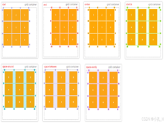 CS3的Grid网格布局是目前最强的二维布局系统,可以同时对列和行进行处理,将网页划分成一个个网格,可以任意组合不同的网格,做出各种各样的布局,本文介绍CSS3 最强二维布局系2025-02-27
- 本文介绍了如何使用CSS3的transform属性和动画技巧实现波浪式图片墙,通过设置图片的垂直偏移量,并使用动画使其周期性地改变位置,可以创建出动态且具有波浪效果的图片墙,同2025-02-27
 文章介绍了如何使用CSS3实现一个雷达探测扫描的效果,包括夜色背景、蜘蛛网盘、扫描体的转动效果、尾巴阴影以及被扫描到的光点,通过HTML和CSS的配合,实现了丰富的动画效果,2025-02-21
- CSS3的Flexbox是一种强大的布局模式,通过设置display:flex可以轻松实现对齐、排列和分布网页元素,它解决了传统布局方法中的对齐、间距分配和自适应布局等问题,接下来通过本2025-02-19
 本文给大家介绍css3 实现icon刷新转动效果,文章开头给大家介绍了webkit-transform、animation、@keyframes这三个属性,结合实例代码给大家介绍的非常详细,感兴趣的朋友一2025-02-19


最新评论