
基于css3实现漂亮便签样式
发布时间:2013-03-18 15:40:32 作者:佚名  我要评论
我要评论
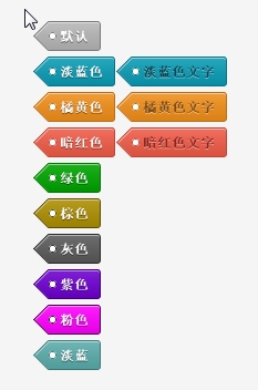
我要评论便签样式依然是脱离图片采用css3实现,效果依然不亚于传统模式,接下来为大家详细介绍下实现方法,感兴趣的你可不要错过了哈,希望本文对你学习css3有所帮助
效果图如下:
代码如下:
<!doctype html>
<html>
<head>
<meta charset="utf-8">
<title>Live Preview</title>
<style>
body {
background: #f5f5f5;
font-family: Arial, "Helvetica Neue", Helvetica, sans-serif;
font-size: 12px;
padding: 50px 0 10px 0;
}
.custom {
width: 260px;
margin: 0 auto;
}
.tags {
padding: 0;
}
.tags a {
background-image: -moz-linear-gradient(top, rgba(255,255,255,0.12) 0%, rgba(0,0,0,0.1) 99%, rgba(0,0,0,0.1) 100%);
background-image: -webkit-gradient(linear, left top, left bottom, color-stop(0%,rgba(255,255,255,0.12)), color-stop(99%,rgba(0,0,0,0.1)), color-stop(100%,rgba(0,0,0,0.1)));
background-image: -webkit-linear-gradient(top, rgba(255,255,255,0.12) 0%,rgba(0,0,0,0.1) 99%,rgba(0,0,0,0.1) 100%);
background-image: -o-linear-gradient(top, rgba(255,255,255,0.12) 0%,rgba(0,0,0,0.1) 99%,rgba(0,0,0,0.1) 100%);
background-image: -ms-linear-gradient(top, rgba(255,255,255,0.12) 0%,rgba(0,0,0,0.1) 99%,rgba(0,0,0,0.1) 100%);
background-image: linear-gradient(top, rgba(255,255,255,0.12) 0%,rgba(0,0,0,0.1) 99%,rgba(0,0,0,0.1) 100%);
filter: progid:DXImageTransform.Microsoft.gradient( startColorstr='#1fffffff', endColorstr='#1a000000',GradientType=0 );
-webkit-border-top-right-radius: 3px;
-webkit-border-bottom-right-radius: 3px;
-moz-border-radius-topright: 3px;
-moz-border-radius-bottomright: 3px;
border-top-right-radius: 3px;
border-bottom-right-radius: 3px;
box-shadow: 0 1px 0 rgba(255,255,255,0.5) inset;
display: inline-block;
font-size: 12px;
font-weight: bold;
line-height: 25px;
height: 25px;
padding: 0 10px;
position: relative;
text-shadow: 0 1px 0 rgba(0,0,0,0.5);
text-decoration: none;
margin: 0 15px 5px 0;
border: 1px solid;
border-left: 0;
color: #fff;
}
.tags a:before {
background-image: -moz-linear-gradient(-45deg, rgba(255,255,255,0.12) 0%, rgba(0,0,0,0.1) 99%, rgba(0,0,0,0.1) 100%);
background-image: -webkit-gradient(linear, left top, right bottom, color-stop(0%,rgba(255,255,255,0.12)), color-stop(99%,rgba(0,0,0,0.1)), color-stop(100%,rgba(0,0,0,0.1)));
background-image: -webkit-linear-gradient(-45deg, rgba(255,255,255,0.12) 0%,rgba(0,0,0,0.1) 99%,rgba(0,0,0,0.1) 100%);
background-image: -o-linear-gradient(-45deg, rgba(255,255,255,0.12) 0%,rgba(0,0,0,0.1) 99%,rgba(0,0,0,0.1) 100%);
background-image: -ms-linear-gradient(-45deg, rgba(255,255,255,0.12) 0%,rgba(0,0,0,0.1) 99%,rgba(0,0,0,0.1) 100%);
background-image: linear-gradient(-45deg, rgba(255,255,255,0.12) 0%,rgba(0,0,0,0.1) 99%,rgba(0,0,0,0.1) 100%);
filter: progid:DXImageTransform.Microsoft.gradient( startColorstr='#1fffffff', endColorstr='#1a000000',GradientType=1 );
-webkit-transform: rotate(45deg);
-moz-transform: rotate(45deg);
-ms-transform: rotate(45deg);
-o-transform: rotate(45deg);
transform: rotate(45deg);
filter: progid:DXImageTransform.Microsoft.Matrix(/* IE6–IE9 */ M11=0.7071067811865476, M12=-0.7071067811865475, M21=0.7071067811865475, M22=0.7071067811865476, sizingMethod='auto expand');
zoom: 1;
box-shadow: 1px 0px 0 rgba(255,255,255,0.5) inset;
content: '';
height: 18px;
left: -10px;
position: absolute;
top: 3px;
width: 18px;
z-index: -1;
border: 1px solid;
border-right: 0;
border-top: 0;
}
.tags a:after {
position: absolute;
background: #fff;
content: '';
width: 5px;
height: 5px;
left: 0;
border-radius: 5px;
top: 9px;
border: 1px solid #888;
}
.tags a:hover {
background-image: -moz-linear-gradient(top, rgba(255,255,255,0.25) 0%, rgba(0,0,0,0.1) 100%);
background-image: -webkit-gradient(linear, left top, left bottom, color-stop(0%,rgba(255,255,255,0.25)), color-stop(100%,rgba(0,0,0,0.1)));
background-image: -webkit-linear-gradient(top, rgba(255,255,255,0.25) 0%,rgba(0,0,0,0.1) 100%);
background-image: -o-linear-gradient(top, rgba(255,255,255,0.25) 0%,rgba(0,0,0,0.1) 100%);
background-image: -ms-linear-gradient(top, rgba(255,255,255,0.25) 0%,rgba(0,0,0,0.1) 100%);
background-image: linear-gradient(top, rgba(255,255,255,0.25) 0%,rgba(0,0,0,0.1) 100%);
filter: progid:DXImageTransform.Microsoft.gradient( startColorstr='#40ffffff', endColorstr='#1a000000',GradientType=0 );
}
.tags a:hover:before {
background-image: -moz-linear-gradient(-45deg, rgba(255,255,255,0.25) 0%, rgba(0,0,0,0.1) 100%);
background-image: -webkit-gradient(linear, left top, right bottom, color-stop(0%,rgba(255,255,255,0.25)), color-stop(100%,rgba(0,0,0,0.1)));
background-image: -webkit-linear-gradient(-45deg, rgba(255,255,255,0.25) 0%,rgba(0,0,0,0.1) 100%);
background-image: -o-linear-gradient(-45deg, rgba(255,255,255,0.25) 0%,rgba(0,0,0,0.1) 100%);
background-image: -ms-linear-gradient(-45deg, rgba(255,255,255,0.25) 0%,rgba(0,0,0,0.1) 100%);
background-image: linear-gradient(-45deg, rgba(255,255,255,0.25) 0%,rgba(0,0,0,0.1) 100%);
filter: progid:DXImageTransform.Microsoft.gradient( startColorstr='#40ffffff', endColorstr='#1a000000',GradientType=1 );
}
.tags a:active {
background-image: -moz-linear-gradient(top, rgba(0,0,0,0.14) 0%, rgba(255,255,255,0.12) 100%);
background-image: -webkit-gradient(linear, left top, left bottom, color-stop(0%,rgba(0,0,0,0.14)), color-stop(100%,rgba(255,255,255,0.12)));
background-image: -webkit-linear-gradient(top, rgba(0,0,0,0.14) 0%,rgba(255,255,255,0.12) 100%);
background-image: -o-linear-gradient(top, rgba(0,0,0,0.14) 0%,rgba(255,255,255,0.12) 100%);
background-image: -ms-linear-gradient(top, rgba(0,0,0,0.14) 0%,rgba(255,255,255,0.12) 100%);
background-image: linear-gradient(top, rgba(0,0,0,0.14) 0%,rgba(255,255,255,0.12) 100%);
filter: progid:DXImageTransform.Microsoft.gradient( startColorstr='#24000000', endColorstr='#1fffffff',GradientType=0 );
}
.tags a:active:before {
background-image: -moz-linear-gradient(-45deg, rgba(0,0,0,0.14) 0%, rgba(255,255,255,0.12) 100%);
background-image: -webkit-gradient(linear, left top, right bottom, color-stop(0%,rgba(0,0,0,0.14)), color-stop(100%,rgba(255,255,255,0.12)));
background-image: -webkit-linear-gradient(-45deg, rgba(0,0,0,0.14) 0%,rgba(255,255,255,0.12) 100%);
background-image: -o-linear-gradient(-45deg, rgba(0,0,0,0.14) 0%,rgba(255,255,255,0.12) 100%);
background-image: -ms-linear-gradient(-45deg, rgba(0,0,0,0.14) 0%,rgba(255,255,255,0.12) 100%);
background-image: linear-gradient(-45deg, rgba(0,0,0,0.14) 0%,rgba(255,255,255,0.12) 100%);
filter: progid:DXImageTransform.Microsoft.gradient( startColorstr='#24000000', endColorstr='#1fffffff',GradientType=1 );
}
.tags .inset {
color: rgba(0,0,0,0.5);
text-shadow: 0 1px 0 rgba(255,255,255,0.5);
}
/* === Customs ==========
================================================== */
.tags a, .tags a:before { background-color: #b7b7b7 }
.tags a, .tags a:after, .tags a:before { border-color: #777 }
.tags a.inset {
color: #454545; /* Here you can override the default rgba(0,0,0,0.5); */
}
.tags .tag-red, .tags .tag-red:before { background-color: #f25c48 }
.tags .tag-red, .tags .tag-red:after, .tags .tag-red:before { border-color: #bc4738 }
.tags .tag-red.inset { color: #8a241e }
.tags .tag-blue, .tags .tag-blue:before { background-color: #0b9db7 }
.tags .tag-blue, .tags .tag-blue:after, .tags .tag-blue:before { border-color: #087184 }
.tags .tag-blue.inset { color: #054854 }
.tags .tag-orange, .tags .tag-orange:before { background-color: #f28f1a }
.tags .tag-orange, .tags .tag-orange:after, .tags .tag-orange:before { border-color: #bb6e14 }
.tags .tag-orange.inset { color: #7e4a0d }
.tags .tag-green, .tags .tag-green:before { background-color: #00A600 }
.tags .tag-green, .tags .tag-green:after, .tags .tag-green:before { border-color: #007500 }
.tags .tag-brown, .tags .tag-brown:before { background-color: #AE8F00 }
.tags .tag-brown, .tags .tag-brown:after, .tags .tag-brown:before { border-color: #5B4B00 }
.tags .tag-gray, .tags .tag-gray:before { background-color: #5B5B5B }
.tags .tag-gray, .tags .tag-gray:after, .tags .tag-gray:before { border-color: #272727 }
.tags .tag-puple, .tags .tag-puple:before { background-color: #6F00D2 }
.tags .tag-puple, .tags .tag-puple:after, .tags .tag-puple:before { border-color: #3A006F }
.tags .tag-fen, .tags .tag-fen:before { background-color: #FF00FF }
.tags .tag-fen, .tags .tag-fen:after, .tags .tag-fen:before { border-color: #460046 }
.tags .tag-danlan, .tags .tag-danlan:before { background-color: #5CADAD }
.tags .tag-danlan, .tags .tag-danlan:after, .tags .tag-danlan:before { border-color: #3D7878 }
</style>
</head>
<body>
<div class="tags custom">
<a href="#">默认</a>
<a href="#" class="tag-blue">淡蓝色</a><a href="#" class="tag-blue inset">淡蓝色文字</a>
<a href="#" class="tag-orange">橘黄色</a><a href="#" class="tag-orange inset">橘黄色文字</a>
<a href="#" class="tag-red">暗红色</a><a href="#" class="tag-red inset">暗红色文字</a>
<a href="#" class="tag-green">绿色</a>
<a href="#" class="tag-brown">棕色</a>
<a href="#" class="tag-gray">灰色</a>
<a href="#" class="tag-puple">紫色</a>
<a href="#" class="tag-fen">粉色</a>
<a href="#" class="tag-danlan">淡蓝</a>
</div>
</body>
</html>

代码如下:
复制代码
代码如下:<!doctype html>
<html>
<head>
<meta charset="utf-8">
<title>Live Preview</title>
<style>
body {
background: #f5f5f5;
font-family: Arial, "Helvetica Neue", Helvetica, sans-serif;
font-size: 12px;
padding: 50px 0 10px 0;
}
.custom {
width: 260px;
margin: 0 auto;
}
.tags {
padding: 0;
}
.tags a {
background-image: -moz-linear-gradient(top, rgba(255,255,255,0.12) 0%, rgba(0,0,0,0.1) 99%, rgba(0,0,0,0.1) 100%);
background-image: -webkit-gradient(linear, left top, left bottom, color-stop(0%,rgba(255,255,255,0.12)), color-stop(99%,rgba(0,0,0,0.1)), color-stop(100%,rgba(0,0,0,0.1)));
background-image: -webkit-linear-gradient(top, rgba(255,255,255,0.12) 0%,rgba(0,0,0,0.1) 99%,rgba(0,0,0,0.1) 100%);
background-image: -o-linear-gradient(top, rgba(255,255,255,0.12) 0%,rgba(0,0,0,0.1) 99%,rgba(0,0,0,0.1) 100%);
background-image: -ms-linear-gradient(top, rgba(255,255,255,0.12) 0%,rgba(0,0,0,0.1) 99%,rgba(0,0,0,0.1) 100%);
background-image: linear-gradient(top, rgba(255,255,255,0.12) 0%,rgba(0,0,0,0.1) 99%,rgba(0,0,0,0.1) 100%);
filter: progid:DXImageTransform.Microsoft.gradient( startColorstr='#1fffffff', endColorstr='#1a000000',GradientType=0 );
-webkit-border-top-right-radius: 3px;
-webkit-border-bottom-right-radius: 3px;
-moz-border-radius-topright: 3px;
-moz-border-radius-bottomright: 3px;
border-top-right-radius: 3px;
border-bottom-right-radius: 3px;
box-shadow: 0 1px 0 rgba(255,255,255,0.5) inset;
display: inline-block;
font-size: 12px;
font-weight: bold;
line-height: 25px;
height: 25px;
padding: 0 10px;
position: relative;
text-shadow: 0 1px 0 rgba(0,0,0,0.5);
text-decoration: none;
margin: 0 15px 5px 0;
border: 1px solid;
border-left: 0;
color: #fff;
}
.tags a:before {
background-image: -moz-linear-gradient(-45deg, rgba(255,255,255,0.12) 0%, rgba(0,0,0,0.1) 99%, rgba(0,0,0,0.1) 100%);
background-image: -webkit-gradient(linear, left top, right bottom, color-stop(0%,rgba(255,255,255,0.12)), color-stop(99%,rgba(0,0,0,0.1)), color-stop(100%,rgba(0,0,0,0.1)));
background-image: -webkit-linear-gradient(-45deg, rgba(255,255,255,0.12) 0%,rgba(0,0,0,0.1) 99%,rgba(0,0,0,0.1) 100%);
background-image: -o-linear-gradient(-45deg, rgba(255,255,255,0.12) 0%,rgba(0,0,0,0.1) 99%,rgba(0,0,0,0.1) 100%);
background-image: -ms-linear-gradient(-45deg, rgba(255,255,255,0.12) 0%,rgba(0,0,0,0.1) 99%,rgba(0,0,0,0.1) 100%);
background-image: linear-gradient(-45deg, rgba(255,255,255,0.12) 0%,rgba(0,0,0,0.1) 99%,rgba(0,0,0,0.1) 100%);
filter: progid:DXImageTransform.Microsoft.gradient( startColorstr='#1fffffff', endColorstr='#1a000000',GradientType=1 );
-webkit-transform: rotate(45deg);
-moz-transform: rotate(45deg);
-ms-transform: rotate(45deg);
-o-transform: rotate(45deg);
transform: rotate(45deg);
filter: progid:DXImageTransform.Microsoft.Matrix(/* IE6–IE9 */ M11=0.7071067811865476, M12=-0.7071067811865475, M21=0.7071067811865475, M22=0.7071067811865476, sizingMethod='auto expand');
zoom: 1;
box-shadow: 1px 0px 0 rgba(255,255,255,0.5) inset;
content: '';
height: 18px;
left: -10px;
position: absolute;
top: 3px;
width: 18px;
z-index: -1;
border: 1px solid;
border-right: 0;
border-top: 0;
}
.tags a:after {
position: absolute;
background: #fff;
content: '';
width: 5px;
height: 5px;
left: 0;
border-radius: 5px;
top: 9px;
border: 1px solid #888;
}
.tags a:hover {
background-image: -moz-linear-gradient(top, rgba(255,255,255,0.25) 0%, rgba(0,0,0,0.1) 100%);
background-image: -webkit-gradient(linear, left top, left bottom, color-stop(0%,rgba(255,255,255,0.25)), color-stop(100%,rgba(0,0,0,0.1)));
background-image: -webkit-linear-gradient(top, rgba(255,255,255,0.25) 0%,rgba(0,0,0,0.1) 100%);
background-image: -o-linear-gradient(top, rgba(255,255,255,0.25) 0%,rgba(0,0,0,0.1) 100%);
background-image: -ms-linear-gradient(top, rgba(255,255,255,0.25) 0%,rgba(0,0,0,0.1) 100%);
background-image: linear-gradient(top, rgba(255,255,255,0.25) 0%,rgba(0,0,0,0.1) 100%);
filter: progid:DXImageTransform.Microsoft.gradient( startColorstr='#40ffffff', endColorstr='#1a000000',GradientType=0 );
}
.tags a:hover:before {
background-image: -moz-linear-gradient(-45deg, rgba(255,255,255,0.25) 0%, rgba(0,0,0,0.1) 100%);
background-image: -webkit-gradient(linear, left top, right bottom, color-stop(0%,rgba(255,255,255,0.25)), color-stop(100%,rgba(0,0,0,0.1)));
background-image: -webkit-linear-gradient(-45deg, rgba(255,255,255,0.25) 0%,rgba(0,0,0,0.1) 100%);
background-image: -o-linear-gradient(-45deg, rgba(255,255,255,0.25) 0%,rgba(0,0,0,0.1) 100%);
background-image: -ms-linear-gradient(-45deg, rgba(255,255,255,0.25) 0%,rgba(0,0,0,0.1) 100%);
background-image: linear-gradient(-45deg, rgba(255,255,255,0.25) 0%,rgba(0,0,0,0.1) 100%);
filter: progid:DXImageTransform.Microsoft.gradient( startColorstr='#40ffffff', endColorstr='#1a000000',GradientType=1 );
}
.tags a:active {
background-image: -moz-linear-gradient(top, rgba(0,0,0,0.14) 0%, rgba(255,255,255,0.12) 100%);
background-image: -webkit-gradient(linear, left top, left bottom, color-stop(0%,rgba(0,0,0,0.14)), color-stop(100%,rgba(255,255,255,0.12)));
background-image: -webkit-linear-gradient(top, rgba(0,0,0,0.14) 0%,rgba(255,255,255,0.12) 100%);
background-image: -o-linear-gradient(top, rgba(0,0,0,0.14) 0%,rgba(255,255,255,0.12) 100%);
background-image: -ms-linear-gradient(top, rgba(0,0,0,0.14) 0%,rgba(255,255,255,0.12) 100%);
background-image: linear-gradient(top, rgba(0,0,0,0.14) 0%,rgba(255,255,255,0.12) 100%);
filter: progid:DXImageTransform.Microsoft.gradient( startColorstr='#24000000', endColorstr='#1fffffff',GradientType=0 );
}
.tags a:active:before {
background-image: -moz-linear-gradient(-45deg, rgba(0,0,0,0.14) 0%, rgba(255,255,255,0.12) 100%);
background-image: -webkit-gradient(linear, left top, right bottom, color-stop(0%,rgba(0,0,0,0.14)), color-stop(100%,rgba(255,255,255,0.12)));
background-image: -webkit-linear-gradient(-45deg, rgba(0,0,0,0.14) 0%,rgba(255,255,255,0.12) 100%);
background-image: -o-linear-gradient(-45deg, rgba(0,0,0,0.14) 0%,rgba(255,255,255,0.12) 100%);
background-image: -ms-linear-gradient(-45deg, rgba(0,0,0,0.14) 0%,rgba(255,255,255,0.12) 100%);
background-image: linear-gradient(-45deg, rgba(0,0,0,0.14) 0%,rgba(255,255,255,0.12) 100%);
filter: progid:DXImageTransform.Microsoft.gradient( startColorstr='#24000000', endColorstr='#1fffffff',GradientType=1 );
}
.tags .inset {
color: rgba(0,0,0,0.5);
text-shadow: 0 1px 0 rgba(255,255,255,0.5);
}
/* === Customs ==========
================================================== */
.tags a, .tags a:before { background-color: #b7b7b7 }
.tags a, .tags a:after, .tags a:before { border-color: #777 }
.tags a.inset {
color: #454545; /* Here you can override the default rgba(0,0,0,0.5); */
}
.tags .tag-red, .tags .tag-red:before { background-color: #f25c48 }
.tags .tag-red, .tags .tag-red:after, .tags .tag-red:before { border-color: #bc4738 }
.tags .tag-red.inset { color: #8a241e }
.tags .tag-blue, .tags .tag-blue:before { background-color: #0b9db7 }
.tags .tag-blue, .tags .tag-blue:after, .tags .tag-blue:before { border-color: #087184 }
.tags .tag-blue.inset { color: #054854 }
.tags .tag-orange, .tags .tag-orange:before { background-color: #f28f1a }
.tags .tag-orange, .tags .tag-orange:after, .tags .tag-orange:before { border-color: #bb6e14 }
.tags .tag-orange.inset { color: #7e4a0d }
.tags .tag-green, .tags .tag-green:before { background-color: #00A600 }
.tags .tag-green, .tags .tag-green:after, .tags .tag-green:before { border-color: #007500 }
.tags .tag-brown, .tags .tag-brown:before { background-color: #AE8F00 }
.tags .tag-brown, .tags .tag-brown:after, .tags .tag-brown:before { border-color: #5B4B00 }
.tags .tag-gray, .tags .tag-gray:before { background-color: #5B5B5B }
.tags .tag-gray, .tags .tag-gray:after, .tags .tag-gray:before { border-color: #272727 }
.tags .tag-puple, .tags .tag-puple:before { background-color: #6F00D2 }
.tags .tag-puple, .tags .tag-puple:after, .tags .tag-puple:before { border-color: #3A006F }
.tags .tag-fen, .tags .tag-fen:before { background-color: #FF00FF }
.tags .tag-fen, .tags .tag-fen:after, .tags .tag-fen:before { border-color: #460046 }
.tags .tag-danlan, .tags .tag-danlan:before { background-color: #5CADAD }
.tags .tag-danlan, .tags .tag-danlan:after, .tags .tag-danlan:before { border-color: #3D7878 }
</style>
</head>
<body>
<div class="tags custom">
<a href="#">默认</a>
<a href="#" class="tag-blue">淡蓝色</a><a href="#" class="tag-blue inset">淡蓝色文字</a>
<a href="#" class="tag-orange">橘黄色</a><a href="#" class="tag-orange inset">橘黄色文字</a>
<a href="#" class="tag-red">暗红色</a><a href="#" class="tag-red inset">暗红色文字</a>
<a href="#" class="tag-green">绿色</a>
<a href="#" class="tag-brown">棕色</a>
<a href="#" class="tag-gray">灰色</a>
<a href="#" class="tag-puple">紫色</a>
<a href="#" class="tag-fen">粉色</a>
<a href="#" class="tag-danlan">淡蓝</a>
</div>
</body>
</html>
相关文章
 CS3的Grid网格布局是目前最强的二维布局系统,可以同时对列和行进行处理,将网页划分成一个个网格,可以任意组合不同的网格,做出各种各样的布局,本文介绍CSS3 最强二维布局系2025-02-27
- 本文介绍了如何使用CSS3的transform属性和动画技巧实现波浪式图片墙,通过设置图片的垂直偏移量,并使用动画使其周期性地改变位置,可以创建出动态且具有波浪效果的图片墙,同2025-02-27
 文章介绍了如何使用CSS3实现一个雷达探测扫描的效果,包括夜色背景、蜘蛛网盘、扫描体的转动效果、尾巴阴影以及被扫描到的光点,通过HTML和CSS的配合,实现了丰富的动画效果,2025-02-21
- CSS3的Flexbox是一种强大的布局模式,通过设置display:flex可以轻松实现对齐、排列和分布网页元素,它解决了传统布局方法中的对齐、间距分配和自适应布局等问题,接下来通过本2025-02-19
 本文给大家介绍css3 实现icon刷新转动效果,文章开头给大家介绍了webkit-transform、animation、@keyframes这三个属性,结合实例代码给大家介绍的非常详细,感兴趣的朋友一2025-02-19
- CSS3过渡属性用于实现元素从一种样式平滑过渡到另一种样式,通过设置transition-property过渡属性、transition-duration过渡时长transition-timing-function过渡函数和trans2025-02-19
- 本文介绍了如何使用CSS3创建一个简单的动态旋转加载样式,通过定义一个带有类名“loader”的HTML元素,并使用CSS样式和@keyframes规则来实现旋转动画,你可以根据需要调整样式2025-02-19
- 这篇文章主要介绍了如何使用CSS3的transition属性实现平滑的过渡动画,本文通过实例代码给大家介绍的非常详细,感兴趣的朋友一起看看吧2025-02-13
 本文介绍了使用CSS3中的Flexbox和Grid布局实现等高元素布局的方法,通过简单的两列实现、每行放置3列以及全部代码的展示,展示了这两种布局方式的实现细节和效果,感兴趣的朋2025-02-11
- CSS3和SVG的结合使用为网页设计带来了创新的动态视觉效果,本文通过一个圆形进度条的动画特效示例,展示了如何利用CSS3的动画功能和SVG的矢量图形能力来创建丰富的用户交互体2024-10-24


最新评论