
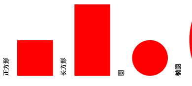
css3.0 图形构成实例练习二
发布时间:2013-03-19 10:45:03 作者:佚名  我要评论
我要评论
我要评论css3.0 的出现给我们带来了很大的影响,本文主要知识点 transform属性/animate的应用,感兴趣的朋友可以参考并学习下实例,希望对你学习图形构成有所帮助
主要知识点
① transform属性:
ratate(旋转度数)
scale(等比例缩放)
skew(x , y);让元素倾斜显示,包含两个参数值,分别表示X轴和Y轴倾斜的角度,如果第二个参数为空,则默认为0,参数为负表示向相反方向倾斜。
②animate 适用于鼠标经过产生宽度,高度,left,top等等 示例 transition:1s ease all;所有事件产生动画!
div {
-webkit-animation-name: pulse;
-webkit-animation-duration: 2s;
-webkit-animation-iteration-count: infinite;
-webkit-animation-timing-function: ease-in-out;
-webkit-animation-direction: alternate;
}@-webkit-keyframes pulse {
from {
opacity: 0.0;
font-size: 100%;
}
to {
opacity: 1.0;
font-size: 200%;
}
}style
*{ margin: 0; padding: 0;}
body {
overflow: hidden;
}
#clouds{
background:-webkit-linear-gradient(top,#c9dbe9 0%,#fff 100%);/*等价于background:-webkit-gradient(linear,left top,left bottom,from(c9dbe9),to(#fff))*/
background:-moz-linear-gradient(top,#c9dbe9 0%,#fff 100%);
background:-o-linear-gradient(top,#c9dbe9 0%,#fff 100%);
padding:100px 0px;
}
.cloud{
width:200px;
height:60px;
background:#FFF;
border-radius:200px;
-webkit-border-radius:200px;
-moz-border-radius:200px;
-o-border-radius:200px;
position:relative;}
.cloud:after,.cloud:before{
content:'';
position:absolute;
background:#FFF;
width:100px;
height:80px;
top:-15px;
left:10px;
border-radius:100px;
-webkit-border-radius:100px;
-moz-border-radius:100px;
-o-border-radius:100px;}
.cloud:after{
width:120px;
height:120px;
top:-55px;
left:auto;
right:15px;}
.x1{
-webkit-animation:moveclouds 25s linear infinite;
-moz-animation:moveclouds 25s linear infinite;
-o-animation:moveclouds 25s linear infinite;}
.x2{
left:200px;
transform:scale(0.6);
-webkit-transform:scale(0.6);
-moz-transform:scale(0.6);
-o-transform:scale(0.6);
opacity:0.6;
animation:moveclouds 25s linear infinite;
-webkit-animation:moveclouds 25s linear infinite;
-moz-animation:moveclouds 25s linear infinite;
-o-animation:moveclouds 25s linear infinite;}
.x3{
top:-200px;
left:-250px;
transform:scale(0.6);
-webkit-transform:scale(0.6);
-moz-transform:scale(0.6);
-o-transform:scale(0.6);
opacity:0.6;
animation:moveclouds 25s linear infinite;
-webkit-animation:moveclouds 25s linear infinite;
-moz-animation:moveclouds 25s linear infinite;
-o-animation:moveclouds 25s linear infinite;}
.x4{
top:200px;
left:470px;
transform:scale(0.6);
-webkit-transform:scale(0.6);
-moz-transform:scale(0.6);
-o-transform:scale(0.6);
opacity:0.6;
animation:moveclouds 25s linear infinite;
-webkit-animation:moveclouds 25s linear infinite;
-moz-animation:moveclouds 25s linear infinite;
-o-animation:moveclouds 25s linear infinite;}
.x5{
left:470px;
top:-250px;
transform:scale(0.8);
-webkit-transform:scale(0.8);
-moz-transform:scale(0.8);
-o-transform:scale(0.8);
opacity:0.8;
animation:moveclouds 25s linear infinite;
-webkit-animation:moveclouds 18s linear infinite;
-moz-animation:moveclouds 18s linear infinite;
-o-animation:moveclouds 18s linear infinite;}
@-webkit-keyframes moveclouds{
0%{margin-left:1000px;}
100%{margin-left:-1000px;}
}
@-moz-keyframes moveclouds{
0%{margin-left:1000px;}
100%{margin-left:-1000px;}
}
@-o-keyframes moveclouds{
0%{margin-left:1000px;}
100%{margin-left:-1000px;}
}
html
<div id="clouds">
<div class="cloud x1"></div>
<div class="cloud x2"></div>
<div class="cloud x3"></div>
<div class="cloud x4"></div>
<div class="cloud x5"></div>
</div>
① transform属性:
ratate(旋转度数)
scale(等比例缩放)
skew(x , y);让元素倾斜显示,包含两个参数值,分别表示X轴和Y轴倾斜的角度,如果第二个参数为空,则默认为0,参数为负表示向相反方向倾斜。
②animate 适用于鼠标经过产生宽度,高度,left,top等等 示例 transition:1s ease all;所有事件产生动画!
复制代码
代码如下:div {
-webkit-animation-name: pulse;
-webkit-animation-duration: 2s;
-webkit-animation-iteration-count: infinite;
-webkit-animation-timing-function: ease-in-out;
-webkit-animation-direction: alternate;
}@-webkit-keyframes pulse {
from {
opacity: 0.0;
font-size: 100%;
}
to {
opacity: 1.0;
font-size: 200%;
}
}style
*{ margin: 0; padding: 0;}
body {
overflow: hidden;
}
#clouds{
background:-webkit-linear-gradient(top,#c9dbe9 0%,#fff 100%);/*等价于background:-webkit-gradient(linear,left top,left bottom,from(c9dbe9),to(#fff))*/
background:-moz-linear-gradient(top,#c9dbe9 0%,#fff 100%);
background:-o-linear-gradient(top,#c9dbe9 0%,#fff 100%);
padding:100px 0px;
}
.cloud{
width:200px;
height:60px;
background:#FFF;
border-radius:200px;
-webkit-border-radius:200px;
-moz-border-radius:200px;
-o-border-radius:200px;
position:relative;}
.cloud:after,.cloud:before{
content:'';
position:absolute;
background:#FFF;
width:100px;
height:80px;
top:-15px;
left:10px;
border-radius:100px;
-webkit-border-radius:100px;
-moz-border-radius:100px;
-o-border-radius:100px;}
.cloud:after{
width:120px;
height:120px;
top:-55px;
left:auto;
right:15px;}
.x1{
-webkit-animation:moveclouds 25s linear infinite;
-moz-animation:moveclouds 25s linear infinite;
-o-animation:moveclouds 25s linear infinite;}
.x2{
left:200px;
transform:scale(0.6);
-webkit-transform:scale(0.6);
-moz-transform:scale(0.6);
-o-transform:scale(0.6);
opacity:0.6;
animation:moveclouds 25s linear infinite;
-webkit-animation:moveclouds 25s linear infinite;
-moz-animation:moveclouds 25s linear infinite;
-o-animation:moveclouds 25s linear infinite;}
.x3{
top:-200px;
left:-250px;
transform:scale(0.6);
-webkit-transform:scale(0.6);
-moz-transform:scale(0.6);
-o-transform:scale(0.6);
opacity:0.6;
animation:moveclouds 25s linear infinite;
-webkit-animation:moveclouds 25s linear infinite;
-moz-animation:moveclouds 25s linear infinite;
-o-animation:moveclouds 25s linear infinite;}
.x4{
top:200px;
left:470px;
transform:scale(0.6);
-webkit-transform:scale(0.6);
-moz-transform:scale(0.6);
-o-transform:scale(0.6);
opacity:0.6;
animation:moveclouds 25s linear infinite;
-webkit-animation:moveclouds 25s linear infinite;
-moz-animation:moveclouds 25s linear infinite;
-o-animation:moveclouds 25s linear infinite;}
.x5{
left:470px;
top:-250px;
transform:scale(0.8);
-webkit-transform:scale(0.8);
-moz-transform:scale(0.8);
-o-transform:scale(0.8);
opacity:0.8;
animation:moveclouds 25s linear infinite;
-webkit-animation:moveclouds 18s linear infinite;
-moz-animation:moveclouds 18s linear infinite;
-o-animation:moveclouds 18s linear infinite;}
@-webkit-keyframes moveclouds{
0%{margin-left:1000px;}
100%{margin-left:-1000px;}
}
@-moz-keyframes moveclouds{
0%{margin-left:1000px;}
100%{margin-left:-1000px;}
}
@-o-keyframes moveclouds{
0%{margin-left:1000px;}
100%{margin-left:-1000px;}
}
html
<div id="clouds">
<div class="cloud x1"></div>
<div class="cloud x2"></div>
<div class="cloud x3"></div>
<div class="cloud x4"></div>
<div class="cloud x5"></div>
</div>
相关文章
- 这篇文章主要介绍了CSS3的常见transformation图形变化用法小结,共整理了旋转、缩放、平移、倾斜以及矩阵的使用方法,需要的朋友可以参考下2016-05-13
 这是一款基于纯CSS3绘制可旋转的太极图形样式效果源码。可实现太极图形的顺时针动态旋转效果。该源码没有引入任何外部图形元素,采用纯css3技术实现2016-05-12
- 这篇文章主要介绍了CSS3绘制不规则图形的一些方法示例,包括polygon()的使用等很多实用技巧,需要的朋友可以参考下2015-11-07
 一款纯css3样式属性制作各种图形图标样式代码2014-05-16
- 这篇文章主要介绍了css3 的图形3d翻转效果应用,需要的朋友可以参考下2014-04-08
基于jquery+css3实现的Tabs带图形按钮选项卡切换
一款基于jquery+css3实现的tab选项卡切换特效代码2013-11-22- css3.0 的出现给我们带来了很大的影响,本文主要介绍下图形构成,感兴趣的朋友可以参考并学习下实例,希望对你学习css3有所帮助2013-03-19
- 纯CSS3实现绘制各种图形实现代码详细整理请在现代浏览器(IE9+、firefox、chrome、safari、opera等浏览器)中查看效果2012-12-26
 用CSS3写的多种风格的按钮.可以参考一下.风格不错的2012-06-27
 纯CSS3绘制各种不规则图形图标样式特效源码是一款无需任何图片即可实现逼真的图形图标特效,本段代码适应于所有网页使用,有需要的朋友可以直接下载使用2016-07-14


最新评论