
用纯css3和html制作泡沫对话框实现代码
发布时间:2013-03-21 15:29:27 作者:佚名  我要评论
我要评论
我要评论泡沫对话框是一种比较流行的趋势因为它改变了传统,通常情况下都是使用html和javascript或者是图片来实现,接下来为大家介绍下使用css3配合html来实现一些简单的泡沫对话框
现在,泡沫对话框是一种比较流行的趋势,一般都是用html和javascript,和或者图片来实现,今天用纯css3和html来实现一些基本的简单的泡沫对话框
html代码如下:
复制代码
代码如下:<div class="content">
<h2>The basic bubble variants</h2>
<p class="triangle-isosceles">This only needs one HTML element.</p>
<p class="triangle-isosceles top">For example, <code><p>[text]</p></code>.</p>
<p class="triangle-isosceles left">But it could be any element you want.</p>
<p class="triangle-isosceles right">The entire appearance is created only with CSS.</p>
<p class="triangle-right">This only needs one HTML element.</p>
<p class="triangle-right top">For example, <code><p>[text]</p></code>.</p>
<p class="triangle-right left">But it could be any element you want.</p>
<p class="triangle-right right">The entire appearance is created only with CSS.</p>
</div>
css代码如下:
复制代码
代码如下:body {
padding:0;
margin:0;
font:1em/1.4 Cambria, Georgia, sans-serif;
color:#333;
background:#fff;
}
a:link, a:visited {
border-bottom:1px solid #c55500;
text-decoration:none;
color:#c55500;
}
a:visited {
border-bottom:1px solid #730800;
color:#730800;
}
a:hover, a:focus, a:active {
border:0;
color:#fff;
background:#c55500;
}
a:visited:hover, a:visited:focus, a:visited:active {
color:#fff;
background:#730800;
}
h2 {
margin:0.5em 0 1.5em;
font-size:1.25em;
font-weight:normal;
font-style:italic;
text-align:center;
}
p {
margin:1em 0;
}
.content h2 {
margin:2em 0 0.75em;
font-size:2em;
font-weight:bold;
font-style:normal;
text-align:left;
}
.content {
width:500px;
padding:0 0 50px;
margin:0 auto;
position:relative;
z-index:1;
}
.triangle-isosceles {
position:relative;
padding:15px;
margin:1em 0 3em;
color:#000;
background:#f3961c;
background:-webkit-gradient(linear, 0 0, 0 100%, from(#f9d835), to(#f3961c));
background:-moz-linear-gradient(#f9d835, #f3961c);
background:-o-linear-gradient(#f9d835, #f3961c);
background:linear-gradient(#f9d835, #f3961c);
filter:progid:DXImageTransform.Microsoft.gradient(GradinetType=0, startColorstr="#f9d835", endColorstr="#f3961c");
-webkit-border-radius:10px;
-moz-border-radius:10px;
border-radius:10px;
}
.triangle-isosceles.top {
background:-webkit-gradient(linear, 0 0, 0 100%, from(#f3961c), to(#f9d835));
background:-moz-linear-gradient(#f3961c, #f9d835);
background:-o-linear-gradient(#f3961c, #f9d835);
background:linear-gradient(#f3961c, #f9d835);
filter:progid:DXImageTransform.Microsoft.gradient(GradientType=0, startColorstr="#f3961c", endColorstr="#f9d835");
}
.triangle-isosceles.left {
margin-left:50px;
background:#f3961c;
}
.triangle-isosceles.right {
margin-right:50px;
background:#f3961c;
}
.triangle-isosceles:after {
content:"";
position:absolute;
left:50px;
bottom:-15px;
border-width:15px 15px 0;
border-style:solid;
border-color:#f3961c transparent;
display:block;
width:0;
}
.triangle-isosceles.top:after {
top:-15px;
bottom:auto;
left:auto;
right:50px;
border-width:0 15px 15px;
border-color:#f3961c transparent;
}
.triangle-isosceles.left:after {
top:16px;
left:-50px;
bottom:auto;
border-width:10px 50px 10px 0;
border-color:transparent #f3961c;
}
.triangle-isosceles.right:after {
top:16px;
right:-50px;
bottom:auto;
border-width:10px 0 10px 50px;
border-color:transparent #f39a1c;
left:auto;
}
.triangle-right {
position:relative;
padding:15px;
margin:1em 0 3em;
color:#fff;
background:#075698;
background:-webkit-gradient(linear, 0 0, 0 100%, from(#2e88c4), to(#075698));
background:-moz-linear-gradient(#2e88c4, #075698);
background:-o-linear-gradient(#2e88c4, #075698);
background:-ms-linear-gradient(#2e88c4, #075698);
filter:progid:DXImageTransform.Microsoft.gradient(GradientType=0, startColorstr="#2e88c4", endColorstr="#075698");
-webkit-border-radius:10px;
-moz-border-radius:10px;
border-radius:10px;
}
.triangle-right.top {
background:-webkit-gradient(linear, 0 0, 0 100%, from(#075698), to(#2e88c4));
background:-moz-linear-gradient(#075698, #2e88c4);
background:-o-linear-gradient(#075698, #2e88c4);
background:linear-gradient(#075698, #2e88c4);
filter:progid:DXImageTransform.Microsoft.gradient(GradientType=0, startColorstr="#075698", endColorstr="#2e88c4");
}
.triangle-right.left {
margin-left:40px;
background:#075698;
}
.triangle-right.right {
margin-right:40px;
background:#075698;
}
.triangle-right:after {
content:"";
position:absolute;
bottom:-20px;
left:50px;
border-width:20px 0 0 20px;
border-style:solid;
border-color:#075698 transparent;
display:block;
width:0;
height:0;
}
.triangle-right.left:after {
top:16px;
left:-40px;
bottom:auto;
border-width:15px 40px 0 0;
border-color:transparent #075698;
}
.triangle-right.top:after {
top:-20px;
right:50px;
bottom:auto;
left:auto;
right:50px;
border-width:20px 20px 0 0;
border-color:transparent #075698;
}
.triangle-right.right:after {
top:16px;
right:-40px;
bottom:auto;
left:auto;
border-width:15px 0 0px 40px;
border-color:transparent #075698;
}
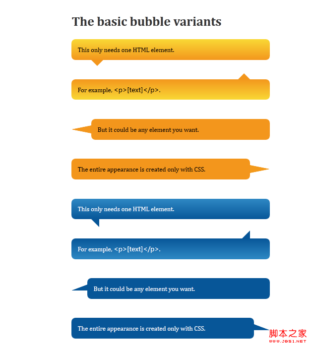
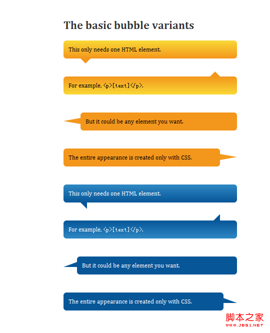
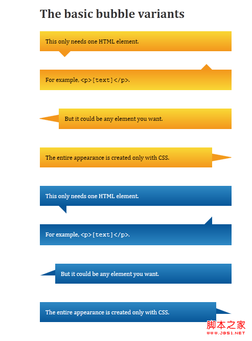
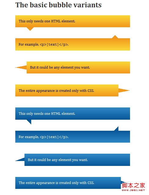
支持的浏览器有:Firefox 3.5+, Safari 4+, Chrome 4+, Opera 10+, IE8+.
预览效果如下:
在firefox14.0中预览的效果:
在chrome10.0中预览效果
在ie9中预览效果:
在ie8中预览的效果:
相关文章
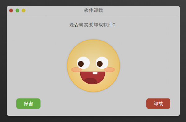 这是一个对话框插件,它主要用来卸载软件时的提示,特点在于,当用户选择保留和卸载后,对话框中间的表情会根据用户选择发生动态变化,非常可爱。需要的朋友前来下载2019-07-29
 对话框小尾巴,估计大家在实际开发中应该经常遇到过,省事点的就是叫设计小姐姐给切个带小尾巴的背景图,那不省事的呢?这篇文章主要介绍了CSS对话框小尾巴,需要的朋友可以2019-05-16
 这篇文章主要介绍了纯CSS实现气泡对话框尖角处理的实现代码,非常不错,具有参考借鉴价值,需要的的朋友参考下吧2017-06-26
- 利用CSS的border属性可以生成一些图形,例如三角或是圆角。纯粹的CSS2的内容,没有兼容性的问题,我之前在纯CSS实现各类气球泡泡对话框效果一文中算是比较详细的讲述了CSS2010-12-27
 这篇文章主要介绍了css 实现小尖角聊天对话框带尖角的说话泡泡效果,本文通过实例代码给大家介绍的非常详细,对大家的学习或工作具有一定的参考借鉴价值,需要的朋友参考下2020-04-10


最新评论