
CSS3 实现的定价表
发布时间:2021-04-06 16:20:08 作者:Arkev  我要评论
我要评论
我要评论这篇文章主要介绍了CSS3 实现定价表的示例代码,帮助大家更好的理解和学习使用css3,感兴趣的朋友可以了解下
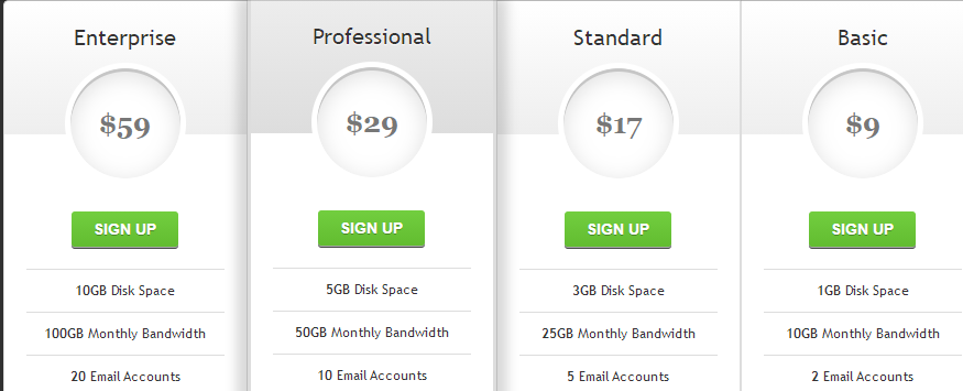
实现效果:
实现代码
html
<div id="pricing-table" class="clear">
    <div class="plan">
        <h3>Enterprise<span>$59</span></h3>
        <a class="signup" href="">Sign up</a>
        <ul>
            <li><b>10GB</b> Disk Space</li>
            <li><b>100GB</b> Monthly Bandwidth</li>
            <li><b>20</b> Email Accounts</li>
			<li><b>Unlimited</b> subdomains</li>
        </ul>
    </div>
    <div class="plan" id="most-popular">
        <h3>Professional<span>$29</span></h3>
        <a class="signup" href="">Sign up</a>
        <ul>
            <li><b>5GB</b> Disk Space</li>
            <li><b>50GB</b> Monthly Bandwidth</li>
            <li><b>10</b> Email Accounts</li>
			<li><b>Unlimited</b> subdomains</li>
        </ul>
    </div>
    <div class="plan">
        <h3>Standard<span>$17</span></h3>
		<a class="signup" href="">Sign up</a>
        <ul>
            <li><b>3GB</b> Disk Space</li>
            <li><b>25GB</b> Monthly Bandwidth</li>
            <li><b>5</b> Email Accounts</li>
			<li><b>Unlimited</b> subdomains</li>
        </ul>
    </div>
    <div class="plan">
        <h3>Basic<span>$9</span></h3>
        <a class="signup" href="">Sign up</a>
        <ul>
            <li><b>1GB</b> Disk Space</li>
            <li><b>10GB</b> Monthly Bandwidth</li>
            <li><b>2</b> Email Accounts</li>
			<li><b>Unlimited</b> subdomains</li>
        </ul>
    </div>
</div>
css3
body{
  background: #303030;
}

#pricing-table {
	margin: 100px auto;
	text-align: center;
	width: 892px; /* total computed width = 222 x 3 + 226 */
}

#pricing-table .plan {
	font: 12px 'Lucida Sans', 'trebuchet MS', Arial, Helvetica;
	text-shadow: 0 1px rgba(255,255,255,.8);
	background: #fff;
	border: 1px solid #ddd;
	color: #333;
	padding: 20px;
	width: 180px; /* plan width = 180 + 20 + 20 + 1 + 1 = 222px */
	float: left;
	position: relative;
}

#pricing-table #most-popular {
	z-index: 2;
	top: -13px;
	border-width: 3px;
	padding: 30px 20px;
	-moz-border-radius: 5px;
	-webkit-border-radius: 5px;
	border-radius: 5px;
	-moz-box-shadow: 20px 0 10px -10px rgba(0, 0, 0, .15), -20px 0 10px -10px rgba(0, 0, 0, .15);
	-webkit-box-shadow: 20px 0 10px -10px rgba(0, 0, 0, .15), -20px 0 10px -10px rgba(0, 0, 0, .15);
	box-shadow: 20px 0 10px -10px rgba(0, 0, 0, .15), -20px 0 10px -10px rgba(0, 0, 0, .15);
}

#pricing-table .plan:nth-child(1) {
	-moz-border-radius: 5px 0 0 5px;
	-webkit-border-radius: 5px 0 0 5px;
	border-radius: 5px 0 0 5px;
}

#pricing-table .plan:nth-child(4) {
	-moz-border-radius: 0 5px 5px 0;
	-webkit-border-radius: 0 5px 5px 0;
	border-radius: 0 5px 5px 0;
}

/* --------------- */

#pricing-table h3 {
	font-size: 20px;
	font-weight: normal;
	padding: 20px;
	margin: -20px -20px 50px -20px;
	background-color: #eee;
	background-image: -moz-linear-gradient(#fff,#eee);
	background-image: -webkit-gradient(linear, left top, left bottom, from(#fff), to(#eee));
	background-image: -webkit-linear-gradient(#fff, #eee);
	background-image: -o-linear-gradient(#fff, #eee);
	background-image: -ms-linear-gradient(#fff, #eee);
	background-image: linear-gradient(#fff, #eee);
}

#pricing-table #most-popular h3 {
	background-color: #ddd;
	background-image: -moz-linear-gradient(#eee,#ddd);
	background-image: -webkit-gradient(linear, left top, left bottom, from(#eee), to(#ddd));
	background-image: -webkit-linear-gradient(#eee, #ddd);
	background-image: -o-linear-gradient(#eee, #ddd);
	background-image: -ms-linear-gradient(#eee, #ddd);
	background-image: linear-gradient(#eee, #ddd);
	margin-top: -30px;
	padding-top: 30px;
	-moz-border-radius: 5px 5px 0 0;
	-webkit-border-radius: 5px 5px 0 0;
	border-radius: 5px 5px 0 0;
}

#pricing-table .plan:nth-child(1) h3 {
	-moz-border-radius: 5px 0 0 0;
	-webkit-border-radius: 5px 0 0 0;
	border-radius: 5px 0 0 0;
}

#pricing-table .plan:nth-child(4) h3 {
	-moz-border-radius: 0 5px 0 0;
	-webkit-border-radius: 0 5px 0 0;
	border-radius: 0 5px 0 0;
}

#pricing-table h3 span {
	display: block;
	font: bold 25px/100px Georgia, Serif;
	color: #777;
	background: #fff;
	border: 5px solid #fff;
	height: 100px;
	width: 100px;
	margin: 10px auto -65px;
	-moz-border-radius: 100px;
	-webkit-border-radius: 100px;
	border-radius: 100px;
	-moz-box-shadow: 0 5px 20px #ddd inset, 0 3px 0 #999 inset;
	-webkit-box-shadow: 0 5px 20px #ddd inset, 0 3px 0 #999 inset;
	box-shadow: 0 5px 20px #ddd inset, 0 3px 0 #999 inset;
}

/* --------------- */

#pricing-table ul {
	margin: 20px 0 0 0;
	padding: 0;
	list-style: none;
}

#pricing-table li {
	border-top: 1px solid #ddd;
	padding: 10px 0;
}

/* --------------- */

#pricing-table .signup {
	position: relative;
	padding: 8px 20px;
	margin: 20px 0 0 0;
	color: #fff;
	font: bold 14px Arial, Helvetica;
	text-transform: uppercase;
	text-decoration: none;
	display: inline-block;
	background-color: #72ce3f;
	background-image: -moz-linear-gradient(#72ce3f, #62bc30);
	background-image: -webkit-gradient(linear, left top, left bottom, from(#72ce3f), to(#62bc30));
	background-image: -webkit-linear-gradient(#72ce3f, #62bc30);
	background-image: -o-linear-gradient(#72ce3f, #62bc30);
	background-image: -ms-linear-gradient(#72ce3f, #62bc30);
	background-image: linear-gradient(#72ce3f, #62bc30);
	-moz-border-radius: 3px;
	-webkit-border-radius: 3px;
	border-radius: 3px;
	text-shadow: 0 1px 0 rgba(0,0,0,.3);
	-moz-box-shadow: 0 1px 0 rgba(255, 255, 255, .5), 0 2px 0 rgba(0, 0, 0, .7);
	-webkit-box-shadow: 0 1px 0 rgba(255, 255, 255, .5), 0 2px 0 rgba(0, 0, 0, .7);
	box-shadow: 0 1px 0 rgba(255, 255, 255, .5), 0 2px 0 rgba(0, 0, 0, .7);
}

#pricing-table .signup:hover {
	background-color: #62bc30;
	background-image: -moz-linear-gradient(#62bc30, #72ce3f);
	background-image: -webkit-gradient(linear, left top, left bottom, from(#62bc30), to(#72ce3f));
	background-image: -webkit-linear-gradient(#62bc30, #72ce3f);
	background-image: -o-linear-gradient(#62bc30, #72ce3f);
	background-image: -ms-linear-gradient(#62bc30, #72ce3f);
	background-image: linear-gradient(#62bc30, #72ce3f);
}

#pricing-table .signup:active, #pricing-table .signup:focus {
	background: #62bc30;
	top: 2px;
	-moz-box-shadow: 0 0 3px rgba(0, 0, 0, .7) inset;
	-webkit-box-shadow: 0 0 3px rgba(0, 0, 0, .7) inset;
	box-shadow: 0 0 3px rgba(0, 0, 0, .7) inset;
}

/* --------------- */

.clear:before, .clear:after {
  content:"";
  display:table
}

.clear:after {
  clear:both
}

.clear {
  zoom:1
}
以上就是CSS3 实现的定价表的详细内容,更多关于CSS3 定价表的资料请关注脚本之家其它相关文章!
相关文章
 基于css3文章列表喜欢点赞按钮特效源码简单的js css3制作文章列表点击按钮喜欢或收藏功能。爱心点赞按钮数量累计特效,非常不错,喜欢的朋友快来下载吧2021-03-24
 是一段基于CSS3实现的可用于各大网站登录页面的带有浮动占位符和提交按钮悬浮灯光加亮效果的登录框代码,非常实用又有趣,欢迎对此段代码有兴趣的朋友前来下载使用2021-03-22
 是一段基于CSS3 SVG实现的5款表情包评论交互效果代码,非常是适合作用于文章内容评论/表情评论等功能,很有意思,欢迎有兴趣的朋友前来下载使用2021-03-22
 实现CSS3登录注册表单特效,表单内部的背景和网页整体的背景,在功能切换时显得非常贴切,而且还有3D立体的视觉效果,欢迎下载2021-03-10
 一款简单好看的鼠标悬停图文列表css3动画特效,案例展示列表布局效果,鼠标悬停图片时中间的圆形文字背景放大,非常不错,喜欢的朋友快来下载体验吧2021-03-08
 是一段基于CSS3实现的通用常见问题列表,标题内容展开收缩ui布局特效,非常有意思,欢迎需要此特效的朋友前来下载使用2021-02-22
 今天给大家分享一个黑色系发光按钮登录表单,这个登录表单最大的特点在于,它有一个带炫酷动画的登录按钮,非常不错,喜欢的朋友快来下载体验吧2021-02-19
- 这篇文章主要介绍了Html5+CSS3+EL表达式问题集锦,需要的朋友可以参考下2020-12-19
 是一段简单的css3 input文本框占位符,placeholders占位符内容填写注册表单特效,非常有意思,欢迎有兴趣的朋友前来下载使用2020-12-11
 jQuery带宽测速仪表盘特效实例是一款jQuery+CSS3实现的电脑下载速度测试仪表盘动画效果。2020-12-10


最新评论