
CSS3 制作的彩虹按钮样式
发布时间:2021-04-09 17:32:50 作者:Giana  我要评论
我要评论
我要评论这篇文章主要介绍了CSS3 制作的彩虹按钮样式,帮助大家更好的理解和学习使用CSS3制作特效,感兴趣的朋友可以了解下
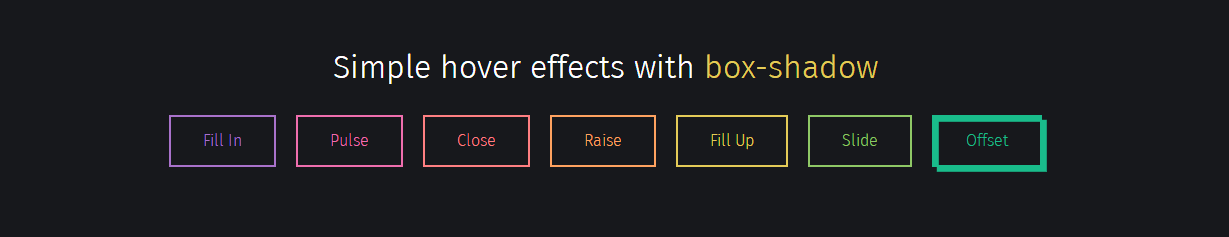
实现效果:
实现代码:
html
<div class="buttons">
  <h1>Simple hover effects with <code>box-shadow</code></h1>
  <button class="fill">Fill In</button>
  <button class="pulse">Pulse</button>
  <button class="close">Close</button>
  <button class="raise">Raise</button>
  <button class="up">Fill Up</button>
  <button class="slide">Slide</button>
  <button class="offset">Offset</button>
</div>
CSS
/*
  https://developer.mozilla.org/en/docs/Web/CSS/box-shadow
  box-shadow: [inset?] [top] [left] [blur] [size] [color];

  Tips:
    - We're setting all the blurs to 0 since we want a solid fill.
    - Add the inset keyword so the box-shadow is on the inside of the element
    - Animating the inset shadow on hover looks like the element is filling in from whatever side you specify ([top] and [left] accept negative values to become [bottom] and [right])
    - Multiple shadows can be stacked
    - If you're animating multiple shadows, be sure to keep the same number of shadows so the animation is smooth. Otherwise, you'll get something choppy.
*/
.fill:hover,
.fill:focus {
  box-shadow: inset 0 0 0 2em var(--hover);
}

.pulse:hover,
.pulse:focus {
  -webkit-animation: pulse 1s;
          animation: pulse 1s;
  box-shadow: 0 0 0 2em rgba(255, 255, 255, 0);
}

@-webkit-keyframes pulse {
  0% {
    box-shadow: 0 0 0 0 var(--hover);
  }
}

@keyframes pulse {
  0% {
    box-shadow: 0 0 0 0 var(--hover);
  }
}
.close:hover,
.close:focus {
  box-shadow: inset -3.5em 0 0 0 var(--hover), inset 3.5em 0 0 0 var(--hover);
}

.raise:hover,
.raise:focus {
  box-shadow: 0 0.5em 0.5em -0.4em var(--hover);
  transform: translateY(-0.25em);
}

.up:hover,
.up:focus {
  box-shadow: inset 0 -3.25em 0 0 var(--hover);
}

.slide:hover,
.slide:focus {
  box-shadow: inset 6.5em 0 0 0 var(--hover);
}

.offset {
  box-shadow: 0.3em 0.3em 0 0 var(--color), inset 0.3em 0.3em 0 0 var(--color);
}
.offset:hover, .offset:focus {
  box-shadow: 0 0 0 0 var(--hover), inset 6em 3.5em 0 0 var(--hover);
}

.fill {
  --color: #a972cb;
  --hover: #cb72aa;
}

.pulse {
  --color: #ef6eae;
  --hover: #ef8f6e;
}

.close {
  --color: #ff7f82;
  --hover: #ffdc7f;
}

.raise {
  --color: #ffa260;
  --hover: #e5ff60;
}

.up {
  --color: #e4cb58;
  --hover: #94e458;
}

.slide {
  --color: #8fc866;
  --hover: #66c887;
}

.offset {
  --color: #19bc8b;
  --hover: #1973bc;
}

button {
  color: var(--color);
  transition: 0.25s;
}
button:hover, button:focus {
  border-color: var(--hover);
  color: #fff;
}

body {
  color: #fff;
  background: #17181c;
  font: 300 1em "Fira Sans", sans-serif;
  justify-content: center;
  align-content: center;
  align-items: center;
  text-align: center;
  min-height: 100vh;
  display: flex;
}

button {
  background: none;
  border: 2px solid;
  font: inherit;
  line-height: 1;
  margin: 0.5em;
  padding: 1em 2em;
}

h1 {
  font-weight: 400;
}

code {
  color: #e4cb58;
  font: inherit;
}
以上就是CSS3 制作的彩虹按钮样式的详细内容,更多关于CSS3 按钮样式的资料请关注脚本之家其它相关文章!
相关文章
 这篇文章主要介绍了CSS3点击按钮圆形进度打钩效果的实现代码,代码简单易懂,对大家的学习或工作具有一定的参考借鉴价值,需要的朋友可以参考下2021-03-30
 基于css3文章列表喜欢点赞按钮特效源码简单的js css3制作文章列表点击按钮喜欢或收藏功能。爱心点赞按钮数量累计特效,非常不错,喜欢的朋友快来下载吧2021-03-24
一套CSS3的新拟物风格UI元素(复选框/按钮/菜单/搜索框/时钟)
这是基于CSS3和HTML5的新拟物风格UI设计元素,包含单选/复选框、按钮、Tab菜单、搜索框,另外还有时钟等表单元素,欢迎下载2021-03-23 是一段基于CSS3实现的可用于各大网站登录页面的带有浮动占位符和提交按钮悬浮灯光加亮效果的登录框代码,非常实用又有趣,欢迎对此段代码有兴趣的朋友前来下载使用2021-03-22
 今天给大家分享一个黑色系发光按钮登录表单,这个登录表单最大的特点在于,它有一个带炫酷动画的登录按钮,非常不错,喜欢的朋友快来下载体验吧2021-02-19
 这篇文章主要介绍了CSS3.0实现霓虹灯按钮动画特效的示例代码,文中通过示例代码介绍的非常详细,对大家的学习或者工作具有一定的参考学习价值,需要的朋友们下面随着小编来2021-01-12
 css3制作单选框按钮美化,方形的单选按钮选中ui特效,非常不错,喜欢的朋友快来下载吧2020-12-29
 这篇文章主要介绍了CSS3中animation实现流光按钮效果,本文通过实例代码给大家介绍的非常详细对大家的学习或工作具有一定的参考借鉴价值,需要的朋友可以参考下2020-12-21
 CSS3分享图标按钮动画特效代码是一款社会分享图标动画特效,鼠标移上去会有一个胶囊闪动的效果。2020-12-15
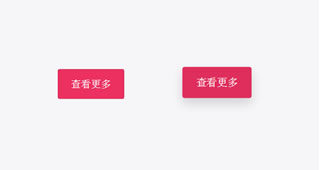 CSS3鼠标悬停按钮阴影缩放特效代码是一款红色简洁的方形按钮,鼠标悬停按钮突出放大阴影效果,非常漂亮。2020-11-18


最新评论