
CSS3实现的闪烁跳跃进度条示例(附源码)
发布时间:2013-08-19 17:48:19 作者:佚名  我要评论
我要评论
我要评论原理是通过大量的css3属性来实现的,如:animation、transform、keyframes等等属性,示例采用了结构性伪类选择符E:nth-child(n),来进行对HTML元素的选择以及控制输出,感兴趣的朋友可以了解下
这个示例的原理是通过大量的css3属性来实现的,如:animation、transform、keyframes等等属性。值得注意的是这个示例采用了结构性伪类选择符E:nth-child(n),来进行对HTML元素的选择以及控制输出。相信这个伪类选择符在将来会是一个很强大的一个工具。推荐大家多多了解以及实践使用。这个伪类选择符E:nth-child(n)的含义是匹配父元素的第n个子元素E。 例如:ul li:nth-child(3)表示的是选择<ul>元素里面的第3个<li>。提示一下,该属性在IE8(包含IE8)版本以下是不支持的。
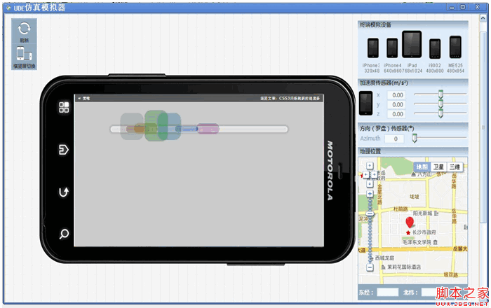
建议开发童鞋使用跨平台开发工具——统一开发环境UDE来进行查看、调试、开发哦~~它是一款HTML5跨平台一站式应用开发、调试和部署工具, 支持HTML5跨平台开发,原Java跨平台插件支持Android/Symbian/Kjava的跨平台和原生开发,为开发者提供丰富的应用模板、示例代码及开发者社区服务,已覆盖Android、iOS、WP、Symbian、Kjava操作系统平台。
UDE模拟器调试效果图:

下面就一起来看看该示例的实现代码吧。完整代码下载请见附件。
HTML结构代码
<div class="center">
<ul>
<li>
<div></div>
</li>
<li>
<div></div>
</li>
<li>
<div></div>
</li>
<li>
<div></div>
</li>
<li>
<div></div>
</li>
<li>
<div></div>
</li>
<li>
<div></div>
</li>
</ul>
</div>
CSS样式代码
@keyframes bump {
0% {
opacity: 0;
left: 535px;
}
100% {
left: -10px;
opacity: 0;
}
10%, 85% {
opacity: 1;
}
}
@keyframes spin {
0%, 100% {
height: 20px;
top: 50px;
}
50% {
height: 100px;
top: 0;
}
}
body {
background: rgba(0, 0, 0, 0.2);
}
div.center {
text-align: center;
margin-top: 40px;
}
ul {
background-color: rgba(255, 255, 255, 0.4);
position: relative;
display: block;
padding: 0;
margin: auto;
width: 600px;
height: 10px;
list-style: none;
border-radius: 200px;
border: 5px solid rgba(255, 255, 255, 0.2);
margin-top: 100px;
box-shadow: 0 0 5px 5px rgba(0, 0, 0, 0.1);
}
ul li {
position: absolute;
margin-top: -55px;
}
ul li:nth-child(1) {
animation: bump 1.5s infinite;
animation-delay: 0.1s;
}
ul li:nth-child(1) div {
border-radius: 22px;
transform-origin: center;
position: absolute;
height: 60px;
width: 80px;
animation: spin 0.4s infinite;
animation-delay: 0.1s;
background-color: rgba(120, 120, 120, 0.3);
}
ul li:nth-child(2) {
animation: bump 1.5s infinite;
animation-delay: 0.2s;
}
ul li:nth-child(2) div {
border-radius: 22px;
transform-origin: center;
position: absolute;
height: 60px;
width: 80px;
animation: spin 0.4s infinite;
animation-delay: 0.2s;
background-color: rgba(120, 0, 0, 0.3);
}
ul li:nth-child(3) {
animation: bump 1.5s infinite;
animation-delay: 0.3s;
}
ul li:nth-child(3) div {
border-radius: 22px;
transform-origin: center;
position: absolute;
height: 60px;
width: 80px;
animation: spin 0.4s infinite;
animation-delay: 0.3s;
background-color: rgba(120, 120, 0, 0.3);
}
ul li:nth-child(4) {
animation: bump 1.5s infinite;
animation-delay: 0.4s;
}
ul li:nth-child(4) div {
border-radius: 22px;
transform-origin: center;
position: absolute;
height: 60px;
width: 80px;
animation: spin 0.4s infinite;
animation-delay: 0.4s;
background-color: rgba(0, 120, 0, 0.3);
}
ul li:nth-child(5) {
animation: bump 1.5s infinite;
animation-delay: 0.5s;
}
ul li:nth-child(5) div {
border-radius: 22px;
transform-origin: center;
position: absolute;
height: 60px;
width: 80px;
animation: spin 0.4s infinite;
animation-delay: 0.5s;
background-color: rgba(0, 120, 120, 0.3);
}
ul li:nth-child(6) {
animation: bump 1.5s infinite;
animation-delay: 0.6s;
}
ul li:nth-child(6) div {
border-radius: 22px;
transform-origin: center;
position: absolute;
height: 60px;
width: 80px;
animation: spin 0.4s infinite;
animation-delay: 0.6s;
background-color: rgba(0, 0, 120, 0.3);
}
ul li:nth-child(7) {
animation: bump 1.5s infinite;
animation-delay: 0.7s;
}
ul li:nth-child(7) div {
border-radius: 22px;
transform-origin: center;
position: absolute;
height: 60px;
width: 80px;
animation: spin 0.4s infinite;
animation-delay: 0.7s;
background-color: rgba(120, 0, 120, 0.3);
}
注:请自行在所需之处加上浏览器前缀(如:-webkit- 、 -moz-),否则将不能正常显示效果。
源码下载请见附件

闪烁跳跃进度条.rar (1.6 KB)
建议开发童鞋使用跨平台开发工具——统一开发环境UDE来进行查看、调试、开发哦~~它是一款HTML5跨平台一站式应用开发、调试和部署工具, 支持HTML5跨平台开发,原Java跨平台插件支持Android/Symbian/Kjava的跨平台和原生开发,为开发者提供丰富的应用模板、示例代码及开发者社区服务,已覆盖Android、iOS、WP、Symbian、Kjava操作系统平台。
UDE模拟器调试效果图:


下面就一起来看看该示例的实现代码吧。完整代码下载请见附件。
HTML结构代码
复制代码
代码如下:<div class="center">
<ul>
<li>
<div></div>
</li>
<li>
<div></div>
</li>
<li>
<div></div>
</li>
<li>
<div></div>
</li>
<li>
<div></div>
</li>
<li>
<div></div>
</li>
<li>
<div></div>
</li>
</ul>
</div>
CSS样式代码
复制代码
代码如下:@keyframes bump {
0% {
opacity: 0;
left: 535px;
}
100% {
left: -10px;
opacity: 0;
}
10%, 85% {
opacity: 1;
}
}
@keyframes spin {
0%, 100% {
height: 20px;
top: 50px;
}
50% {
height: 100px;
top: 0;
}
}
body {
background: rgba(0, 0, 0, 0.2);
}
div.center {
text-align: center;
margin-top: 40px;
}
ul {
background-color: rgba(255, 255, 255, 0.4);
position: relative;
display: block;
padding: 0;
margin: auto;
width: 600px;
height: 10px;
list-style: none;
border-radius: 200px;
border: 5px solid rgba(255, 255, 255, 0.2);
margin-top: 100px;
box-shadow: 0 0 5px 5px rgba(0, 0, 0, 0.1);
}
ul li {
position: absolute;
margin-top: -55px;
}
ul li:nth-child(1) {
animation: bump 1.5s infinite;
animation-delay: 0.1s;
}
ul li:nth-child(1) div {
border-radius: 22px;
transform-origin: center;
position: absolute;
height: 60px;
width: 80px;
animation: spin 0.4s infinite;
animation-delay: 0.1s;
background-color: rgba(120, 120, 120, 0.3);
}
ul li:nth-child(2) {
animation: bump 1.5s infinite;
animation-delay: 0.2s;
}
ul li:nth-child(2) div {
border-radius: 22px;
transform-origin: center;
position: absolute;
height: 60px;
width: 80px;
animation: spin 0.4s infinite;
animation-delay: 0.2s;
background-color: rgba(120, 0, 0, 0.3);
}
ul li:nth-child(3) {
animation: bump 1.5s infinite;
animation-delay: 0.3s;
}
ul li:nth-child(3) div {
border-radius: 22px;
transform-origin: center;
position: absolute;
height: 60px;
width: 80px;
animation: spin 0.4s infinite;
animation-delay: 0.3s;
background-color: rgba(120, 120, 0, 0.3);
}
ul li:nth-child(4) {
animation: bump 1.5s infinite;
animation-delay: 0.4s;
}
ul li:nth-child(4) div {
border-radius: 22px;
transform-origin: center;
position: absolute;
height: 60px;
width: 80px;
animation: spin 0.4s infinite;
animation-delay: 0.4s;
background-color: rgba(0, 120, 0, 0.3);
}
ul li:nth-child(5) {
animation: bump 1.5s infinite;
animation-delay: 0.5s;
}
ul li:nth-child(5) div {
border-radius: 22px;
transform-origin: center;
position: absolute;
height: 60px;
width: 80px;
animation: spin 0.4s infinite;
animation-delay: 0.5s;
background-color: rgba(0, 120, 120, 0.3);
}
ul li:nth-child(6) {
animation: bump 1.5s infinite;
animation-delay: 0.6s;
}
ul li:nth-child(6) div {
border-radius: 22px;
transform-origin: center;
position: absolute;
height: 60px;
width: 80px;
animation: spin 0.4s infinite;
animation-delay: 0.6s;
background-color: rgba(0, 0, 120, 0.3);
}
ul li:nth-child(7) {
animation: bump 1.5s infinite;
animation-delay: 0.7s;
}
ul li:nth-child(7) div {
border-radius: 22px;
transform-origin: center;
position: absolute;
height: 60px;
width: 80px;
animation: spin 0.4s infinite;
animation-delay: 0.7s;
background-color: rgba(120, 0, 120, 0.3);
}
注:请自行在所需之处加上浏览器前缀(如:-webkit- 、 -moz-),否则将不能正常显示效果。
源码下载请见附件

闪烁跳跃进度条.rar (1.6 KB)
相关文章
 这篇文章主要介绍了使用CSS3制作一个简单的进度条(demo)的相关资料,需要的朋友可以参考下2017-05-23
- 这篇文章主要给大家介绍了利用CSS3实现进度条的两种姿势,文中给出了详细的示例代码和图文介绍,对大家具有一定的参考价值,需要的朋友们下面来一起看看吧。2017-03-21
HTML5+CSS3网页加载进度条的实现,下载进度条的代码实例
本篇文章主要介绍了HTML5+CSS3网页加载进度条的实现,下载进度条的代码实例,具有一定的参考价值,有兴趣的可以了解一下。2016-12-30- 用CSS3的border-radius、box-shadow、transition、-moz-linear-gradient、-webkit-gradient等样式就可以完成一个时尚进度条,这里我们来看几个CSS3制作彩色进度条样式的代码2016-06-23
- 圆环形进度条制作的基本思想还是画出基本的弧线图形,然后CSS3中我们可以控制其旋转来串联基本图形,制造出部分消失的效果,下面就来带大家学习图解CSS3制作圆环形进度条的实2016-05-26
- 下面小编就为大家分享一篇html5+css3进度条倒计时动画特效代码【推荐】。希望对大家有所帮助。一起跟随小编过来看看吧2016-03-08
- 这篇文章主要介绍了可以随进度显示不同颜色的css3进度条,文章最后有下载地址,需要的朋友可以参考下2014-04-11
- 进度条而且还是带有闪亮,不可思议吧,看下效果图,至于实现代码,感兴趣的前端设计者可以参考下哈,或许有所意想不到的收获2013-04-17
纯CSS3编写的的精美动画进度条(无flash/无图像/无脚本/附源码)
加载动画和进度条的真正目的是让用户了解任务的进度,有很多的基于JavaScript的动画,但我决定切换到CSS3,使用纯CSS:没有flash,没有图像,没有脚本2013-01-07- 今天就为大家分享一个利用css3制作动态进度条以及附加jQuery百分比数字显示,其效果对比flash来说却毫不逊色,有一个精致的动画进度条,上面还有当前进度的百分比数字显示,2012-12-13


最新评论