
css3 iphone玻璃透明气泡完美实现
发布时间:2024-04-23 15:18:16 作者:mob604756f04b77  我要评论
我要评论
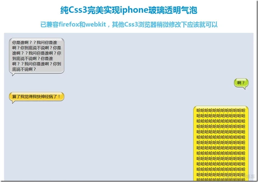
我要评论玻璃透明气泡而且还是类似iphone风格的,听起来还不错吧,貌似css3的出现让一切看似不可能的事情变成了可能,接下来为大家介绍下css3实现玻璃透明气泡的写法,感兴趣的朋友可以参考下哈
最近在一个私活做手机项目时候,需要实现一个类似ios 6中短信那样的气泡效果。
这里分享下实现心得,希望能给大家一点启发。
首先分析下iphone的气泡效果有一下特点
1. 四面圆角
2. 界面上向下的外阴影
3. 上边和下边的内阴影
4. 上边内的一个内嵌的玻璃气泡的反光效果
因为文字的长度、高度,内容多少都未知,所以如果用图片,会涉及到了多张拼贴,而且效果不好,所以就选择了CSS3。
首先定义一个容器,盒模型为display: inline-block,方便自适应文字大小
.bubble {
position: relative;
display: inline-block;
min-width: 30px;
max-width: 200px;
word-break: break-all;
word-wrap: break-word;
min-height: 22px;
background: #d2d2d2;
border-radius: 15px;
margin-bottom: 20px;
padding: 6px 8px;
-webkit-box-shadow: 0px 1px 2px #000, inset 0px 4px 4px rgba(0,0,0,.3), inset 0px -4px 4px rgba(255,255,255,.5);
-moz-shadow: 0px 1px 2px #000, inset 0px 4px 4px rgba(0,0,0,.3), inset 0px -4px 4px rgba(255,255,255,.5);
box-shadow: 0px 1px 2px #000, inset 0px 4px 4px rgba(0,0,0,.3), inset 0px -4px 4px rgba(255,255,255,.5);
}
设置断词,避免文字过长,撑开容器,同时设置最小宽度,最大宽度
设置圆角,使用border-radius
设置box-shadow: 0px 1px 2px #000实现气泡的外阴影
inset 0px 4px 4px rgba(0,0,0,.3)为上边框内阴影
inset 0px -4px 4px rgba(255,255,255,.5)为下边框的内阴影
接下来,我们需要实现最后一个效果内嵌玻璃气泡的反光效果
.bubble .content {
position: relative;
padding: 0 4px;
}
.bubble .content:before {
content: '';
position: absolute;
margin: auto;
top: -5px;
left: 0;
width: 100%;
height: 12px;
background-image: -webkit-linear-gradient(top, rgba(255,255,255,1) 0%, rgba(255,255,255,0.2) 90%, rgba(255,255,255,0) 90% );
background-image: -moz-linear-gradient(top, rgba(255,255,255,1) 0%, rgba(255,255,255,0.2) 90%, rgba(255,255,255,0) 90% );
border-radius: 10px
}
在气泡内嵌一个显示内容的block,使用block的before伪元素,实现一个圆角的渐变气泡
background-image: -webkit-linear-gradient(top, rgba(255,255,255,1) 0%, rgba(255,255,255,0.2) 90%, rgba(255,255,255,0) 90% );
最后,通过气泡的before和after伪元素,实现三角
.bubble:before {
content: '';
display: block;
font-size: 0;
width: 0;
height: 0;
border-width: 6px;
position: absolute;
bottom: -12px;
left: 12px;
border-color: #4a4c50 transparent transparent #4a4c50;
border-style: solid dashed dashed solid;
}
.bubble:after {
content: '';
display: block;
font-size: 0;
position: absolute;
bottom: -9px;
left: 13px;
width: 0;
height: 0;
border-width: 5px;
border-color: #e8e8e8 transparent transparent #e8e8e8;
border-style: solid dashed dashed solid;
}
相关文章
 本篇文章主要介绍了CSS3 仿微信聊天小气泡实例代码,具有一定的参考价值,感兴趣的小伙伴们可以参考一下2017-04-05
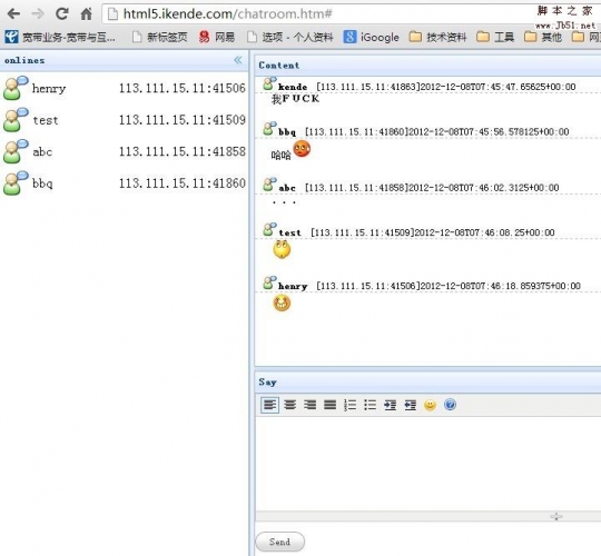 本篇文章主要介绍了HTML5-WebSocket实现聊天室示例,具有一定的参考价值,感兴趣的小伙伴们可以参考一下。2016-12-15
- 这篇文章主要为大家详细介绍了HTML5仿手机微信聊天界面的关键代码,具有一定的参考价值,感兴趣的小伙伴们可以参考一下2016-03-18
- 经常看到这样的尖角,以前不懂,以为都是用图片做出来的,后来惊奇的发现,原来很多都是用CSS做出来的,既美观又节省资源,真是两全其美啊!2014-04-04
利用html5的websocket实现websocket聊天室
利用html5的websocket实现一个聊天室,大家可以参考使用2013-12-12纯CSS实现右侧底部悬浮效果(悬浮QQ、微信、微博、邮箱等联系方式)
这篇文章主要介绍了纯CSS实现右侧底部悬浮效果(悬浮QQ、微信、微博、邮箱等联系方式),本文给出了HTML和CSS实现代码,并给出了完整代码下载,需要的朋友可以参考下2015-04-24- 如何不添加好友弹出QQ临时对话框实现在线交谈效果,这样的一个需求,我们真的是太需要了,实现起来也很简单,一行代码即可搞定,需要的朋友可以参考下2021-03-19
- 这篇文章主要介绍了CSS3制作气泡对话框的实例教程,同时讲到了对气泡的垂直居中的设定技巧,需要的朋友可以参考下2016-05-10
- 这篇文章主要介绍了一款可自定义箭头样式的CSS3气泡提示框,CSS气泡提示框由纯CSS完成,最大的特点就是可以自定义配置,包括文字颜色、背景颜色和箭头方向等,想要拥有这款2016-03-16
- 这篇文章主要介绍了利用CSS3实现气泡效果的教程,就是经常被用于对话框的那种,需要的朋友可以参考下2015-07-03


最新评论