
时尚的CSS3进度条效果
发布时间:2012-02-22 10:32:50 作者:佚名  我要评论
我要评论
我要评论基于css3的进度条效果代码,需要的朋友可以参考下
时尚的CSS3进度条先看效果图,非常漂亮吧: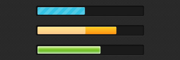
demo:http://demo.jb51.net/js/2012/css3-progress-bars/
英文原文:http://www.red-team-design.com/stylish-css3-progress-bars
HTML代码:
HTML代码比较简单
复制代码
代码如下:<div class="progress-bar blue stripes">
<span style="width: 40%"></span>
</div>
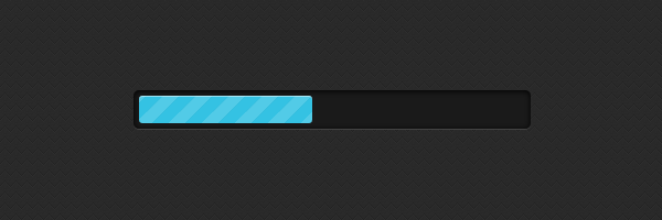
1.progress-bar – 定义进度栏的常规样式。
2.blue – 定义进度条的风格,这里是蓝色的
3.stripes – 当前进度的动画类型。
4 span – 填充进度条。内联设置的宽度,0%-100%,进度条的宽度。
CCS代码:
复制代码
代码如下:.progress-bar {
background-color: #1a1a1a;
height: 25px;
padding: 5px;
width: 350px;
margin: 50px 0;
-moz-border-radius: 5px;
-webkit-border-radius: 5px;
border-radius: 5px;
-moz-box-shadow: 0 1px 5px #000 inset, 0 1px 0 #444;
-webkit-box-shadow: 0 1px 5px #000 inset, 0 1px 0 #444;
box-shadow: 0 1px 5px #000 inset, 0 1px 0 #444;
}
.progress-bar span {
display: inline-block;
height: 25px;
width: 200px;
-moz-border-radius: 3px;
-webkit-border-radius: 3px;
border-radius: 3px;
-moz-box-shadow: 0 1px 0 rgba(255, 255, 255, .5) inset;
-webkit-box-shadow: 0 1px 0 rgba(255, 255, 255, .5) inset;
box-shadow: 0 1px 0 rgba(255, 255, 255, .5) inset;
-webkit-transition: width .4s ease-in-out;
-moz-transition: width .4s ease-in-out;
-ms-transition: width .4s ease-in-out;
-o-transition: width .4s ease-in-out;
transition: width .4s ease-in-out;
}
添加颜色,进度条风格:
复制代码
代码如下:.blue span {
background-color: #34c2e3;
}
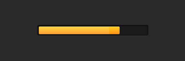
.orange span {
background-color: #fecf23;
background-image: -webkit-gradient(linear, left top, left bottom, from(#fecf23), to(#fd9215));
background-image: -webkit-linear-gradient(top, #fecf23, #fd9215);
background-image: -moz-linear-gradient(top, #fecf23, #fd9215);
background-image: -ms-linear-gradient(top, #fecf23, #fd9215);
background-image: -o-linear-gradient(top, #fecf23, #fd9215);
background-image: linear-gradient(top, #fecf23, #fd9215);
}
.green span {
background-color: #a5df41;
background-image: -webkit-gradient(linear, left top, left bottom, from(#a5df41), to(#4ca916));
background-image: -webkit-linear-gradient(top, #a5df41, #4ca916);
background-image: -moz-linear-gradient(top, #a5df41, #4ca916);
background-image: -ms-linear-gradient(top, #a5df41, #4ca916);
background-image: -o-linear-gradient(top, #a5df41, #4ca916);
background-image: linear-gradient(top, #a5df41, #4ca916);
}
条纹样式
复制代码
代码如下:.stripes span {
-webkit-background-size: 30px 30px;
-moz-background-size: 30px 30px;
background-size: 30px 30px;
background-image: -webkit-gradient(linear, left top, right bottom,
color-stop(.25, rgba(255, 255, 255, .15)), color-stop(.25, transparent),
color-stop(.5, transparent), color-stop(.5, rgba(255, 255, 255, .15)),
color-stop(.75, rgba(255, 255, 255, .15)), color-stop(.75, transparent),
to(transparent));
background-image: -webkit-linear-gradient(135deg, rgba(255, 255, 255, .15) 25%, transparent 25%,
transparent 50%, rgba(255, 255, 255, .15) 50%, rgba(255, 255, 255, .15) 75%,
transparent 75%, transparent);
background-image: -moz-linear-gradient(135deg, rgba(255, 255, 255, .15) 25%, transparent 25%,
transparent 50%, rgba(255, 255, 255, .15) 50%, rgba(255, 255, 255, .15) 75%,
transparent 75%, transparent);
background-image: -ms-linear-gradient(135deg, rgba(255, 255, 255, .15) 25%, transparent 25%,
transparent 50%, rgba(255, 255, 255, .15) 50%, rgba(255, 255, 255, .15) 75%,
transparent 75%, transparent);
background-image: -o-linear-gradient(135deg, rgba(255, 255, 255, .15) 25%, transparent 25%,
transparent 50%, rgba(255, 255, 255, .15) 50%, rgba(255, 255, 255, .15) 75%,
transparent 75%, transparent);
background-image: linear-gradient(135deg, rgba(255, 255, 255, .15) 25%, transparent 25%,
transparent 50%, rgba(255, 255, 255, .15) 50%, rgba(255, 255, 255, .15) 75%,
transparent 75%, transparent);
-webkit-animation: animate-stripes 3s linear infinite;
-moz-animation: animate-stripes 3s linear infinite;
}
@-webkit-keyframes animate-stripes {
0% {background-position: 0 0;} 100% {background-position: 60px 0;}
}
@-moz-keyframes animate-stripes {
0% {background-position: 0 0;} 100% {background-position: 60px 0;}
}
闪烁样式:
复制代码
代码如下:.shine span {
position: relative;
}
.shine span::after {
content: '';
opacity: 0;
position: absolute;
top: 0;
right: 0;
bottom: 0;
left: 0;
background: #fff;
-moz-border-radius: 3px;
-webkit-border-radius: 3px;
border-radius: 3px;
-webkit-animation: animate-shine 2s ease-out infinite;
-moz-animation: animate-shine 2s ease-out infinite;
}
@-webkit-keyframes animate-shine {
0% {opacity: 0; width: 0;}
50% {opacity: .5;}
100% {opacity: 0; width: 95%;}
}
@-moz-keyframes animate-shine {
0% {opacity: 0; width: 0;}
50% {opacity: .5;}
100% {opacity: 0; width: 95%;}
}
发光样式:
复制代码
代码如下:.glow span {
-moz-box-shadow: 0 5px 5px rgba(255, 255, 255, .7) inset, 0 -5px 5px rgba(255, 255, 255, .7) inset;
-webkit-box-shadow: 0 5px 5px rgba(255, 255, 255, .7) inset, 0 -5px 5px rgba(255, 255, 255, .7) inset;
box-shadow: 0 5px 5px rgba(255, 255, 255, .7) inset, 0 -5px 5px rgba(255, 255, 255, .7) inset;
-webkit-animation: animate-glow 1s ease-out infinite;
-moz-animation: animate-glow 1s ease-out infinite;
}
@-webkit-keyframes animate-glow {
0% { -webkit-box-shadow: 0 5px 5px rgba(255, 255, 255, .7) inset, 0 -5px 5px rgba(255, 255, 255, .7) inset;}
50% { -webkit-box-shadow: 0 5px 5px rgba(255, 255, 255, .3) inset, 0 -5px 5px rgba(255, 255, 255, .3) inset;}
100% { -webkit-box-shadow: 0 5px 5px rgba(255, 255, 255, .7) inset, 0 -5px 5px rgba(255, 255, 255, .7) inset;}
}
@-moz-keyframes animate-glow {
0% { -moz-box-shadow: 0 5px 5px rgba(255, 255, 255, .7) inset, 0 -5px 5px rgba(255, 255, 255, .7) inset;}
50% { -moz-box-shadow: 0 5px 5px rgba(255, 255, 255, .3) inset, 0 -5px 5px rgba(255, 255, 255, .3) inset;}
100% { -moz-box-shadow: 0 5px 5px rgba(255, 255, 255, .7) inset, 0 -5px 5px rgba(255, 255, 255, .7) inset;}
}
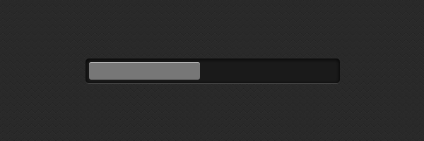
在不支持css3的浏览器下的表现: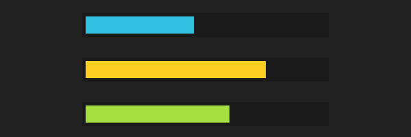
demo:http://demo.jb51.net/js/2012/css3-progress-bars/
相关文章
 这篇文章主要介绍了使用CSS3制作一个简单的进度条(demo)的相关资料,需要的朋友可以参考下2017-05-23
- 这篇文章主要给大家介绍了利用CSS3实现进度条的两种姿势,文中给出了详细的示例代码和图文介绍,对大家具有一定的参考价值,需要的朋友们下面来一起看看吧。2017-03-21
HTML5+CSS3网页加载进度条的实现,下载进度条的代码实例
本篇文章主要介绍了HTML5+CSS3网页加载进度条的实现,下载进度条的代码实例,具有一定的参考价值,有兴趣的可以了解一下。2016-12-30- 用CSS3的border-radius、box-shadow、transition、-moz-linear-gradient、-webkit-gradient等样式就可以完成一个时尚进度条,这里我们来看几个CSS3制作彩色进度条样式的代码2016-06-23
- 圆环形进度条制作的基本思想还是画出基本的弧线图形,然后CSS3中我们可以控制其旋转来串联基本图形,制造出部分消失的效果,下面就来带大家学习图解CSS3制作圆环形进度条的实2016-05-26
- 下面小编就为大家分享一篇html5+css3进度条倒计时动画特效代码【推荐】。希望对大家有所帮助。一起跟随小编过来看看吧2016-03-08
- 这篇文章主要介绍了可以随进度显示不同颜色的css3进度条,文章最后有下载地址,需要的朋友可以参考下2014-04-11
- 原理是通过大量的css3属性来实现的,如:animation、transform、keyframes等等属性,示例采用了结构性伪类选择符E:nth-child(n),来进行对HTML元素的选择以及控制输出,感2013-08-19
- 进度条而且还是带有闪亮,不可思议吧,看下效果图,至于实现代码,感兴趣的前端设计者可以参考下哈,或许有所意想不到的收获2013-04-17
纯CSS3编写的的精美动画进度条(无flash/无图像/无脚本/附源码)
加载动画和进度条的真正目的是让用户了解任务的进度,有很多的基于JavaScript的动画,但我决定切换到CSS3,使用纯CSS:没有flash,没有图像,没有脚本2013-01-07


最新评论