
CSS3实现水平居中、垂直居中、水平垂直居中的实例代码
 我要评论
我要评论作为一个前端小猴子,不管是面试的时候还是工作中,我们都会或多或少的遇到“使用css居中”的效果,今天就写一篇关于css垂直水平居中的几种方法。
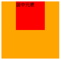
栗子1:从最简单的水平居中开始
margin: 0 auto;
块级元素使用margin: 0 auto;可以在父元素的中间位置居中,不过要记得设置块级元素的宽高。 HTML部分
<div class="wrap">
  <div class="example1">
    <p>CSS</p>
  </div>
</div>
CSS部分
.example1 {
  width: 200px;
  height: 200px;
  background-color: orange;
}
.example1 p {
  width: 100px;
  height: 100px;
  background-color: red;
  margin: 0 auto;
  line-height: 100px;
  text-align: center;
}
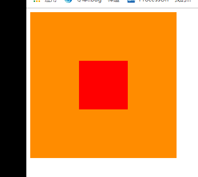
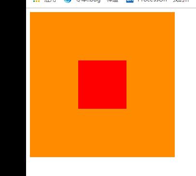
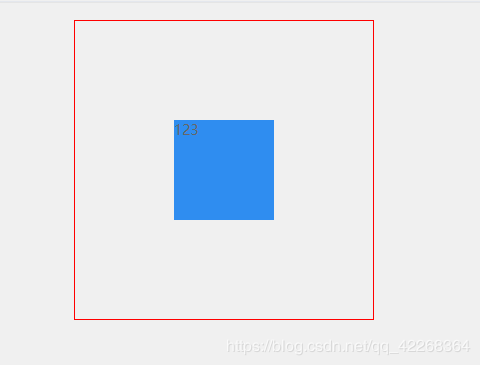
栗子2:元素水平垂直居中
position 元素已知宽度 绝对定位+margin反向偏移
.wrap { position: relative; background-color: orange; width: 300px; height: 300px; } .example2 { background-color: red; width: 100px; height: 100px; position: absolute; left: 50%; top: 50%; margin: -50px 0 0 -50px; }
position transform 元素未知宽度 如果元素未知宽度,只需将上面 example2 中的 margin: -50px 0 0 -50px ;替换为: transform: translate(-50%,-50%) ;
栗子3: flex布局
HTML同上面,附 css 代码
.warp {
  background-color: #FF8C00;
  width: 200px;
  height: 200px;
  display: flex;
  justify-content: center; /*使子项目水平居中*/
  align-items: center; /*使子项目垂直居中*/
}
.example3 {
  background-color: #F00;
  width: 100px;
  height: 100px;
}
另外一种就是 table-cell布局了,这个我就不介绍了,因为不想介绍。
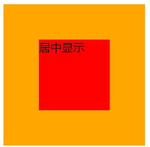
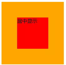
栗子4: 绝对布局
div使用绝对布局,设置margin:auto;并设置top、left、right、bottom的值相等即可,不一定要都是0。 HTML部分
<div class="warp">
  <div class="example3">
    居中显示
  </div>
</div>
CSS部分
.warp {
  position: relative;
  background-color: orange;
  width: 200px;
  height: 200px;
}
.example3 {
  position: absolute;
  top: 0;
  left: 0;
  right: 0;
  bottom: 0;
  background-color: red;
  width: 100px;
  height: 100px;
  margin: auto;
}

栗子5:给子元素相对定位,在通过translaY()得到垂直居中
.warp {
  position: relative;
  background-color: orange;
  width: 200px;
  height: 200px;
}
.example3 {
  position: relative;
  top:50%;
  transform:translateY(-50%);
  background-color: red;
  width: 100px;
  height: 100px;
  margin: 0 auto;
}
栗子6:利用inline-block的vertical-align: middle去对齐after伪元素
利用inline-block的vertical-align:middle去对齐after伪元素实现效果更加好,居中块的尺寸可以做包裹性、自适应内容,兼容性也相当好。缺点是水平居中需要考虑inline-block间隔中的留白(代码换行符遗留问题。)
.warp {
    text-align: center;
    overflow: auto;
    width: 200px;
    height: 200px;
    background-color: orange;
}
.example3 {
    display: inline-block;
    background-color: red;
    vertical-align: middle;
    width: 100px;
    height: 100px;
}

.warp:after {
    content: '';
    display: inline-block;
    vertical-align: middle;
    height: 100%;
    margin-left: -0.25em;
    /* To offset spacing. May vary by font */
}
栗子7:display: flex-box
flexbox布局。此乃布局终极大法,专治各种布局定位难题!优点:能解决各种排列布局问题.
.warp {
  display: -webkit-flex;
  display: -moz-box;
  display: -ms-flexbox;
  display: -webkit-box;
  display: flex;
  -webkit-box-align: center;
  -moz-box-align: center;
  -ms-flex-align: center;
  -webkit-align-items: center;
  align-items: center;
  -webkit-box-pack: center;
  -moz-box-pack: center;
  -ms-flex-pack: center;
  -webkit-justify-content: center;
  justify-content: center;
  width: 200px;
  height: 200px;
  background-color: orange;
}

.example3 {
  width: 100px;
  height: 100px;
  background-color: red;
}
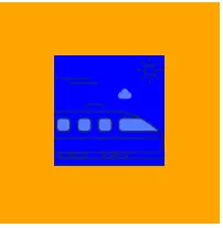
图片居中的栗子1:
<div class="warp">
  <div class="example3">
    <img src="xxxx" alt="">
  </div>
</div>
.warp {
  width: 200px;
  height: 200px;
  background-color: orange;
  display: flex;
  align-items: center;
  justify-content: center;
}
.example3 img {
  width: 100px;
  height: 100px;
  background-color: blue;
}
总结
到此这篇关于CSS3实现水平居中、垂直居中、水平垂直居中的实例代码的文章就介绍到这了,更多相关css3 垂直居中内容请搜索脚本之家以前的文章或继续浏览下面的相关文章,希望大家以后多多支持脚本之家!
相关文章
 这篇文章主要介绍了使用CSS实现盒子水平垂直居中的方法(8种),文中通过示例代码介绍的非常详细,对大家的学习或者工作具有一定的参考学习价值,需要的朋友们下面随着小编来2020-11-11
- 这篇文章主要介绍了CSS 水平居中并限定最大的宽度实现,文中通过示例代码介绍的非常详细,对大家的学习或者工作具有一定的参考学习价值,需要的朋友们下面随着小编来一起学2020-09-14
- 这篇文章主要介绍了CSS实现子元素div水平垂直居中的示例,文中通过示例代码介绍的非常详细,对大家的学习或者工作具有一定的参考学习价值,需要的朋友们下面随着小编来一起2020-09-03
CSS中的translate(-50%,-50%)实现水平垂直居中效果
这篇文章主要介绍了CSS中的translate(-50%,-50%)实现水平垂直居中效果,本文通过实例代码给大家介绍的非常详细,对大家的学习或工作具有一定的参考借鉴价值,需要的朋友可以2020-09-02- 这篇文章主要介绍了css3 flex实现div内容水平垂直居中的几种方法,文中通过示例代码介绍的非常详细,对大家的学习或者工作具有一定的参考学习价值,需要的朋友们下面随着小2020-03-27
- 这篇文章主要介绍了CSS3 不定高宽垂直水平居中的几种方式,文中通过示例代码介绍的非常详细,对大家的学习或者工作具有一定的参考学习价值,需要的朋友们下面随着小编来一起2020-03-26
 这篇文章主要介绍了手把手教你CSS水平、垂直居中的10种方式(小结),文中通过示例代码介绍的非常详细,对大家的学习或者工作具有一定的参考学习价值,需要的朋友们下面随着2019-11-07
 如何让子元素在父容器中水平垂直居中呢,下面我们来列举几种常见的方法,通过真实场景分析给大家详解web前端之css水平居中代码解析,感兴趣的朋友跟随小编一起看看吧2021-05-20


最新评论