
纯HTML5+CSS3制作生日蛋糕代码
发布时间:2016-11-16 17:39:02 作者:Jeremy阳仔  我要评论
我要评论
我要评论“祝你生日快乐,祝你生日快乐……”,过生日有生日歌,生日蛋糕也是必不可少的,这篇文章主要为大家详细介绍了程序员利用纯HTML5+CSS3制作的生日蛋糕,具有一定的参考价值,感兴趣的小伙伴们可以参考一下
以一个前端开发的身份绘制一个简单的蛋糕庆祝一下今天这个好日子吧,程序员庆生的乐趣与哀愁啊。写的比较简陋,感兴趣的看一下吧。
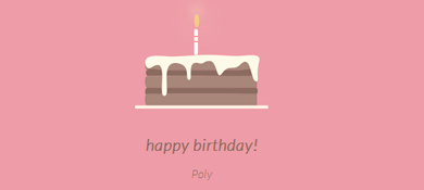
先发个效果图吧

蛋糕分为三个部分,底部蛋糕,顶层蛋糕和蜡烛部分。HTML的布局结构也是按照这三部分布局的。另外就是使用CSS定位和CSS3的rotate,内外阴影等效果调整部分DOM元素样式。比较简单,相信码农都懂的。
不赘述其它有的没的了。
下面给出完整的的HTML代码和CSS代码
<!DOCTYPE html>
<html>
<head lang="en">
    <meta charset="UTF-8">
    <title></title>
    <style>
        .birthday .container{
            width:600px;
            height:600px;
            margin:0px auto;
            background: #fafafa;
            border-radius:5px;
            position: relative;
        }

        /**
       ** 顶层的
       **/

        .birthday .top-one{
            position: absolute;
            width:280px;
            height: 280px;
            bottom: 200px;
            left:160px;
        }

        .birthday .top-one .bottom{
            position: absolute;
            width:280px;
            height: 280px;
            bottom:-30px;
            border:1px solid #3e2001;
            border-radius: 140px;
            transform: rotateX(60deg);
            z-index: 4;
            background: #3e2001;
            box-shadow: 0px 0px 20px #3e2001;
        }
        .birthday .top-one .top{
            position: absolute;
            width:280px;
            height: 280px;
            top:-50px;
            border-radius: 140px;
            background: #FFFFFF;
            transform: rotateX(60deg);
            box-shadow: 2px 2px 20px #b7b7b7;
            z-index: 6;
            background: -webkit-repeating-radial-gradient(circle, #783d01, #3e2001 10px, #914909 10px,white 20px);
            background: -moz-repeating-radial-gradient(circle, #783d01, #3e2001 10px,#914909 10px,white 20px);
        }
        .birthday .top-one .side{
            position: absolute;
            top:95px;
            width:280px;
            height: 70px;
            border:1px solid #3e2001;
            border-top-width: 0px;
            border-bottom-width: 0px;
            background: #FFFFFF;
            z-index: 5;
            background: #3e2001;
        }


        /**
        ** 底层的
        **/
        .birthday .bottom-one{
            position: absolute;
            width:400px;
            height: 400px;
            bottom: 0px;
            left:100px;
        }
        .birthday .bottom-one .bottom{
            position: absolute;
            width:400px;
            height: 400px;
            bottom:-30px;
            border:1px solid #914909;
            border-radius: 200px;
            transform: rotateX(60deg);
            box-shadow: 2px 2px 20px #914909;
            z-index: 1;
            background: #3e2001;
            overflow: hidden;
        }
        .birthday .bottom-one .line{
            position: absolute;
            width:400px;
            height: 400px;
            border-radius: 200px;
            z-index: 1;
        }
        .birthday .bottom-one .line1{
            bottom: 30px;
            border:5px solid #783d01;
            left:-5px;
            z-index: 1;
        }

        .birthday .bottom-one .top{
            position: absolute;
            width:400px;
            height: 400px;
            top:-100px;
            border:1px solid #3e2001;
            border-radius: 200px;
            background: #FFFFFF;
            transform: rotateX(60deg);
            z-index: 3;
            background: #783d01;
            box-shadow: inset 0px 0px 20px #3e2001;

        }

        .birthday .bottom-one .side{
            position: absolute;
            top:100px;
            width:400px;
            height: 130px;
            border:1px solid #3e2001;
            border-top-width: 0px;
            border-bottom-width: 0px;
            background: #3e2001;
            z-index: 2;

        }


        /**
        ** 底层的文字
        **/
        .birthday .flower{
            position: relative;
            text-align: justify;
            z-index: 9;
            top:200px;
            font-size: 32px;
            font-family: "Helvetica Neue", "Noto Sans CJK SC", "Source Han Sans CN";
            color:#FFFFFF;
            font-weight: bold;
        }
        .birthday .flower:after{
            content:"";
            display:inline-block;
            position: relative;
            width:100%;
        }

        .birthday .flower i{
            position: relative;
            width:80px;
            line-height: 80px;
            display: inline-block;
            border-radius: 50%;
            border:2px solid #783d01;
            text-align: center;

        }

        /**
        ** 顶层的文字
        **/
        .birthday .top-one .text{
            width:100%;
            text-align: center;
            position: absolute;
            top:165px;
            z-index: 9;
            margin:0px auto;
            font-size: 30px;
            color:#FFFFFF;
            transform: rotateX(60deg) skew(10deg,20deg);
        }


        /**
         ** 蜡烛
        **/

        .birthday .candle{
            width:10px;
            height:80px;
            margin:0px auto;
            position: absolute;
            left:295px;
            top:130px;
            z-index: 9;
        }
        .birthday .candle .body{
            width:10px;
            height:70px;
            margin:0px auto;
            background: red;
            border-bottom-width: 0px;
        }

        .birthday .candle .top{
            width:10px;
            height: 10px;
            border-radius: 5px;
            transform: rotateX(60deg);
            position: relative;
            top:5px;
            background: red;
        }
        .birthday .candle .bottom{
            width:10px;
            height: 10px;
            border-radius: 5px;
            transform: rotateX(60deg);
            position: relative;
            bottom:5px;
            background: red;
            box-shadow: 1px 1px 10px red;
        }

        .birthday .candle .fire{
            position: absolute;
            width:6px;
            height: 6px;
            left:2px;
            transform: rotate(45deg);
            background: #ffd507;
            box-shadow: 0px 0px 20px #ffff00, 2px 2px 10px red;

        }


    </style>

</head>
<body>
    <div class="birthday">
        <div class="container">

            <div class="candle">
                <div class="fire"></div>
                <div class="top"></div>
                <div class="body"></div>
                <div class="bottom"></div>
            </div>

            <div class="top-one">
                <div class="top"></div>
                <div class="side"></div>
                <div class="bottom"></div>
                <div class="text">
                    Happy Birthday
                </div>
            </div>

            <div class="bottom-one">
                <div class="top"></div>
                <div class="side"></div>
                <div class="bottom">
                    <div class="line line1"></div>
                </div>
                <div class="flower">
                    <i style="top:-20px;transform: rotateY(50deg)">生</i>
                    <i style="top:15px;transform: rotateY(30deg)">日</i>
                    <i style="top:15px;transform: rotateY(30deg)">快</i>
                    <i style="top:-20px;transform: rotateY(50deg)">乐</i>
                </div>
            </div>
        </div>
    </div>
</body>
</html>
okay,庆生开发的小Demo,以后可以尝试用Canvas画布或SVG试着在做一下,感谢阅读。
以上就是本文的全部内容,希望对大家的学习有所帮助,也希望大家多多支持脚本之家。
相关文章
 一款非常有创意的生日蛋糕动画,它是用svg来做的2014-05-19
- 蛋糕分为三个部分,底部蛋糕,顶层蛋糕和蜡烛部分。HTML的布局结构也是按照这三部分布局的。另外就是使用CSS定位和CSS3的rotate,内外阴影等效果调整部分DOM元素样式。实现2016-11-16
- 下面小编就为大家带来一篇浅谈HTML5 & CSS3的新交互特性。小编觉得挺不错的,现在就分享给大家,也给大家做个参考。一起跟随小编过来看看吧2016-07-19
HTML5+Canvas+CSS3实现齐天大圣孙悟空腾云驾雾效果
使用HTML5的canvas画的孙悟空,CSS3画的白云飘飘。本文给大家介绍基于HTML5+Canvas+CSS3实现齐天大圣孙悟空腾云驾雾效果,感兴趣的朋友参考下吧2016-04-26- 这篇文章主要教大家如何利用HTML5 CSS3绘制出锯齿状的矩形,绘制图形时可以用canvas标签,感兴趣的小伙伴们可以参考一下2016-03-01
- 这篇文章主要介绍了纯HTML5+CSS3制作图片旋转,HTML5结合CSS3 实现的一些动画特效,实现起来比较容易,感兴趣的小伙伴们可以参考一下2016-01-12
 本篇文章给大家分享基于html和CSS3制作酷炫的导航栏,效果非常美观,需要的朋友可以从参考下2015-09-23
- 这篇文章主要介绍了检测浏览器对HTML5和CSS3支持度的方法,使用Modernizr来检测浏览器对HTML5和CSS3代码的兼容程度,需要的朋友可以参考下2015-06-25
- 这篇文章主要为大家介绍了一款利用html5和css3动画排列人物头像的实例演示,这款实例页面初始时,只有中间的美女图,然后出现微笑图,紧接着出现小的人物图,慢慢的以动画2014-12-05
- 本文主要讲诉了HTML5&CSS3在WEBAPP中的应用,webapp模式的网站追求的就是一个体验,而体验优化的一个重点便是动画,可以说动画是webapp的一个亮点,今天我们就来谈谈动画2014-11-21


最新评论