
html5简介及新增功能介绍
发布时间:2020-05-18 15:34:28 作者:风雨等归期  我要评论
我要评论
我要评论这篇文章主要介绍了html5简介及新增功能介绍,本文通过实例代码给大家介绍的非常详细,对大家的学习或工作具有一定的参考借鉴价值,需要的朋友可以参考下

<!DOCTYPE html>
<html lang="en">
<head>
<meta charset="UTF-8">
<title>audio</title>
</head>
<body>
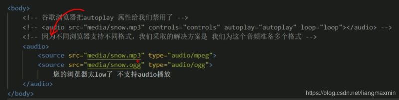
<audio controls="controls">
<source src="video/Light.mp3" type="audio/mpeg">
<source src="video/Light.ogg" type="audio/ogg">
您的浏览器太low了
</audio>
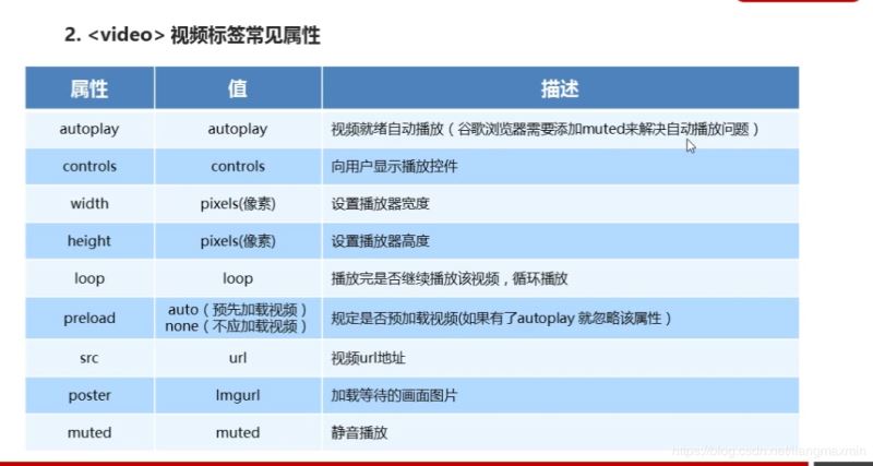
<video controls muted poster="img/1.png" width="300px" height="300px">
<source src="video/Light.mp3" type="video/mp3">
<source src="video/Light.mp3" type="video/ogg">
您的浏览器太low
</video>
<form action="">
<ol>
<li>邮箱:<input type="email"></li>
<li>网址:<input type="url"></li>
<li>日期:<input type="date"></li>
<li>数量:<input type="number"></li>
<li>日期:<input type="time"></li>
<li>手机号:<input type="tel"></li>
<li>搜索:<input type="search"></li>
<li>颜色:<input type="color"></li>
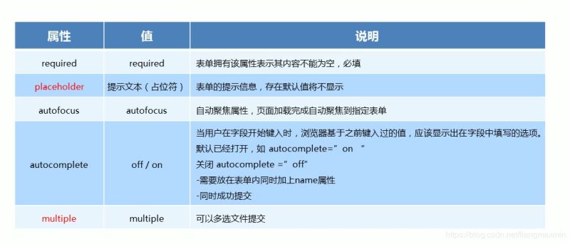
<li>不能为空:<input type="text" required="required"></li>
<li>提示为本:<input type="text" placeholder="啦啦啦 我是卖报的"></li>
<li>自动获得鼠标焦点:<input type="text" autofocus="autofocus"></li>
<li><input type="text" autocomplete="on" name="autocomplete"></li>
<li><input type="submit" value="提交"></li>
</ol>
<hr>
</form>
<form action="">
<ul>
<li><input type="file" name="" id="" multiple></li>
<li><input type="submit" value="提交"></li>
</ul>
</form>
</body>
</html>

<!DOCTYPE html>
<html lang="en">
<head>
<meta charset="UTF-8">
<title>css3</title>
</head>
<style>
ul li:nth-child(odd) {
background-color: cornflowerblue;
}
ul {
display: inline-grid;
width: 200px;
margin-left: -39px;
list-style: none;
text-align: center;
}
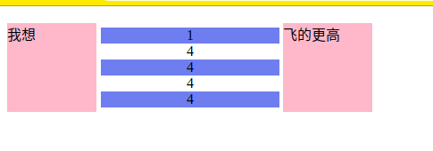
div::before {
display: inline-block;
content: "我想";
width: 100px;
height: 100px;
background-color: pink;
}
div::after {
display: inline-block;
content: "飞的更高";
width: 100px;
height: 100px;
background-color: pink;
}
</style>
<body>
<div>
<ul>
<li>1</li>
<li>4</li>
<li>4</li>
<li>4</li>
<li>4</li>
</ul>
</div>
</body>
</html>
<!DOCTYPE html>
<html lang="en">
<head>
<meta charset="UTF-8">
<title>动画</title>
</head>
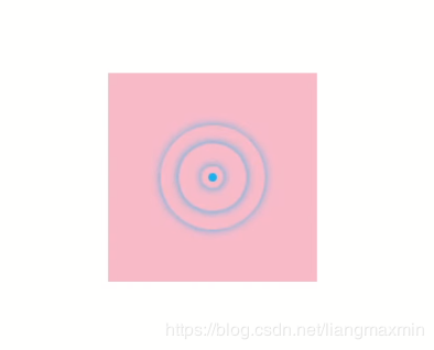
<style>
/*from 和 to 等价于 0% 和 100%*/
/*@keyframes move {*/
/*0%{*/
/*transform:translateX(0px);*/
/*}*/
/*100%{*/
/*transform:translateX(1000px);*/
/*}*/
/*}*/
.bowen {
position: fixed;
top: 50%;
left: 50%;
width: 200px;
height: 200px;
transform: translate(-50%, -50%);
background-color: pink;
}
.bowen div[class^="dotted"] {
position: absolute;
top: 50%;
left: 50%;
width: 8px;
height: 8px;
transform: translate(-50%, -50%);
background-color: deepskyblue;
border-radius: 50%;
}
@keyframes pulse {
0% {
}
70% {
width: 100px;
height: 100px;
opacity: 1;
}
100% {
width: 100px;
height: 100px;
opacity: 0;
}
}
.bowen div.dotted2,
.bowen div.dotted3,
.bowen div.dotted4 {
background-color: transparent;
box-shadow: 0 0 8px deepskyblue;
animation: pulse 1.2s linear infinite forwards;
}
.bowen div.dotted2 {
animation-delay: 0.4s;
}
.bowen div.dotted3 {
animation-delay: 0.8s;
}
</style>
<body>
<div class="bowen">
<div class="dotted1"></div>
<div class="dotted2"></div>
<div class="dotted3"></div>
<div class="dotted4"></div>
</div>
</body>
</html>
<!DOCTYPE html>
<html lang="en">
<head>
    <meta charset="UTF-8">
    <title>3D</title>
</head>

<style>
    body {
        perspective: 500px;
    }

    .box {
        position: relative;
        width: 200px;
        height: 200px;
        margin: 0 auto;
        transform-style: preserve-3d;
        transition: all .3s;
    }

    .box div {
        position: absolute;
        top: 0;
        left: 0;
        width: 100%;
        height: 100%;
        background-color: cornflowerblue;
    }

    .box div:last-child {
        background-color: aliceblue;
        transform: rotateX(60deg);
    }

    .box:hover {
        transform: rotate3D(0, 1, 0, 60deg);
    }

</style>

<body>
<div class="box">
    <div></div>
    <div></div>
</div>
</body>
</html>

<!DOCTYPE html>
<html lang="en">
<head>
    <meta charset="UTF-8">
    <title>导航栏</title>
</head>
<style>

    li {
        float: left;
        padding: 0 10px;
        list-style: none;
        perspective: 500px;
    }

    .box {
        position: relative;
        width: 200px;
        height: 50px;
        transform-style: preserve-3d;
        transition: all .5s;
    }

    .box div {
        position: absolute;
        top: 0;
        left: 0;
        width: 100%;
        height: 100%;
        background-color: pink;
        text-align: center;
        line-height: 50px;
    }

    .box div:nth-child(1) {
        transform: translateZ(25px);
    }

    .box div:nth-child(2) {
        background-color: purple;
        /*必须先移动后旋转*/
        transform: translateY(25px) rotateX(-90deg);

    }

    .box:hover {

        transform: rotateX(90deg);

    }


</style>

<body>
<ul>
    <li>
        <div class="box">
            <div>好好学习</div>
            <div>天天向上</div>
        </div>
    </li>
    <li>
        <div class="box">
            <div>好好学习</div>
            <div>天天向上</div>
        </div>
    </li>
    <li>
        <div class="box">
            <div>好好学习</div>
            <div>天天向上</div>
        </div>
    </li>
    <li>
        <div class="box">
            <div>好好学习</div>
            <div>天天向上</div>
        </div>
    </li>

</ul>
</body>
</html>

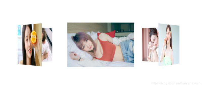
<!DOCTYPE html>
<html lang="en">
<head>
    <meta charset="UTF-8">
    <title>旋转木马</title>
</head>
<style>
    section {
        position: fixed;
        top: 50%;
        left: 50%;
        width: 300px;
        height: 200px;
        transform: translate(-50%, -50%);
        perspective: 2500px;
    }

    section div.box {
        position: relative;
        transform-style: preserve-3d;
        animation: move 15s linear infinite;
        background: url("img/4.jpg") no-repeat;
        background-size: 300px 200px;
    }

    div {
        position: absolute;
        top: 0;
        left: 0;
        width: 100%;
        height: 100%;
    }

    div:nth-child(1) {
        background: url("img/3.jpg") no-repeat;
        background-size: 300px 200px;
        transform: rotateY(0) translateZ(400px);
    }

    div:nth-child(2) {
        background: url("img/9.jpg") no-repeat;
        background-size: 300px 200px;
        transform: rotateY(60deg) translateZ(400px);
    }

    div:nth-child(3) {
        background: url("img/5.jpg") no-repeat;
        background-size: 300px 200px;
        transform: rotateY(120deg) translateZ(400px);
    }

    div:nth-child(4) {
        background: url("img/6.jpg") no-repeat;
        background-size: 300px 200px;
        transform: rotateY(180deg) translateZ(400px);
    }

    div:nth-child(5) {
        background: url("img/7.jpg") no-repeat;
        background-size: 300px 200px;
        transform: rotateY(240deg) translateZ(400px);
    }

    div:nth-child(6) {
        background: url("img/8.jpg") no-repeat;
        background-size: 300px 200px;
        transform: rotateY(300deg) translateZ(400px);
    }

    @keyframes move {
        0% {
            transform: rotateY(0);
        }
        100% {
            transform: rotateY(360deg);
        }
    }

    .box:hover{
        animation-play-state: paused;
    }


</style>
<body>
<section>
    <div class="box">
        <div></div>
        <div></div>
        <div></div>
        <div></div>
        <div></div>
        <div></div>
    </div>
</section>
</body>
</html>
总结
到此这篇关于html5简介及新增功能介绍的文章就介绍到这了,更多相关html5简介新增功能内容请搜索脚本之家以前的文章或继续浏览下面的相关文章,希望大家以后多多支持脚本之家!
相关文章
浅谈HTML5 FileReader分布读取文件以及其方法简介
本篇文章主要介绍了浅谈HTML5 FileReader分布读取文件以及其方法简介,具有一定的参考价值,感兴趣的小伙伴们可以参考一下2017-11-09HTML与XHTML、以及HTML4与HTML5标签之间的区别简介
这篇文章主要介绍了HTML与XHTML、以及HTML4与HTML5标签之间的区别,是网页前端编程入门学习中的基础知识,需要的朋友可以参考下2015-11-07- 这篇文章主要介绍了HTML5的一个显示电池状态的API简介,由Mozilla设计,具体的设备和浏览器支持情况还要通过检测才能确定,需要的朋友可以参考下2015-06-18
- 随着Windows8正式版发布的脚步近在咫尺,近来关于Win8、IE10、HTML5的新闻逐渐增多,很多朋友对于Win8系统以及IE10浏览器都比较了解,但对于HTML5是什么还真有不少朋友不清2012-10-26
- 前言:HTML5出现后,网络安全更加受到广泛的关注。Web对于网络安全有哪些改进?我们如何来面对越来越危险的网络欺诈和攻击?下面的文章谈到了W3C对于这个问题的最新解决方2012-07-10
- 本文主要介绍了HTML5的标签.不同于以前的标签.更简单.更方便2012-05-28
html5新增的定时器requestAnimationFrame实现进度条功能
html5为什么新增一个requestAnimationFrame,他的出现是为了解决什么问题?带着这些问题跟随脚本之家小编一起学习吧2018-12-13- 下面小编就为大家带来一篇HTML5新增加的功能详解。小编觉得挺不错的,现在就分享给大家,也给大家做个参考。一起跟随小编过来看看吧2016-09-05
- 大多数移动应用,不管是企业移动应用还是互联网移动应用,90%都可以使用基于HTML5的Web技术就足够2013-12-13

最新评论