
个性化创意鲜明的网站设计实例(30个)
基于FLASH的设计
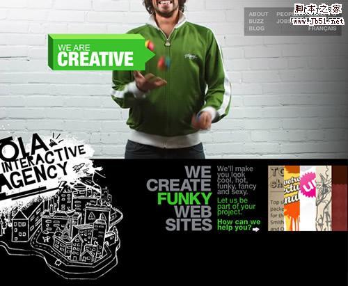
Ola Interactive Agency
A fun and straightforward website, with small videos running in the back to illustrate some of the company values, like creativity, speed and coolness! There’s a speaker on the left to kill the music.
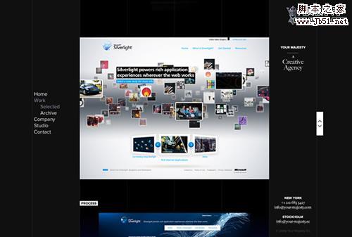
Your Majesty
Nice and clean website with more than one way to explore the portfolio, excellent branding, and a smooth dark color scheme.
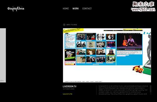
EnjoyThis
The minimal design and a sleek touch of Flash are the strong points of this one. Browsing trough the works seems so natural.
Valerie Phillips
This is huge. Literally!

Ben Thomas
A simple and effective left aligned website, with a stylish motion effect that works great with the dynamic visuals in the portfolio.
Studio Output
This one is for the average portfolio what Vimeo is for YouTube: a minimal yet powerful alternative, an almost buttonless experience.
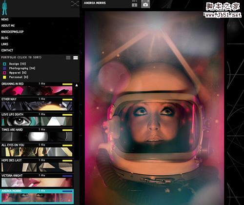
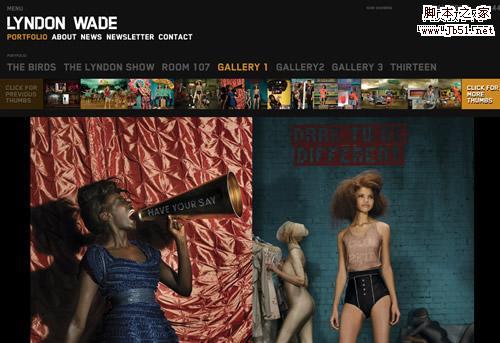
Lyndon Wade
A classic dark styled background with a thumbnail menu and awesome transition effects are all you need for a killer portfolio. Oh, and some pictures from one of the top 15 photographers in America.
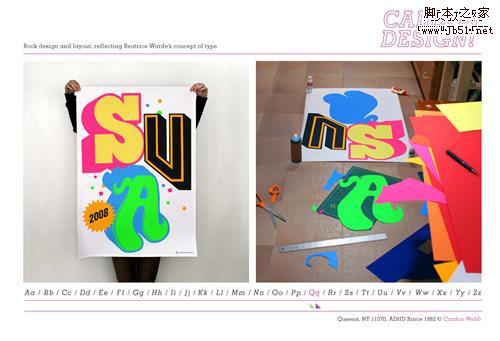
Cardon Design
A simple and innovative way to show the portfolio, in a dictionary way. Great works also!
Kenjiro Harigai
One of the most complex websites in our selection, it features a visual menu with a lens effect, a text menu with the names of the works, and some amazing motion effects.
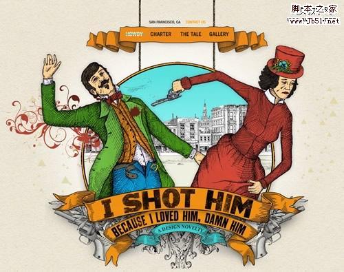
I Shot Him
This one is all about the story: with just a few vintage illustrations and some creative lines they really deliver "a design novelty".
Unique browsing system
Websites that let you scan the portfolio trough original and fresh techniques.
Orange Label
This is a one-page journey, a dive in the studio’s achievements, beginning with a strong graphic & profile, then some works and finally a feedback form.

Counter Fill
Exploring this portfolio is like falling from the roof of a tall building and stopping by a few times to look on the window. Click to see why.

X3 Studios
The excellent use of AJAX makes browsing this website such a smooth experience that you get the feeling you never left the homepage. Which is true!

Lucas Hirata
Very good use of thumbnails and light.

Work at Play
Maybe the most dynamic non-Flash website of the selection. Great uses of colors, transparency and AJAX.

Zaum & Brown
Finally a grid based portfolio with a fluid layout. Don’t know if Brown comes from the color of the background, but that certainly works well also.

Creative People
The background is so important here! This amazing photo manipulation steals the show but introduce us properly in the studio atmosphere.

Design by Slint
This prolific studio from Singapore also has a grid-based fluid portfolio, where they show the works in a blog style way.

Dave Hill
The best proof that great photography doesn’t really need sophisticated design to stand out. Elegant and smooth.

Any Which Way
Nothing fancy seems to be happening here at the first sight, but this website has a great navigation system: a mirror-like menu that stands as a fantastic alternative for the way over-used "carousel".

Special elements
Portfolios that use at least one remarkable element (widget, color scheme, game) to create an immersive adventure.
Crispin Porter + Boguski
Basically this website aggregates a YouTube video for a given campaign, the live news feed about it, Twitter bits, and blog pieces. It sure is the most social-ready portfolio of the selection.

Great Works
An excellent example of three colors website: sleek, smooth, and effective!

Home de Caramel
Another fullscreener, Home de Caramel features a double menu, just a few words and huge images. Makes sense.

Trust The KDU
The vintage design and the sepia tone of the photos work extremely well together and make a great portfolio.

Carsonified
Strong colors and striking, simple illustrations make from the new Carsonified website an instant classic.

Poccuo
Very clean and dynamic website with a powerful Twitter integration and a nice simple way to show the creative work.

BKWLD
Clean design + Good navigation + Great works = Winner Portfolio

Elliot Jay Stocks
Another classic, the portfolio of Elliot teaches us the importance of a huge footer, actually as big as the body. Break the barriers, think big!

Mojave Interactive
Social media is very important business for Mojave, so they have compiled a few different channels in the homepage.

Merix Studio
Full intreactivity map with clients and resources, amazing idea!

相关文章
 今天的文章,我们将分享15个可以学习编程的网站,这些网站上提供了很多编程教程,图书以及编程练习,希望对你有用2024-11-02
- 这篇文章主要介绍了web开发中的长度单位主要包括px,pt,em等,需要的朋友可以参考下2023-08-06
- px单位是绝对单位,一般用于pc端网页开发,因为是绝对单位所以在移动端上的使用体验并不是很好,rem它是描述相对于当前根元素字体尺寸,是相对单位,它可以根据根元素的变换而2023-08-06
WEB前端优化必备js/css压缩工具YUI-compressor详解与集成用法
压缩工具层次不穷,各有优点,选择适合的压缩工具为将来做项目开发使用是一件很重要的事情!!在这介绍YUI-compressor,需要的朋友可以参考下2023-06-21- 浏览器是多进程的,有浏览器主进程,网络进程,渲染进程,插件进程等,在将html,css,javascript解析成一个页面的时候,就需要多个进程的分工合作2023-05-01
- 本文为大家整理了常用的文件对应的MIME类型,对大家的学习或者工作具有一定的参考学习价值,需要的朋友们下面随着小编来一起学习学习吧2022-04-25
postman中form-data、x-www-form-urlencoded、raw、binary的区别介绍
这篇文章介绍了postman中form-data、x-www-form-urlencoded、raw、binary的区别,对大家的学习或者工作具有一定的参考学习价值,需要的朋友们下面随着小编来一起学习学习吧2021-12-28- 国际组织制定了可以容纳世界上所有文字和符号的字符编码方案,称为Unicode,是通用字符集Universal Character Set的缩写,用以满足跨语言、跨平台进行文本转换、处理的要求2021-11-27
- 这篇文章主要介绍了前端实现字符串GBK与GB2312的编解码(小结),小编觉得挺不错的,现在分享给大家,也给大家做个参考。一起跟随小编过来看看吧2020-12-02
 这篇文章主要介绍了告别硬编码让你的前端表格自动计算,本文通过实例代码给大家介绍的非常详细,对大家的学习或工作具有一定的参考借鉴价值,需要的朋友可以参考下2020-09-27


最新评论