
html+css实现环绕倒影加载特效
发布时间:2021-07-06 16:52:43 作者:北极光之夜。  我要评论
我要评论
我要评论本文主要介绍了html+css实现环绕倒影加载特效,文中通过示例代码介绍的非常详细,对大家的学习或者工作具有一定的参考学习价值,需要的朋友们下面随着小编来一起学习学习吧
本文主要介绍了html+css实现环绕倒影加载特效,具体如下:
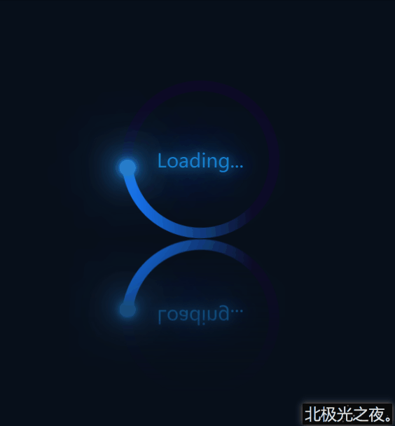
先看效果(完整代码在底部):
实现(可一步一步边看效果边编写):
※先初始化(直接复制):
 *{
            margin: 0;
            padding: 0;
            box-sizing: border-box;
        }
 body{
            height: 100vh;
            display: flex;
            justify-content: center;
            align-items: center;
            background-color: rgb(7, 15, 26);
        }
flex布局,让子元素居中对齐。
1.定义标签:
<div class="container">
        <span>Loading...</span>
        <div class="circle">
            <div class="ring"></div>
        </div>
    </div>
.container是最底层盒子。
span是文本。
.circle是底层圆形盒子。
.ring是那个蓝色环。
2. .container的css样式:
.container{
            position: relative;
            height: 150px;
            width: 250px;
            -webkit-box-reflect:below 1px linear-gradient(transparent  ,rgb(7, 15, 26));
        }
-webkit-box-reflect:该属性能实现倒影特效。详细。
3. .circle的css样式,动画部分可暂时注释掉:
.circle{
            position: relative;
            margin: 0 auto;
            height: 150px;
            width: 150px;
            background-color: rgb(13, 10, 37);
            border-radius: 50%;
            animation: zhuan 2s linear infinite;
        }
        @keyframes zhuan{
            0%{

                transform: rotate(0deg);
            }
            100%{

                 transform: rotate(360deg);
            }
        }
margin: 0 auto;居中。
border-radius: 50%; 角弧度。
animation: zhuan 2s linear infinite; 设置动画,让其旋转。
transform: rotate(…deg); 旋转角度。
4. 定义一个双伪类,为一个与背景色相同的小圆,覆盖在.circle上:
.circle::after{
            content: '';
            position: absolute;
            top: 10px;
            left: 10px;
            right: 10px;
            bottom: 10px;
            background-color: rgb(7, 15, 26);
            border-radius: 50%;
        }
5.定义蓝色环形效果,因为被第4步的小圆覆盖了,所以直接定义一个渐变的蓝色圆形即可得到蓝色环形:
.ring{
            position: absolute;
            top: 0;
            left: 0;
            width: 75px;
            height: 150px;
            background-image: linear-gradient(180deg,rgb(22, 121, 252) ,transparent 80%);
            border-radius: 75px 0 0 75px;

        }
background-image: linear-gradient(180deg,rgb(22, 121, 252) ,transparent 80%); 渐变颜色,先蓝色,过渡到透明色。
6.定义环形上发光的小圆球:
.ring::after{
            content: '';
            position: absolute;
            right: -5px;
            top: -2.5px;
            width: 15px;
            height: 15px;
            background-color: rgb(40, 124, 202);
            box-shadow: 0 0 5px rgb(40, 151, 202),
            0 0 10px rgb(40, 124, 202),
            0 0 20px rgb(40, 124, 202),
            0 0 30px rgb(40, 124, 202),
            0 0 40px rgb(40, 124, 202),
            0 0 50px rgb(40, 124, 202),
            0 0 60px rgb(40, 124, 202),
            0 0 60px rgb(40, 124, 202);
            border-radius: 50%;
            z-index: 1;

        }
box-shadow: 阴影。
z-index: 1; 显示在最上层。
7. 定义文本loading:
.container>span{
            position: absolute;
            left: 50%;
            top: 50%;
            transform: translate(-50%,-50%);
            color: rgb(20, 129, 202);
            text-shadow: 0 0 10px rgb(20, 129, 202),
            0 0 30px rgb(20, 129, 202),
            0 0 60px rgb(20, 129, 202),
            0 0 100px rgb(20, 129, 202);
            font-size: 18px;
            z-index: 1;

        }
left: 50%;
top: 50%;
transform: translate(-50%,-50%); 居中对齐。
text-shadow: 文字阴影。
完整代码:
<!DOCTYPE html>
<html lang="zh-CN">
<head>
    <meta charset="UTF-8">
    <meta http-equiv="X-UA-Compatible" content="IE=edge">
    <meta name="viewport" content="width=device-width, initial-scale=1.0">
    <title>Document</title>
    <style>
        *{
            margin: 0;
            padding: 0;
            box-sizing: border-box;
        }
        body{
            height: 100vh;
            display: flex;
            justify-content: center;
            align-items: center;
            background-color: rgb(7, 15, 26);
        }
        .container{
            position: relative;
            height: 150px;
            width: 250px;
            -webkit-box-reflect:below 1px linear-gradient(transparent  ,rgb(7, 15, 26));
        }
        .container>span{
            position: absolute;
            left: 50%;
            top: 50%;
            transform: translate(-50%,-50%);
            color: rgb(20, 129, 202);
            text-shadow: 0 0 10px rgb(20, 129, 202),
            0 0 30px rgb(20, 129, 202),
            0 0 60px rgb(20, 129, 202),
            0 0 100px rgb(20, 129, 202);
            font-size: 18px;
            z-index: 1;

        }
        .circle{
            position: relative;
            margin: 0 auto;
            height: 150px;
            width: 150px;
            background-color: rgb(13, 10, 37);
            border-radius: 50%;
            animation: zhuan 2s linear infinite;
        }
        @keyframes zhuan{
            0%{

                transform: rotate(0deg);
            }
            100%{

                 transform: rotate(360deg);
            }
        }
        .circle::after{
            content: '';
            position: absolute;
            top: 10px;
            left: 10px;
            right: 10px;
            bottom: 10px;
            background-color: rgb(7, 15, 26);
            border-radius: 50%;
        }

        .ring{
            position: absolute;
            top: 0;
            left: 0;
            width: 75px;
            height: 150px;
            background-image: linear-gradient(180deg,rgb(22, 121, 252) ,transparent 80%);
            border-radius: 75px 0 0 75px;

        }

        .ring::after{
            content: '';
            position: absolute;
            right: -5px;
            top: -2.5px;
            width: 15px;
            height: 15px;
            background-color: rgb(40, 124, 202);
            box-shadow: 0 0 5px rgb(40, 151, 202),
            0 0 10px rgb(40, 124, 202),
            0 0 20px rgb(40, 124, 202),
            0 0 30px rgb(40, 124, 202),
            0 0 40px rgb(40, 124, 202),
            0 0 50px rgb(40, 124, 202),
            0 0 60px rgb(40, 124, 202),
            0 0 60px rgb(40, 124, 202);
            border-radius: 50%;
            z-index: 1;

        }

    </style>
</head>
<body>
    <div class="container">
        <span>Loading...</span>
        <div class="circle">
            <div class="ring"></div>
        </div>
    </div>
</body>
</html>
总结:
到此这篇关于html+css实现环绕倒影加载特效的文章就介绍到这了,更多相关html+css环绕倒影加载内容请搜索脚本之家以前的文章或继续浏览下面的相关文章,希望大家以后多多支持脚本之家!
相关文章
巧用 CSS3的webkit-box-reflect 倒影实现各类动效
这篇文章主要介绍了巧用 CSS3的webkit-box-reflect 倒影实现各类动效,本文给大家介绍的非常详细,对大家的学习或工作具有一定的参考借鉴价值,需要的朋友可以参考下2021-03-05- 这篇文章主要通过一张图给大家介绍了关于CSS3实现倒影的相关资料,文中给出来详细的示例代码供大家参考学习,对大家学习或者使用css3具有一定的参考学习价值,需要的朋友们2017-09-26
CSS3 Notes: -webkit-box-reflect实现倒影的实例
这篇文章主要介绍了CSS3 Notes: -webkit-box-reflect实现倒影的实例,具有一定的参考价值,有需要的可以了解一下。2016-12-08- 以前要实现这种效果,我们只能乖乖的找设计去制作,然后在页面上插入一张图片,但是随着CSS3的出现,我们可以纯代码实现,如何实现呢?就是通过CSS3的box-reflect属性。下2016-11-15
- 下面小编就为大家带来一篇5分钟让你掌握css3阴影、倒影、渐变小技巧(小编推荐)。小编觉得挺不错的,现在就分享给大家,也给大家做个参考。一起跟随小编过来看看吧2016-08-15
用CSS3的box-reflect设置文字倒影效果的方法讲解
这篇文章主要介绍了用CSS3的box-reflect设置文字倒影效果的方法讲解,文中举了包括遮罩效果在内的一些基础的例子,需要的朋友可以参考下2016-03-07- CSS3制作文字半透明倒影效果,可以使用box-reflect以及transform属性的scaleY方式,下面是具体的实现代码,需要的朋友可以参考下2014-08-08
- 无需flash,完全用css就可以做出超炫的图片倒影效果,大伙不要不信;网上流传很多种版本,经过本人的一番研究,做成能够兼容firefox、chrome、IE等各主流浏览器的版本,跟大2012-12-27

最新评论