
利用css3实现进度条效果及动态添加百分比
发布时间:2020-06-01 16:33:32 作者:someWhere_weMeet  我要评论
我要评论
我要评论这篇文章主要介绍了利用css3实现进度条效果及动态添加百分比,文中通过示例代码介绍的非常详细,对大家的学习或者工作具有一定的参考学习价值,需要的朋友们下面随着小编来一起学习学习吧
项目过程中,开始使用了js的requestAnimationFrame方法实现进度条,但是在数据超级多的时候非常影响性能,如此改用css去实现,优化。
先贴代码:
<!DOCTYPE html>
<html lang="en">
<head>
    <meta charset="UTF-8">
    <meta name="viewport" content="width=device-width, initial-scale=1.0">
    <meta http-equiv="X-UA-Compatible" content="ie=edge">
    <title>Document</title>
    <style type="text/css">
        *{margin: 0;padding: 0}

        .box{width: 100px;height: 10px;border-radius: 10px;background: #999;margin: 100px auto;border: 1px solid #ff6780;}
        .child{position: relative;height:100%;border-radius:inherit;}

        .process-animate{background: #ff6780;position: absolute;left: 0;top: 0;bottom: 0;border-radius:inherit;
            animation: process 1s linear forwards ;
        }
        @keyframes process
        {
            0%{
                left:0;right:100%;
            }
            20%{
                right:80%
            }
            40%{
                right:60%;
            }
            60%{right:40%;}
            80%{right:20%;}
            100%{right:0;}
        }

    </style>
</head>
<body>
    <div class="box">
        <div class="child" style="width:50%"> // child的百分比就是进度条的占比效果
            <p class="process-animate"></p>
        </div>
    </div>
</body>
</html>
效果图(复制代码可查看动态效果):

正常情况下,百分比肯定是根据后台数据进行计算得出的,所以是动态传入的,下面贴vue代码
进度条子组件(progress.vue):
<template>
  <div class="process-wrapper" :class="{'addGray':addGray}">
    <div class="process-child" ref="processChild">
      <p class="process-animate" :class="{'addGray':addGray}"></p>
    </div>
  </div>
</template>

<script>
export default {
  props: {
    addGray: {
      //置灰
      type: Boolean,
      default: false
    },
    progressWidth: {
      //进度条百分比
      type: Number,
      default: 0
    }
  },
  mounted() {
    this.$nextTick(() => {
      console.log(this.addGray, "addGray---");
      this.$refs.processChild.style.width = this.progressWidth + "%";  //动态改变进度条
      // this.$refs.processChild.style.width = 90 + "%"; 测试效果
    });
  }
};
</script>

<style lang="scss" scoped>
.process-wrapper {
  width: 1.98rem;
  height: 0.13rem;
  margin: 0.12rem 0 0.1rem 0;
  border-radius: 0.1rem;
  background: #fff;
  border: 0.01rem solid #ff6780;
  &.addGray {
    background: #999;
    border: 0.01rem solid #999;
  }
  .process-child {
    position: relative;
    height: 100%;
    // width: 100%;  //这个width就是动态变化。通过js改变
    border-radius: inherit;
    .process-animate {
      background: #ff6780;
      position: absolute;
      left: 0;
      top: 0;
      bottom: 0;
      border-radius: inherit;
      animation: process 1s linear forwards;
      &.addGray {
        background: #999 !important;
        // border: 0.01rem solid #999;
      }
    }
  }
}

@keyframes process {
  0% {
    left: 0;
    right: 100%;
  }
  20% {
    right: 80%;
  }
  40% {
    right: 60%;
  }
  60% {
    right: 40%;
  }
  80% {
    right: 20%;
  }
  100% {
    right: 0;
  }
}
</style>
父组件调用:
<!-- 进度条 -->
 <Progress :addGray="inactive" :progressWidth="progressWidth"></Progress>
看看实际效果:

over;完美用css 解决了js递归动画性能消耗。
到此这篇关于利用css3实现进度条效果及动态添加百分比的文章就介绍到这了,更多相关css3进度条添加动态百分比内容请搜索脚本之家以前的文章或继续浏览下面的相关文章,希望大家以后多多支持脚本之家!
相关文章
 这篇文章主要介绍了css 实现圆形渐变进度条效果的示例代码,代码简单易懂,对大家的学习或工作具有一定的参考借鉴价值,需要的朋友可以参考下2020-09-24
- 这篇文章主要介绍了css 横向进度条和竖向进度条实现代码,有时候看一些不错的滚动条效果不错,这里给大家分享一下如果用css实现2020-04-14
 这篇文章主要介绍了使用CSS3实现环形进度条效果,需要的朋友可以参考下2018-06-01
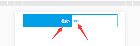 这篇文章主要介绍了css 进度条的文字根据进度渐变的示例代码,介绍了进度条里面的文字需要根据进度的长度而变化,小编觉得挺不错的,现在分享给大家,也给大家做个参考。一2018-01-09
- 这篇文章主要给大家介绍了利用CSS实现带箭头的流程进度条大方法,文中给出了详细的示例代码,对大家具有一定的参考价值,有需要的朋友们一起来看看吧。2017-01-22
- 这篇文章主要为大家详细介绍了CSS进度条和订单进度条的制作方法,具有一定的参考价值,感兴趣的小伙伴们可以参考一下2016-07-12
- 纯css做漂亮好看的进度条,看了绝对不后悔。2010-05-31
- [html] <style> #graphbox{ border:1px solid #e7e7e7; padding:10px; width:250px; background-color:#f8f8f8; margin:5px 0; } #graphbox h2{ color:#662009-03-30
 这篇文章主要介绍了仅仅使用 HTML/CSS 实现各类进度条的方式汇总,本文给大家介绍的非常详细,对大家的学习或工作具有一定的参考借鉴价值,需要的朋友可以参考下2021-11-08


最新评论