
css实现角标效果并带有文章或图标效果(完整代码)
发布时间:2025-06-19 09:55:53 作者:默默地写代码  我要评论
我要评论
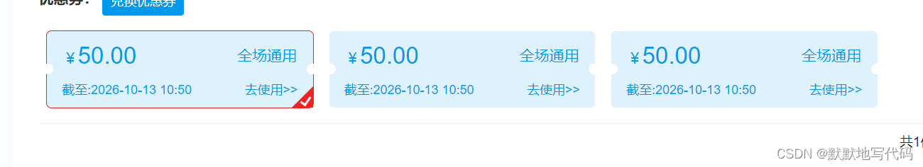
我要评论文章介绍如何用CSS实现角标效果,通过.active类结合::after和::before伪元素,利用定位、边框和旋转创建红色边框与白色三角形的提示标志,适用于按钮或卡片元素的视觉增强设计,结合实例代码给大家介绍的非常详细,感兴趣的朋友跟随小编一起看看吧
代码示例:
.coupon_card.active {
    border: 1px solid #f32121;
    position: relative;
}
.coupon_card.active::after {
    content: '';

    position: absolute;
    right: 0;
    bottom: 0;
    border-width: 0 0 20px 20px;
    border-style: solid;
    border-color: transparent transparent #f32121;

}
.coupon_card.active::before {
        content: '';
        position: absolute;
        width: 10px;
        height: 6px;
        background: transparent;
        bottom: 4px;
        right: 2px;
        border: 2px solid white;
        border-top: none;
        border-right: none;
        -webkit-transform: rotate(-55deg);
        -ms-transform: rotate(-55deg);
        transform: rotate(-55deg);
        z-index: 9;
 }
效果图:
到此这篇关于css实现角标效果并带有文章或图标的文章就介绍到这了,更多相关css角标效果内容请搜索脚本之家以前的文章或继续浏览下面的相关文章,希望大家以后多多支持脚本之家!
相关文章
 这篇文章主要介绍了CSS 实现角标效果,分为圆角矩形和三角形,本文通过实例代码给大家介绍的非常详细,对大家的学习或工作具有一定的参考借鉴价值,需要的朋友可以参考下2022-06-28
 这篇文章主要介绍了css伪类 右下角点击出现 对号角标表示选中,本文通过实例代码给大家介绍的非常详细,对大家的学习或工作具有一定的参考借鉴价值,需要的朋友可以参考下2020-06-22
- 这篇文章主要为大家介绍了CSS实现带倒三角标记的WEB标准菜单效果代码,通过纯css实现鼠标滑过呈现倒三角标记的显示效果,非常简单实用,需要的朋友可以参考下2015-10-12
CSS教程:可扩展圆角标签的实现方法-CSS教程-网页制作-网页教学网
在制作网页的时候,很流行使用标签的方式进行分类显示,圆角标签具有样式美观、表现方式形象的优点,一般我们都会将圆角标签的背景制作成一张图片,这样做的不足之处是如2008-10-17
CSS运用阿里巴巴矢量库快速在对应位置加上好看的图标效果(实例代码)
这篇文章主要介绍了CSS运用阿里巴巴矢量库快速在对应位置加上好看的图标效果,本文通过实例代码给大家介绍的非常详细,对大家的学习或工作具有一定的参考借鉴价值,需要的朋2020-04-14使用CSS和Bootstrap图标制作上下跳动的指示箭头动画效果
有时侯页面很长,需要指示箭头告诉用户下面还有东西。下面脚本之家小编给大家带来了使用CSS和Bootstrap图标制作上下跳动的指示箭头动画效果,感兴趣的朋友一起看看吧2018-06-04 这篇文章主要介绍了CSS实现鼠标上移图标旋转效果,需要的朋友可以参考下2017-06-17


最新评论