
css圆形镂空(优惠券背景图)的实现
发布时间:2021-03-01 17:05:26 作者:网瘾颓废  我要评论
我要评论
我要评论这篇文章主要介绍了css圆形镂空(常用做优惠券背景图),文中通过示例代码介绍的非常详细,对大家的学习或者工作具有一定的参考学习价值,需要的朋友们下面随着小编来一起学习学习吧
本文主要介绍了css圆形镂空(常用做优惠券背景图),分享给大家,具体如下:
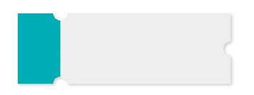
.hollow-compose-three-circles {
  width: 300px;
  height: 100px;
  position: relative;
  background: radial-gradient(circle at right top, transparent 10px, #00adb5 0) top left / 60px 51% no-repeat,
    radial-gradient(circle at right bottom, transparent 10px, #00adb5 0) bottom left /60px 51% no-repeat,
    radial-gradient(circle at left top, transparent 10px, #eeeeee 0) 60px 0/230px 51% no-repeat,
    radial-gradient(circle at left bottom, transparent 10px, #eeeeee 0) 60px 50px /230px 51% no-repeat,
    radial-gradient(circle at 10px 50px, transparent 10px, #eeeeee 0) 290px 0/10px 100px no-repeat;
   filter: drop-shadow(2px 2px 2px rgba(0,0,0,.2));
}

.hollow-compose-three-circles::after {
  content: '';
  height: 80px;
  border: 1px dashed #fff;
  position: absolute;
  left: 60px;
  top: 0;
  bottom: 0;
  margin: auto;
}
<div  class="hollow-compose-three-circles"></div>
<!doctype html>
<head>
<meta charset="UTF-8">
<title>process</title>
<style>
body{
background: gray;
}
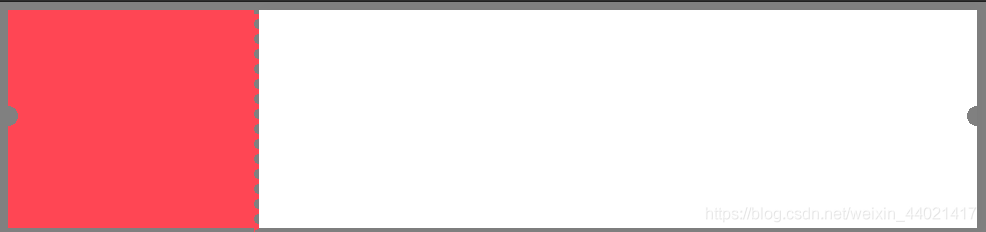
.many-circles {
margin: 10px 0 0 40px;
width: 200px;
height: 100px;
background: radial-gradient(circle at right, transparent 10px, #00adb5 0) top right / 51% 60px no-repeat,
radial-gradient(circle at left, transparent 10px, #00adb5 0) top left / 51% 60px no-repeat;
/*radial-gradient(circle at top right, transparent 10px, #eeeeee 0) bottom right / 51% 40px no-repeat,
radial-gradient(circle at left top, transparent 10px, #eeeeee 0) bottom left / 51% 40px no-repeat;*/
filter: drop-shadow(2px 2px 2px rgba(0,0,0,.2));
}
</style>
</head>
<body>
<div data-v-85036100="" class="many-circles"></div>
<script>
</script>
</body>
</html>
效果如下

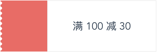
<style>
	body{
		background: gray;
	}

   .hollow-one-circle{
		display: inline-block;
	  width: 246px;
	  height: 218px;
	  position: relative;
	  background: radial-gradient(circle at 0 106px, transparent 10px, #FF4654 0) top left/246px 100% no-repeat;
	}
	.hollow-one-right{
		display: inline-block;
		width: 718px;
		  height: 218px;
		  position: relative;
		background: radial-gradient(circle at 718px 106px, transparent 10px, #ffffff 0) top left/718px 100% no-repeat;

box-shadow:3px 0px 13px 0px rgba(0,0,0,0.03);
	}

.hollow-one-circle::before {
  content: '';
  position: absolute;
  height: 100%;
  width:5px;
  top: 4px;
  left: 246px;
  background-image: linear-gradient(to bottom, #FF4654 5px, transparent 5px, transparent),
  radial-gradient(10px circle at 5px 10px, transparent 5px, #FF4654 5px);
  background-size: 5px 15px;
}
.hollow-one-circle:after {

}
</style>
<div data-v-85036100="" class="hollow-one-circle"></div>
<div data-v-85036100="" class="hollow-one-right"></div>
到此这篇关于css圆形镂空(常用做优惠券背景图)的文章就介绍到这了,更多相关css 圆形镂空内容请搜索脚本之家以前的文章或继续浏览下面的相关文章,希望大家以后多多支持脚本之家!
相关文章
 这篇文章主要介绍了CSS 使用radial-gradient 实现优惠券样式,本文通过实例代码讲解的非常详细,具有一定的参考借鉴价值,需要的朋友可以参考下2019-11-25
 这篇文章主要介绍了使用css创建一个优惠券的方法,本文通过实例代码给大家介绍的非常详细,具有一定的参考借鉴价值,需要的朋友可以参考下2019-10-21
 这篇文章主要介绍了利用css3径向渐变做一张优惠券的示例的相关资料,小编觉得挺不错的,现在分享给大家,也给大家做个参考。一起跟随小编过来看看吧2018-03-22
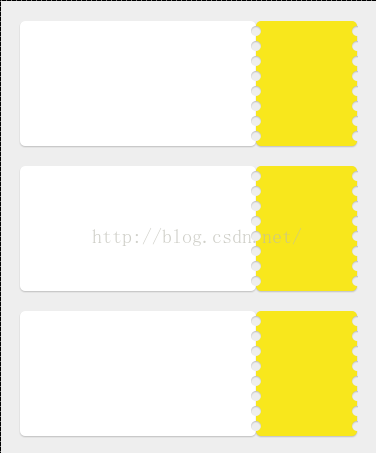 本文给大家分享使用纯css写的一个边沿打孔效果,需要的朋友参考下2018-02-08


最新评论