

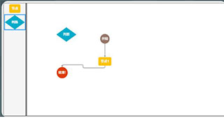 基于JS实现拖拽连线流程图代码
296KB / 09-27
 ractive.js联系表单动画效果源码
70KB / 09-21
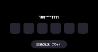 vue实现移动端6格验证码特效
44.6KB / 09-19
 vue实现表格在线绘制编辑插件
382KB / 08-30
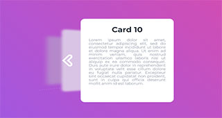 React实现3D层叠卡片切换动画特效源码
10KB / 04-22
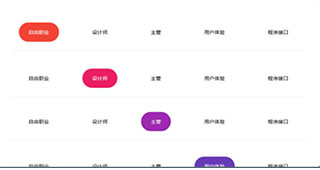 基于Gsap.js实现文字导航条ReactJs选中动画特效代码
74KB / 07-13
 Vue.js实现3D Tab菜单特效
472KB / 07-07
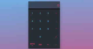 基于React制作计算器实例源码(有输入记忆)
45KB / 06-24
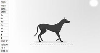 TweenMax实现狗狗骨骼动画特效
128KB / 04-16
 vue随机密码生成器特效源码
416KB / 03-24


-
-
基于JS实现拖拽连线流程图代码 其它框架 / 296KB
-
ractive.js联系表单动画效果源码 其它框架 / 70KB
-
vue实现移动端6格验证码特效 其它框架 / 44.6KB
-
vue实现表格在线绘制编辑插件 其它框架 / 382KB
-
React实现3D层叠卡片切换动画特效源码 其它框架 / 10KB
-
-
Vue.js实现3D Tab菜单特效 其它框架 / 472KB
-
基于React制作计算器实例源码(有输入记忆) 其它框架 / 45KB
-
TweenMax实现狗狗骨骼动画特效 其它框架 / 128KB

详情介绍
Step 1
Include the folllowing somewhere in the HTML of your page
NB: Make sure "src" points to the correct location of the boxOver.js file
Step 2
Next, go to the code for the HTML element you would like the tooltip to appear over.
For instance, imagine we had the following "div" in our HTML document.
My div with some text inside
</DIV>
This "div" looks as follows:
BoxOver is configured through the "title" attribute of HTML elements.
To make a tooltip appear over the "div" above we alter the code as follows:
My div with some text inside. Move over me to see my tooltip.
</DIV>
This "div" now looks like this:
Settings The "installation" section details the most simple way to initialise BoxOver.
There are many tweaks which can be set to customise it to your needs.
As shown above BoxOver is set through a tag's "title" attribute.
The general format is given by
The following table lists settings for BoxOver.
| Parameter | Possible values | Default | Description |
| header | Any character | blank | Specifies the header text of the tooltip |
| body | Any character | blank | Specifies the body text of the tooltip |
| fixedrelx | Any integer | N/A | Forces the X-coordinate of the tooltip to stay fixed (offset is relative to the annotated HTML element) |
| fixedrely | Any integer | N/A | Forces the Y-coordinate of the tooltip to stay fixed (offset is relative to the annotated HTML element) |
| fixedabsx | Any integer | N/A | Forces the X-coordinate of the tooltip to stay fixed (X is an offset relative to the body of the HTML document) |
| fixedabsy | Any integer | N/A | Forces the Y-coordinate of the tooltip to stay fixed (Y is an offset relative to the body of the HTML document) |
| windowlock | on / off | on | Make tooltip stick to side of the window if user moves close to the side of the screen. |
| cssbody | Any defined style class | Built in styles | Specifies CSS class for styles to be used on tooltip body. |
| cssheader | Any defined style class | Built in styles | Specifies CSS class for styles to be used on tooltip header. |
| offsetx | Any integer | 10 | Horizontal offset, in pixels, of the tooltip relative to the mouse cursor. |
| offsety | Any integer | 10 | Vertical offset, in pixels, of the tooltip relative to the mouse cursor. |
| doubleclickstop | on / off | on | Specifies whether to halt the tooltip when the user double clicks on the HTML element with the tooltip. |
| singleclickstop | on / off | off | Specifies whether to halt the tooltip when the user single clicks on the HTML element with the tooltip. - if both singleclickstop and doubleclickstop are set to "on", singleslclickstop takes preference. |
| requireclick | on / off | off | Specifies whether the user must first click the element before a tooltip appears. Intended for use on links so that information appears while the link is followed. |
| hideselects | on / off | off | Specifies whether to hide all SELECT boxes on page when popup is activated. |
| fade | on / off | off | Specifies whether to fade tooltip into visibility. |
| fadespeed | Number between 0 and 1 | 0.04 | Specifies how fast to fade in tooltip. |
| delay | Any integer | 0 | Specifies delay in milliseconds before tooltip displays. |
下载地址
人气脚本


相关文章
-
基于JS实现拖拽连线流程图代码
JS拖拽连线流程图代码,很实用的流程图网页代码,实现代码也非常简单易懂,需要的朋友前来下载吧...
-
ractive.js联系表单动画效果源码
很有创意的发送邮件、联系内容等表单,基于ractive.js实现的动画效果,以发送信件的方式,喜欢的朋友快来下载吧...
-
vue实现移动端6格验证码特效
一个vue手机移动端的6格验证码特效,支持自动填充效果,可将发送验证码功能抽离成单独的组件使用,简单易用...
-
vue实现表格在线绘制编辑插件
一个vue表格在线绘制编辑的插件,可通过鼠标方式来绘制表格,可配置表头行、单元格、模板,以及撤销、还原、删除、保存等功能,简单好用...
-
React实现3D层叠卡片切换动画特效源码
今天给大家介绍基于React插件制作一个3D视觉效果的CSS3层叠卡片切换动画,切换的内容可以是tab内容页,也可以是图片,喜欢的朋友快来下载源码体验吧...
-
基于Gsap.js实现文字导航条ReactJs选中动画特效代码
文字导航条ReactJs选中动画特效代码,基于Gsap.js实现的文字导航菜单鼠标悬停背景底色变化效果,喜欢的朋友快来下载体验吧...
下载声明
☉ 解压密码:www.jb51.net 就是本站主域名,希望大家看清楚,[ 分享码的获取方法 ]可以参考这篇文章
☉ 推荐使用 [ 迅雷 ] 下载,使用 [ WinRAR v5 ] 以上版本解压本站软件。
☉ 如果这个软件总是不能下载的请在评论中留言,我们会尽快修复,谢谢!
☉ 下载本站资源,如果服务器暂不能下载请过一段时间重试!或者多试试几个下载地址
☉ 如果遇到什么问题,请评论留言,我们定会解决问题,谢谢大家支持!
☉ 本站提供的一些商业软件是供学习研究之用,如用于商业用途,请购买正版。
☉ 本站提供的BoxOver js 提示框 TIP提示效果资源来源互联网,版权归该下载资源的合法拥有者所有。